Hello!
In the previous article I mentioned that a lot of my development on the game was a process of iterative improvement. Nothing is better proof of this work philosophy than the enemies. If it is not obvious, at the time I made these enemy models I had pretty much not done any modelling at all, let alone in Blender.


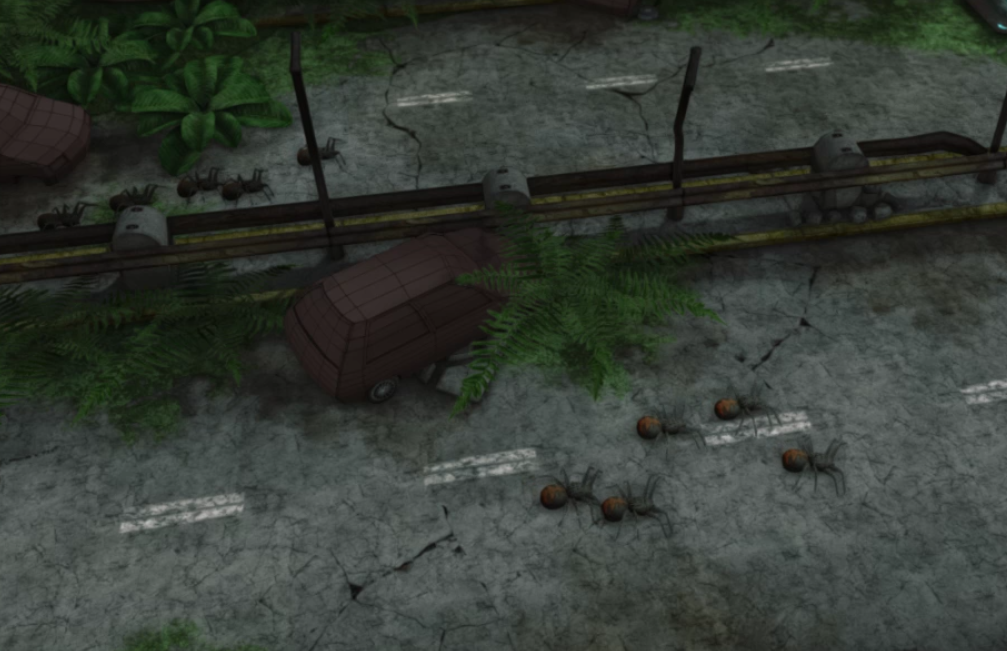
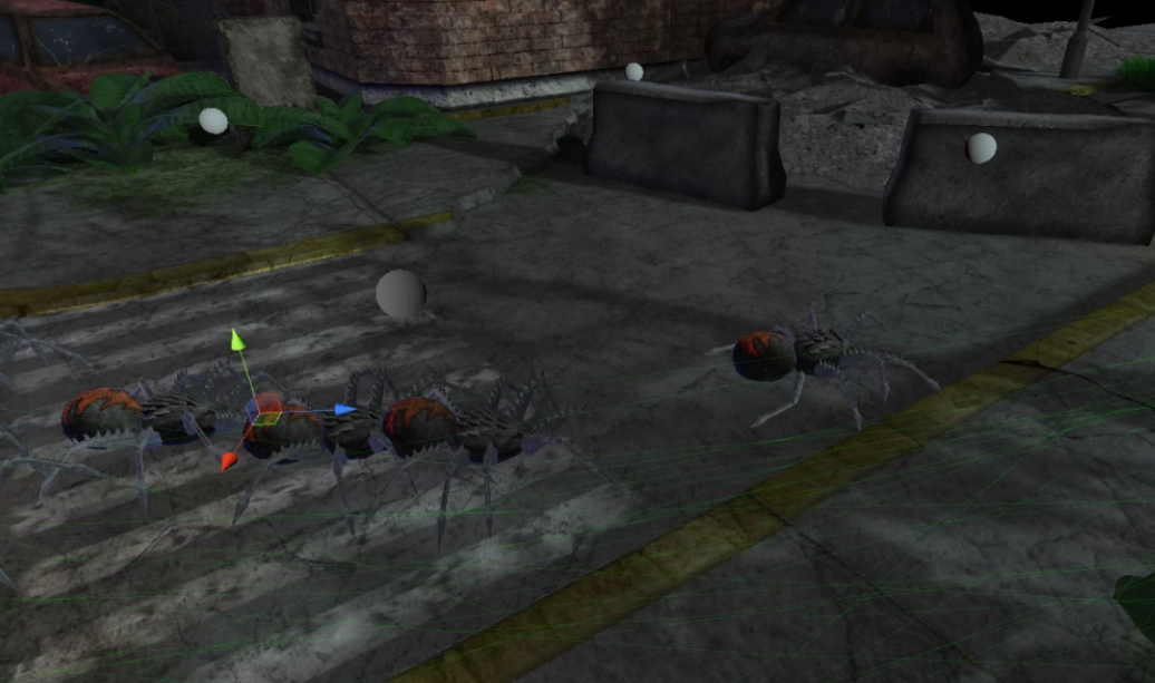
These images show the first design of the fire spider. A couple of things are apparent here, aside from just the badly done modelling. When started working on the game, I knew that large, mutated insects would be the enemy type of the game. However, I had not considered any further any other design philosophies to adopt. This iteration of the fire spider has, in my opinion, several flaws (again, aside from just hideous modelling).
1: The consistency of the enemy is very poor. The legs look mechanical while the body is more organic looking. This combination could be all well and good, but in this case, it is clear that there is no good transition between the mechanical parts and the organic parts and that makes the enemy look very bad.
2: When seeing this enemy, it also not clear what kind of enemy it is. There's no give away as to what kind of attack this enemy can be expected to have.
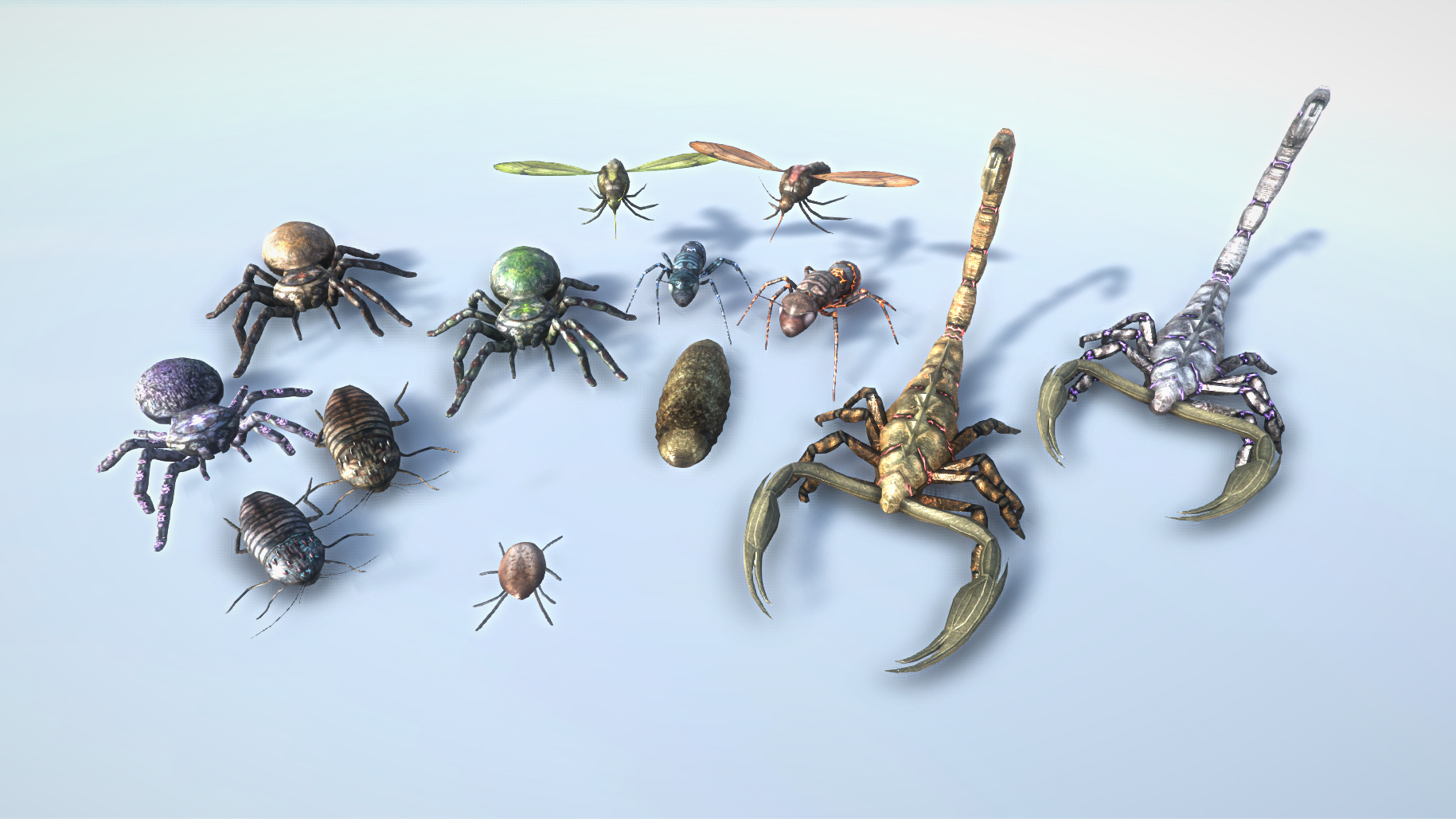
If you have played the game, you will know that the enemies are color coded so that it's easy to see what kind of enemy you're facing. If you haven't, please do, but for the sake of the article, here are the enemies:

This image, in my opinion, displays two things, consistency within the same enemy, and consistency between enemies.
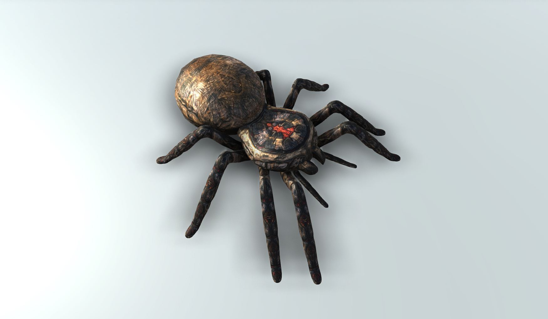
The spider, as shown in the beginning, went through a redesign with the same base material, which was later scrapped, and a fully redone model, which is the one now seen in the game and in the image above.

Although this version of the spider still consists of several loose pieces, it now looks more like well put-together and solid enemy, both structurally and aesthetically.
The way I handled consistency between enemies was to ensure that the texturing process was more or less the same for all enemies (you can read the full details on this process The making of the skins of the enemies of BoE ). But I also wanted to make it obvious what type of projectile that can be expected from each type of enemy. Fire, laser and rocks: The enemies are brown and have red theme colors. Acid: Enemies are greenish/lime colored and have green as theme color. Blitz: Enemies are bluish grey and have blue or whitish blue as theme color.
By following this design philosophy throughout, I believe I accomplished a consistent looking "family of insects".
For the next and last update I will start detailing what will go into the upcoming few updates for the game. Although the game has been released, there are still quite a few things that I would like to implement.
/ Dispersing Minds


