Hello World,
We all need an image that quickly portrays what our game is about and that is unique enough to be a key point of a game image. As such, you would usually wait until you have enough material to come up with a logo.
But that means that, as you might have noticed, our first Indie DB logs have almost no images or are only identified with our Studio logo - and this is something that we were trying to solve as soon as possible! it is with great excitement that we are finally able to present to you:
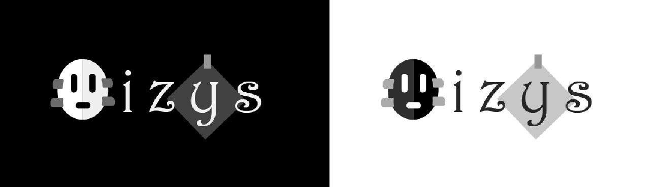
Oizys' Game Logo!
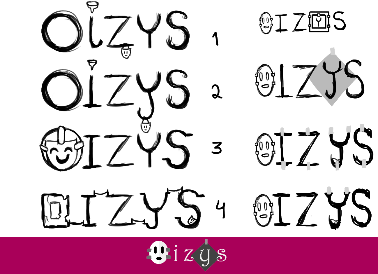
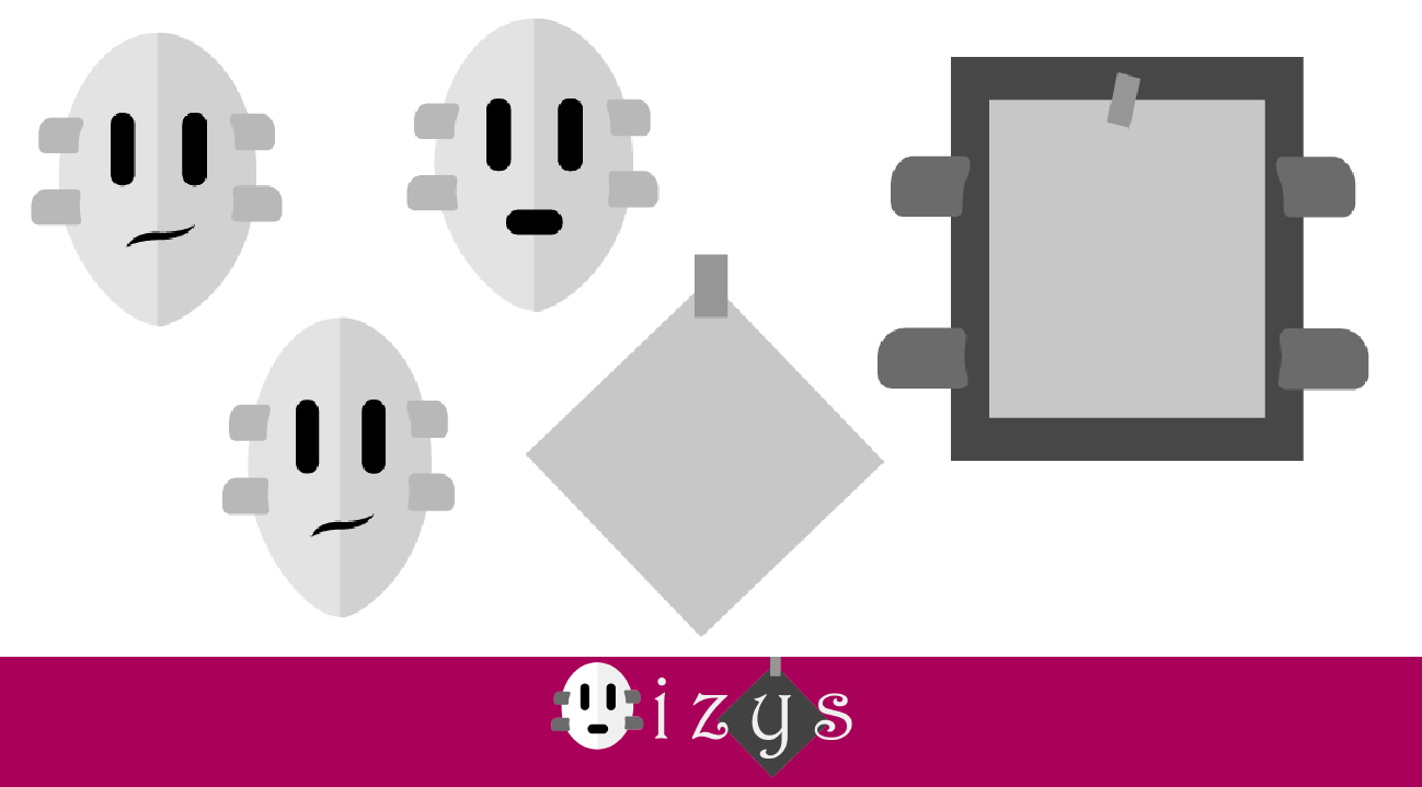
Initially, Diana started sketching some ideas, exploring multiple ideas that are a part of the world of Oizys: Alex's mask (have you checked our blog presenting our main character, Alex? See it here!), the guide mask/sheet of paper, the islands that make up the entire environment, the bridges connecting the islands, and the pieces of duct tape evoking the idea of a puzzle/something put together while simultaneosly evoking the guide's mask.
We wanted the overall look of our logo to feel light while simultaneosly hinting at the darkness of our narrative.
Considering those sketches, we then went looking for an appropriate font. We looked for something that was 100% free and that portrayed exactly the mood we wanted for Oizys.
As Diana is not confortable working with Illustrator, it was then time for Matilde to block some of the shapes and try possibilities for the different icons and iconography that were to be present in our logo.
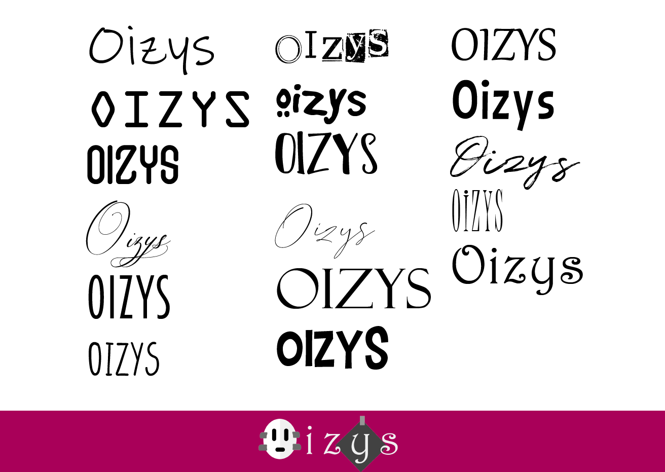
Then it was time to merge this two components into a logo! As you can see, we tried different approaches based on the sketches Diana made.
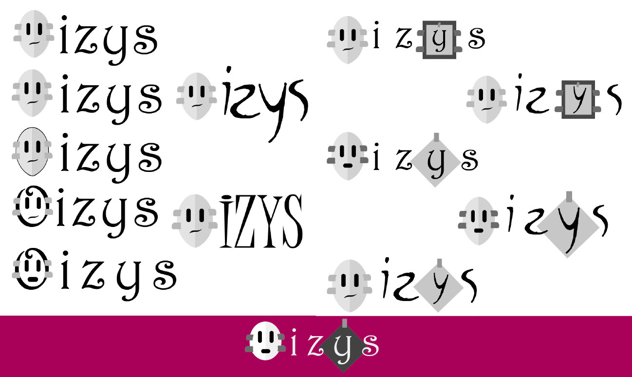
And we finally settled on a logo!
So, what do you think? If you have any feedback or comments, we'd be glad to here them! :)
What's next?
We're finishing up our level design, so if you have any tips on how to balance difficulty in puzzles, let us know in the comments below! :D
Stay tuned for all our DevBlogs, and don't forget to follow our Twitter, Facebook and Instagram. Thank you so much for all your support and feedback :)