Last week I switched over to making some art as I was getting slightly frustrated with the coding- not because it was going badly, but because without graphics the game feels like it wasn't progressing. I needed that change of pace, and seeing the visuals start to come together a bit has given me some more confidence in the project.
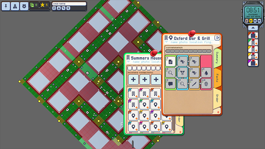
I'm trying to keep the UI as minimalist as possible. In this initial design,
I've managed to fit in all essential display elements into 2 compact but not overcrowded spaces.
The more room the player has to browse those case files the better!
Selecting fonts has been interesting- since I'm working with bitmap pixel art fonts on this project, I can't scale them properly without them looking awful. Therefore I've had to stick to 1x, 2x or more their designed size in order for the pixels to remain consistent sizes. It's not a design challenge I had prepared for, but with some extra time and attention, I've managed to find some great fonts that are the size I need and most importantly remain clear. Font artists who provide affordable or even free fonts for commercial use are the unsung heroes of game development! A big thank you to Zacchary-Dempsey-Plante, Yusuke Kamiyamane, 'NAL' and Chase Babb for the fonts I'm using here.
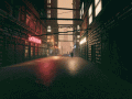
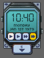
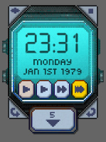
I'm taking a skeuomorphic approach to the interface design- that is the elements look like their real-world counterparts. For example, the evidence information windows look like case files, the clock in the corner of the screen looks like a retro digital watch (the game takes place in the late 70s through to 90s) and the corkboard interface looks like, well, a corkboard.
Many games feature this design style, the one that springs to mind off the top of my head being Papers Please. I tried to touch a little on this in Concrete Jungle too- my games tend to be interface heavy, so why not make the interface as fun to use as possible? It's the attention to detail that can go a long way- especially in combination with satisfying sound design (eg. rustles of paper, or the 'stamp' sound when you purchased a new card in Concrete Jungle). A good UI the player will never really notice because ideally, it presents no barrier to interaction and immersion with the game.
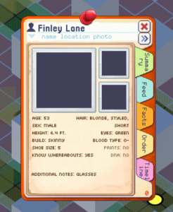
The game uses a pseudo windows interface- the evidence is presented in windows that can be moved, resized, minimized and pinned to a case cork board (which acts like the windows desktop). Just the presence of a small 'X' in the top corner gives the player feedback this is an interface they are familiar with.
The interface also needs to be intuitive. This is a really complex game that will no doubt require a fairly in-depth tutorial, but that's not going to stop me trying to communicate as much as I can about how to play the game through the interface design. One super obvious thing that I really like in games like this is the use of tooltips. Mouse over something for a second or so and you'll get a small popup window explaining what it is and its place in the game. In absence of a tutorial, I'm relying on tooltips to communicate to players almost everything right now.
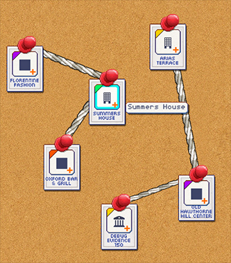
The slightly revamped corkboard interface features animated strings
to show which way the 'incrimination' is flowing.
The corkboard itself is a familiar detective trope that everyone knows from movies and tv shows, and within the game has even more functionality. At the moment the corkboard also displays the core mechanic behind the game logic recognising incriminating evidence. Incrimination is passed along from one evidence item to another via connections (represented by the string). For example, the source of incrimination could be a dead body with a stab wound. The connection to where it was found (in this example lets say an apartment) will pass a sizable portion of that incrimination from the body along to it. From there you could discover that someone other than the victim lives in that apartment- again a portion of incrimination from the apartment is passed along to that person via the connection.
This means the incrimination spans outward from the key evidence of the crime and is also visualized really well with the corkboard interface. Recently I've added animation to the strings so you can clearly see which way the incrimination is 'flowing'. String colours range from white to red the more incriminating a connection is. The strings also vary in width depending on how reliable a connection is.
I'm focusing on these seemingly minor details now as they have a knock-on effect of streamlining how you play the game. Whenever I run a build, I don't know what's going to happen. The clearer the interface is, the easier it is to understand what's happening within the game.
I've really been enjoying the UI work- next I hope to start moving onto some 3D stuff. Exciting!