Hello there!
A big part of game development is refining stuff that you've already created, be it code, sound effects or graphics. Sometimes it's also taking stuff out permanently, bits and pieces which don't fit the narrative or overall story.
This week we'll take a peek into what's been left on the cutting room floor, and what features or assets have been altered during the process. Of course we'll be talking about the highlights, not every single thing that has changed during development.
Background art

The home road scene from one of the first builds, circa February 2015.
 Comparison shot from one of the background assets.
Especially the early scenes, which have been there from the start, have gone through many iterations. The graphical style has been re-hauled a couple of times, and that has required some drastic changes. At first, we created the environments in this very fantasy-like fashion, with crazy lights and mostly prerendered stuff.
During the spring of 2015 we moved to a more serious tone with the background art, and revised the areas to look more realistic. Trees looked like they could belong in the real world, and ground looked more realistic. Of course there's still this comic-book style flavor to the assets, but now they at least represent actual real-life scenes, instead of this very abstract and game-like environment.
The third version of the background art came when we decided to set the game permanently at night, or at the hours of dusk. All the lights would be pre-set in the locations, and the sun would never come up. An eerie fog rolls over the scenes, and there is an ominous glow to some areas. Most of the areas look very different, than they looked during daylight.
Art style
 Original design of the big house on the left, and current version on the right.
 Screenshot from the current version of the game; the abandoned gas station.
This is partially related to the earlier point, but this one is about the big picture. In the very first draft our game was designed to feature a fully top-down view. Then, we tried to create a sidescrolling concept, but that lacked all the fun and engaging gameplay that we wanted to achieve. After that we settled on this slightly slanted bird's eye vision. It was supposed to function like a top-down game in the code, and reveal a bit more about characters and environment, but it soon transformed into this isometric type of deal. Now we have to deal with things being behind other things, walls to become transparent once you're inside the building, and avoid player overlapping things.
When we finally got past the initial birth pain, I took some time to sketch stuff out, and think about how I wanted the whole game to look and feel. In the spring of 2015 I had recently watched the Nirvana documentary Cobain: Montage of Heck, which featured these beautiful hand-animated sequences. Those became one of my main inspirations in creating the look for this little mid-nineties Finnish town.
Another key inspiration at that time was the wonderful artwork done by Simon Stålenhag. He has created some really unique vistas, which perfectly capture the bleak and beautiful nordic atmosphere.
Enemy design

The old enemy design in motion. This build is from the summer of 2015.

The evolution of the Bruiser design.
One character asset, which has gone through most iterations, is the 'Bruiser' monster, also known as 'The werewolf monster'. The very first version was this demon-like hairy blob of flesh, which was inspired by Warhammer chaos miniatures. Then, we took the design to a more standard humanoid / werewolf form, which is more streamlined and clear visually.
The writing
 One of the more grislier bits of Kalaban, seen in the current version of the game.
Oh yes, even the core of our storytelling has changed quite a bit. Kalaban was originally set during the winter, in some generic American little town. The town was overrun by demons and monsters, but we then decided to make the story and setting more personal. The date was set to be in 1995 in early development, and frankly it could've been set in -94 or -93 as well during that time. Somehow just setting it in the smack center resonated with us, especially with the cultural transition happening during that time. For example, the album Mellon Collie and the Infinite Sadness by The Smashing Pumpkins, and films like Se7en coming out that year.
All the dialogue and interactions in the game are written by either Tuukka or me. We've discussed about the tone and the themes endlessly. If something needed to go, it was axed. If something had to be added, we worked it into the game. Earlier this year we did a huge re-haul to the story, and decided to add the NPCs into the game, with their own little side quests. Now, it would be impossible to think about the game without those characters. They are an integral part of the experience.
User interface
 Original UI from early 2015, where inventory bar was always visible and in real-time.
 Comparison between the old icons, and the new.
The UI in Kalaban has been through a lot of changes. Originally, we started the game as a purely horror-themed adventure game, and then moved more towards action adventure genre. We needed to add the inventory screen to the game, so that players could manage their hotbar and the items they're carrying, all without interruptions.
This gave the game more action RPG type of flavor. The changes and reworks took a long time to refine. We started planning the new inventory in October 2015, and at first it was going to be a drop-down menu like in the early Fallout games. We then opted for a more standard grid-based view, but that meant scrapping the previous system entirely.
Not only have we redesigned the interface over and over, but we've also thrown away the old icons. They were created in the early stages of our development, and they no longer represented the overall visual fidelity of the project. The current ones are better in line with the present art style.
 Initial sketch art of the drop-down style inventory, with old icons as placeholders.
 Current version of the inventory screen, with ammunition counters and the classic paper doll.
But it was the right call, and that choice gave the inventory a lot more clarity, without having to scroll through the whole list, and sub-tabs. Ease-of-use and speed are everything when you're creating the UI, and that's what we went for.
Now you can drag & drop items to your hotbar, like the health items and weapons, and equip them in real-time. The inventory screen pauses the whole game, so you don't have to worry about enemy attacks, as you read through the flavor text.
Sound design
 We can't present you the current sound fx, so we present some moving pictures.
The original sound design in Kalaban was godawful. It was just a bunch of freeware and stock effects cobbled together by me. They were only meant to give you a general idea of what you might hear in the game. For the longest time, we did not have a real sounds for any of the inventory items, or effects for the UI. Those details were only recently been added to the game.
The enemy sounds in the game were particularly awful in early development. The werewolf monster taunts were recorded by me, and I made them as total placeholders, so that they could be replaced at any time. Now, finally after a long wait, our audio mastermind Eetu re-designed the mutant sound effects. And my god, they're a thousand times better than the old ones!
 Combat with the Blow-up mutant.
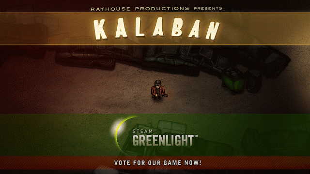
In other news
Our game was finally launched on Steam Greenlight on Halloween. Some people have missed the point of our very retro intro cinematic, which is not that surprising. I do understand, that for those people who have not grown up with PC games during the nineties, that cinematic can be really confusing. Some people thought that it was just laziness to create such visuals, or that perhaps we don't care enough to put more effort.
But in fact, the cinematic looks pretty much exactly like we wanted it to look. We wanted to faithfully re-create the cgi videos from the mid-nineties, and all the details in that animation was done with this in mind. The game in itself is done with a quite serious tone. We wanted to have a bit of fun with the trailer, and show our love for the old cinematics, and their wonderfully cheesy nature.
I think people have different kind of ideas about nostalgia. A show like the Stranger Things is set in the 80s, and takes story cues from the old Stephen King stories and Spielberg movies. But at the same time it has very modern visuals, with CGI effects, and all the frames looking polished and perfectly lit. That's what viewers today expect, not the authentic retro quality, which would actually represent the era truthfully. And that is totally fine. We've been taught to expect the certain kind of visuals, no matter what the subject.
Anyways, our game is on Greenlight right now, so go give it a thumbs up, and help us fulfill our dreams: Kalaban at Steam Greenlight.
- Harri J.