I don't consider myself particularly gifted as an artist - drawing a straight line or getting proportions right are beyond me. So I take a very methodical approach with lots of layers to making pixel art. Here, in eight steps, is how I made the logo for Airships.
I've tried to avoid any sudden jumps of the "draw a sphere, draw another sphere, now just add some details" sort. I started out with an approximate idea of what I wanted: the logo as an airship with a shape reminiscent of a heraldic eagle.
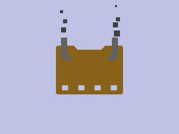
I started out by blocking out the basic shape of the airship, using the default wood colour and the rectangle select tool. (This is all done in GIMP.)
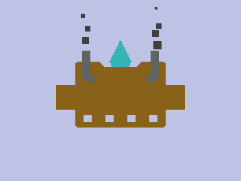
Next, I added a panel for the game's name. Note that I *am* streamlining this a bit here: everything I did required multiple attempts and a lot of jiggling back and forth by single pixels to make everything fit and look nice. I also added a suspendium crystal, just in its base turquoise colour.
Next, I opened up the game's sprite sheet for reference. I added some rocket-coloured thin rectangles and gun-coloured thick ones, then rotated and placed them. Again, a lot of fiddling went into placement.

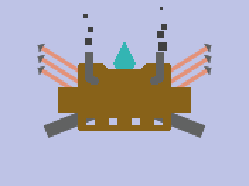
Shading: the way to make everything look a lot better all of a sudden. I did this by creating a separate layer at 20% opacity and drawing with black and white. Shading may sound scary, but it's actually a pretty mechanical process of thinking about where the light comes from and which surfaces would be particularly bright or dark.

Now it's getting to the details: yellow energy sparks around the crystal and window frames (which I grabbed from the sprite sheet).
More things grabbed from the sprite sheet: boarders and various bits of machinery. Also, a small coat of arms, which took a long time to get right.

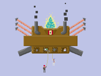
Lettering: The official font for Airships is Liberation Mono. Unfortunately, GIMP does an awful job rendering it with anti-aliasing turned off, so I spent a lot of time cleaning this up, making sure the letters look decent and the spacing's OK.
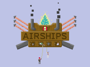
Finally, some gentle texturing. The texture for the main bit I grabbed from the wooden wall texture in the game, and for the sign, I just drew some slightly crooked lines in a slightly darker brown.
The final logo has about 20 layers and took maybe 3 hours to make. I'm pretty pleased with it, all in all. The next dev blog update is going to be some hardcore stuff about Java memory management!


> Java memory management!
Yeee!!!!
Or to give it its full name, "the horrors of Java memory management, and which goats to sacrifice to appease the garbage collector"...