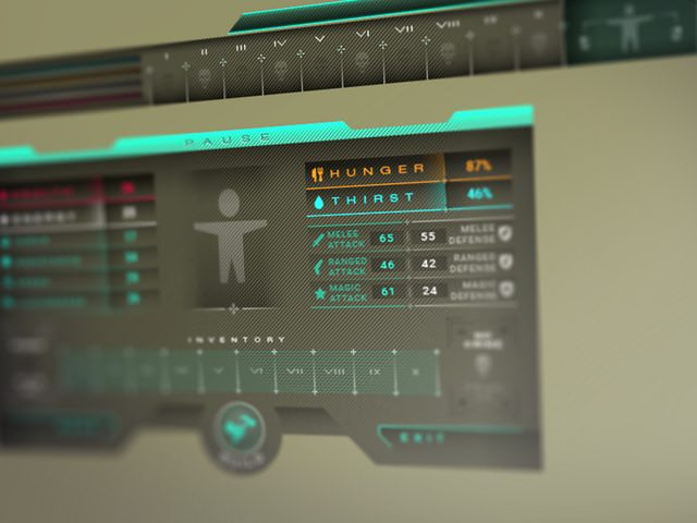
As I'm an art director during the day, I worked a lot on 3571 The Game design elements during the night. I am finally happy of the result after many years and many versions. I really like the new futuristic look and it is still very effective and fast to use, combining all RPG functions ( inventory, equipment, stats, etc... ) in one unique small GUI window.
1. Less is more work
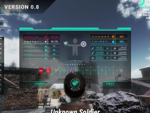
The new interface is 100% pixel-perfect, this was a lot of work to get things as small, precise and functional as possible.

2.Interface history
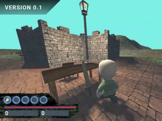
The global design of the game never stopped improving. For the very first version, I still had to learn C# coding and 3D modeling so it was just horribly ugly:
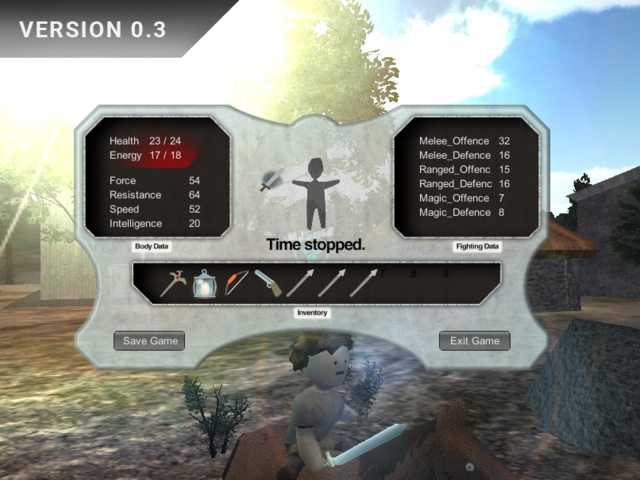
When I switched to C#, I had to deal with real GUI development. I designed a first and medieval HUD, which was already close to the final version "all-in-one" concept.
For the first early access version available on Steam, and I wanted to give the game a more modern look. I created this first sci-fi version of the HUD:
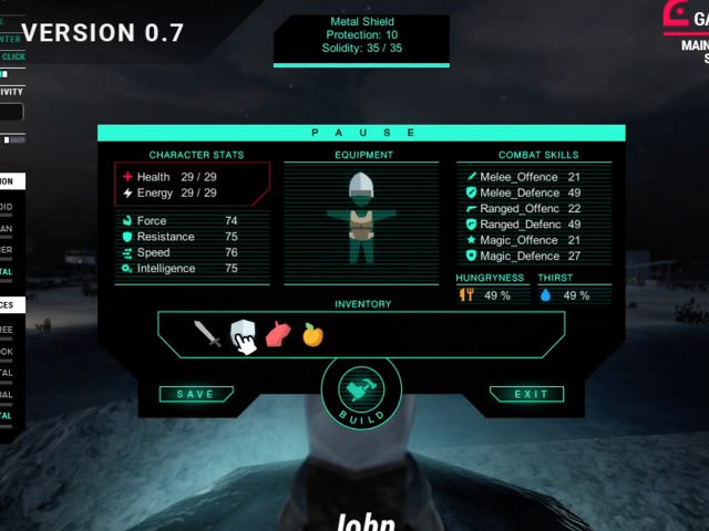
The black background was too heavy, and it was lacking details and subtelty. Next version will really define the final design of the game:
3. More about the new design
You want to see the new interface in action before the next release? No problem :

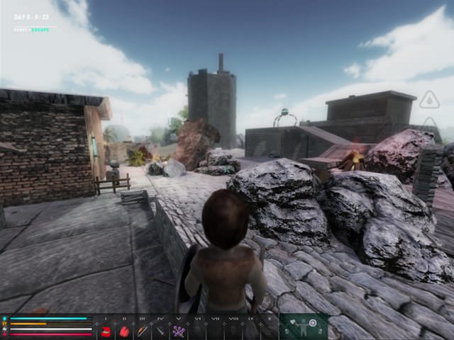
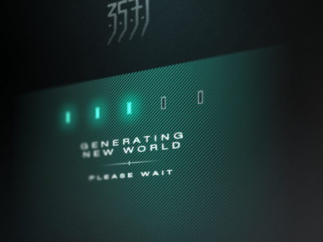
I also created new in-game interface and new loading screen, fitting with the global new design. Look at this new micro-GUI equipment tooltip in the inventory bar displayed while playing:
Version 0.8 should be ready next sunday. Thanks for reading and see you soon in the year 3571!