With Battle Brothers we are using a distinct design and artstyle, especially regarding the characters. In this dev blog we want to share with you the story behind the design and explain which decisions and reasons led up to the way the game looks now.
How resource constraints can turn into an advantage
We started development with full body figures painted and animated in Flash. But we soon discovered this would be way too much work for all the assets we needed, being that we are a team of just four people (only one of which is an artist!) and some of us are working a fulltime office job on the side. Not only would we have needed each character drawn in several directions, it was important to us also that the player could see all equipped gear on the characters. The exact helmet, shield, weapon, armor. This would have multiplied the workload immensely. You can see a mockup of a very early version below with the full body characters. Note that at this point we still had square fields instead of hexes.
So we were stuck with an extremely high workload and limited resources. Something had to give if we ever wanted the project to see the light of the day - we had to set priorities.
The first step was to cut character animations like walking and turning. Animations are a great way of having a scene feel alive, but especially with 2d visuals they require an immense amount of work. And while it seems cool at first to have your guys perform animated attacks and walk across the battlefield, these animations do become repetitive quickly; at some point, many players would likely feel that they're waiting for animations to finish more than anything else, and would choose to speed up animations or make movement instantaneous if the game supported this. At least, this was our experience with playing and watching other people play similar games for many hours.
Not having to deal with animations made things a lot easier for us, but some things still posed problems with full body representations. As part of our goal of showing all equipment that characters wear, we also wanted our characters to show the weapon they wield, which would be important for gameplay purposes. Weapons go in a character’s hand, naturally, but what about two handed weapons? The character would need a completely different pose to wield them than with one handed weapons, with ranged weapons, and with a lot of all the exotic weapon types we dreamed of. Since we also wanted to show different armor types on the characters, each pose would have needed to be drawn for every armor type. So as it turned out, just cutting animations might not be enough.
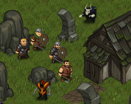
We knew about "Unity of Command" and decided to experiment with a similar look using busts placed on sockets to have the characters feel "figurine like". We imagined the look and feel of a tabletop game or boardgame where you have somewhat abstracted figurines moving within a fairly lifelike environment of miniature terrain. For the weapons we chose to add individual icons that clearly represent them to the characters, as you can see on the screenshots. This proved to be a good solution because you, the player, can reliably identify a character’s equipment without the need for us to make different character poses or hand positions for each weapon type. To us, it was one of our main goals, having all equipment be clearly visible on any character, reached, while keeping our workload manageable.
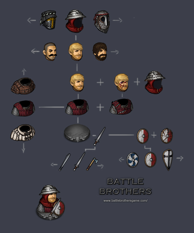
This solved a lot of our problems. We could still go with a painted and detailed look and on top of that include all the customization we wanted without too much work by just layering everything. While we’re only showing the top half of characters without any animations, we wanted to make what we do show as detailed as we could. Characters got individual heads, we added visible injuries and made damaged variants for every type of armor and helmet that can be worn. In the screenshot to the right you can see how our characters are composed for the game. Each part like head, helmet or weapon can be individually swapped.
Ultimately, our resource constraint led to a unique visual style that is very distinct from other fantasy TBS games, that allows for detailed visuals, and that has now turned into an advantage for the whole project.
Designing the sockets
With the characters depicted as busts we wanted to go one step further in the direction of a tabletop game and add sockets. Also, as early feedback showed, the characters were not always that easy to distinguish from the environment, so we needed a way to make them stick out a little better. When designing the sockets themselves we wanted them to help the character stick out from the surroundings without the sockets themselves appearing too massive. The problem with massive sockets is that they can quickly become too intrusive if they are too bright or too large. They take away the attention from the character which should be the focus point. On top of that, it is very important for gamplay reasons to see where and on what heightlevel a character is standing. If the sockets were too high there would be a lot of confusion with what height level a character is standing on. On the other hand, sockets that are too small and too inconsiderable make the characters look like they are burrowed into the ground or cut in half.
With that in mind and based on community feedback we iterated various socket designs until we ended up with the one you can see on the screen to the right. We also have distinct versions for each of the factions in the game like the Battle Brothers, the Undead and Orcs & Goblins. At this point we are pretty satisfied with we design we arrived at, as we think it meets all of our criteria and looks pretty badass ;).
Why are the characters somewhat “cute” looking?
All characters are depicted in a certain visual style, an almost carricature style if you will, with large heads and prominent facial features. In fact, they are borderline cute looking. Let us elaborate on why this is the case.
The game of Battle Brothers is pretty grim. Bloodshed and injuries occur at every turn and the death of Battle Brothers is common. The player should expect to lose people, and with our permadeath mechanic, they’ll be gone for good. Battlefields are littered with corpses. Now, we could have fully embraced this dark setting and made everything depressingly realistic. But what we chose instead is to go with a visual style that borders on cuteness not despite but because of the setting to create an interesting contrast. With your people dying left and being resurrected as zombies right, we want this to have a certain comical and/or entertaining value so that even the experience of losing can be fun in this game. We want the player to sympathize and become emotionally invested into the characters that they guide, and to feel their loss as more than just their overall combat effectiveness taking a dive.
On the other hand, there are also some technical considerations that made us go this way. The smaller a figure gets the more iconic and readable it has to be. We support seamless zooming in and out on the tactical map, and we want to Battle Brothers’ faces to be clearly readable even when zoomed out. We don’t use real proportions for weapon icons for a similar reason; weapons would look extremely thin and long, and couldn’t be easily recognized from afar. They’d just melt into the background and details would become a mess. For example, a real sword’s hilt and handle are minuscule compared to the overall length of the sword. For this reason we have exaggerated the items’ iconic features to make them easily readable - which results in the kind of stubby but still tight look.
If you have any further questions regarding the art style don’t hesitate to head over to Paul’s Art Corner and ask him anything! Battlebrothersgame.com