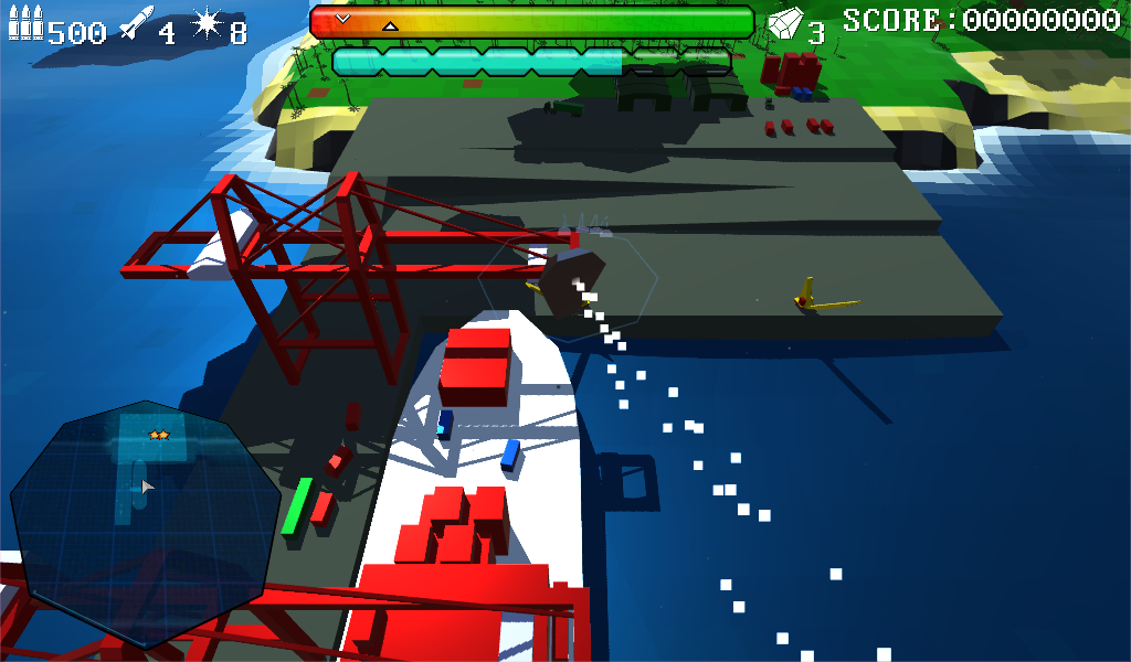
I've recently changed a number of elements on the HUD and user interface in-game that have greatly improved Arc Vector's look and feel, and made significant changes to the minimap, (although the main minimap change from square to octagonal has already shown up in screenshots here). Let's have a look at the changes:
Hud Icons
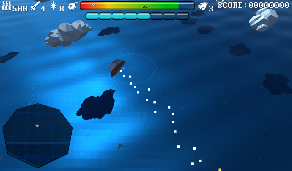
Let's quickly fly out to sea for a more neutral background:
For comparison, these were the old icons
First we can see the new icons are much more stylised. They fill their sprite area better. I've stuck with the monochromatic look as I feel it gives a cleanness while emphasising the central shield and fuel bars. The old EMP icon (horseshoe magnet) felt messy, the new bomb with flash cut-out is much cleaner. Initially I was reluctant to use drop shadows, but it helps them stand out from bright background objects like clouds and white-painted control towers. The extra-ships indicator (right of shield bar with a "3") is now solid rather than wireframe, which felt more consistent.
The power bars have also been tweaked, losing the rounded corners from some default sprite for sharper, bevelled edges, mirroring a lot of the hexagonal and octagonal design in the game world. (The shape of your ship, landing pads, minimap, and many objects in the world are frequently 6 or 8-sided, through low-poly nature and design). They also have a more angled, crystal-like nature to them now.
Speech popups
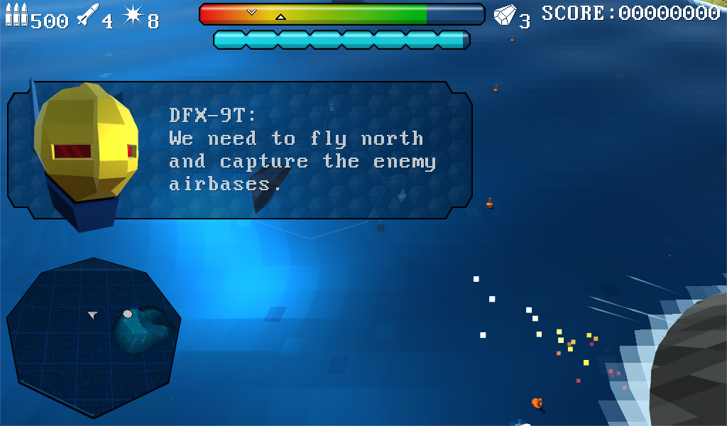
DFX-9T's head was recently improved, and given ears, and now he gets a prettier backdrop!
The old pop-up boxes had a plain background colour and rounded corners, they looked a little ugly! (see earlier screenshots if you must!) In the new design, again we can see hexagonal elements both in the background fill and emphasised in the cut-off corners. I should point out that at a more usual resolution like 1920x1080 instead of the 1024x600 above these pop-ups are more off to the side and far less intrusive.
Resource panels
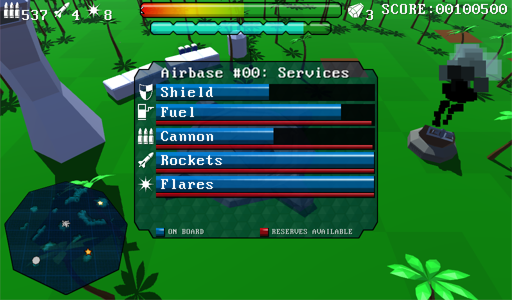
Again the old resource panel was ugly, now we've updated it inline with the speech pop-ups.
Here we see shield and fuel icons which I felt aren't necessary on the HUD. All resource bars are labelled for additional clarity. An important addition is the red resource meters. Some facilities will offer limited resources, affecting your strategy on a map, but shield charging is available at all landing pads.
Minimap changes
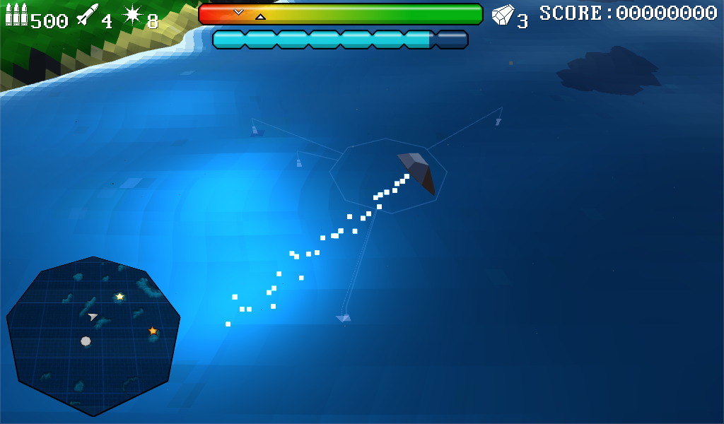
The most obvious change to the minimap from early versions is that it is now octagonal rather than square. It is also pseudo 3d, pitched at a slight angle away from the player. Rather than a flat terrain texture, it now has a holographic, 3d effect, thanks to a custom POM shader (parallax occlusion map).
Building this required a mish-mash of custom cameras, render textures, 2d and 3d canvases, and was a ridiculously convoluted and over-complicated task! End results, though, eh? :)
I reduced the number of zoom levels from 10 to 4, so just three mouse wheel clicks up or down, and the closest is a little closer than before. Scaling between zoom levels is now smoothed out rather than snapping for a nicer feel, and a scale bar along the bottom left edge indicates the current zoom level. At closest zoom the 3d effect of the POM shader really starts to give the terrain a sense of depth.
Some large structures are also visible on the minimap, like this ship and the dockyard concrete. This required duplicate objects with another custom shader positioned and scaled into the minimap's render hierarchy.
Hopefully the end result of all this is a much more consistent and solid interface, it's definitely starting to look and feel much nicer to me. That's all for this update, I'll be back soon with more screenshots and a look at some new enemy units.
Follow me on twitter @overwound for more behind the scenes info!
