After the hard struggle in choosing the proper name for the game, time to start the logo creation.
The name says it all about the game and who we suppose to fight against, the Capitalists who rule the Market and therefore rule us all in the end.
My first ideas were to name the game with the Hero's name like, "Agent Void", "Agent Klank", "Sir Spy" and finally, "The Gentleman". I keep on working in this idea because I thought it work a lot better in case of making sequels. Let's face it, in the most part when we start a new game development, in my case because I only made two games, we want new things. In this case my main goal is to approach the 2D Pixel Art and work in 2D in Unity3D, improve my animation, character design, Pixel Art and all my skills, a new challenge ahead waiting.
No more words, time to show the Log process till the final result.
In this first image you can see all the names I've already filtered for the game.
![]()
Working on the name most voted in this Facebook Group, CASH ONLY, a good name but didn't feet all the game needs.
![]()
![]()
Working with another names, this time the most voted were Money Lords and Market Mafia.
![]()
About this time and after a long battle, MONEY LORDS was the chosen one. Started to create around this name.
![]()
Added a new idea, more of a illustration than a Logo Design, but who knows it could work just fine.
Started with a Black & White approach, the game theme is darker the idea was good but in the end can't make it work.
![]()
Putting some colour in this Illustrative Logo.
![]()
My final stage for this logo. I really like the final result on this, not for this game logo, but I'll use it in the future for promotion.
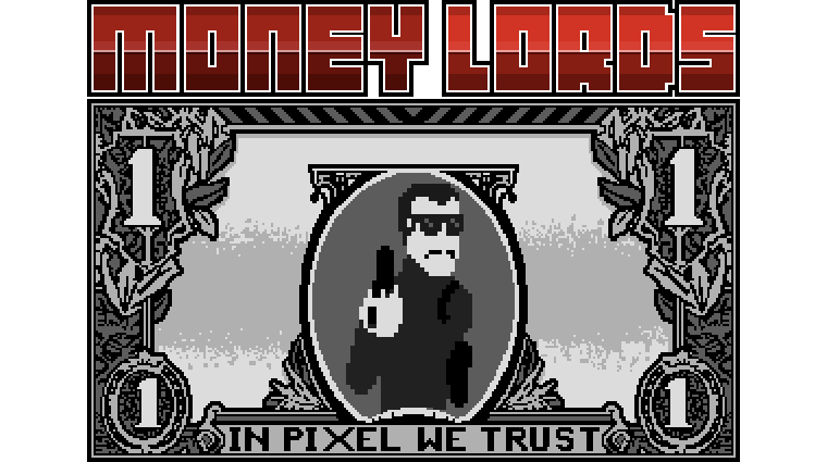
After showing all the Logo creation process here's the final result
Chose this approach because it works better as a Brand. Strong, simple (not so simple, I know, after all this is a game, so a bit of drawing is always nice). Shows who's the Enemies, putting in that position make them ruling, taking control, like the world owners. They are way above us and their decisions affects us all in our lives.
![]()
The App Icons with several sizes. Only with our Enemy Boss, the Dollar. Several sizes to work with different resolutions.
![]()
Hope you like the game Logo and the name chosen for him, I thinks it says all about the game theme, who we'll be fighting and a name who describes perfectly who really own's the worls we are living right now!!
Keep on track about the game following me on my personal Twitter account and my AKhan74 - Devblog
Cheers!