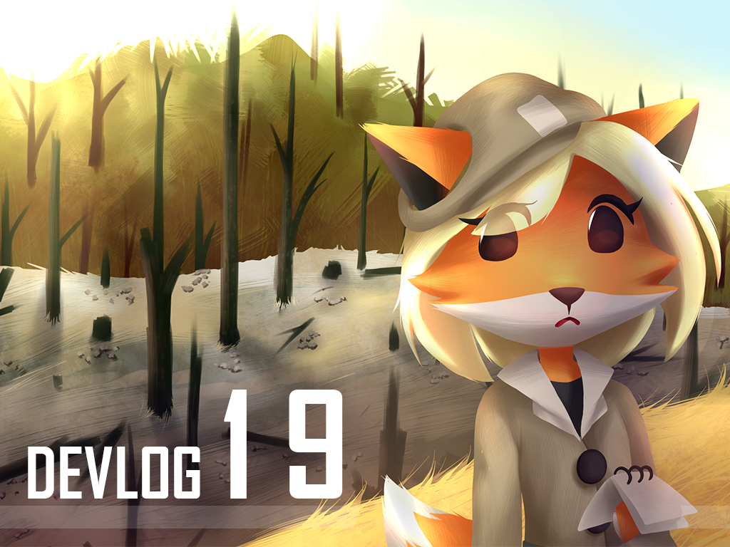
Devlog #19 - The 3D Art
Hey! Welcome to this week’s article of Chama!
In Chama, things keep getting more serious as the game develops. The art style was one of those topics. It started being more about changing the art style of the prototype, transforming it to a completed and high quality video game.
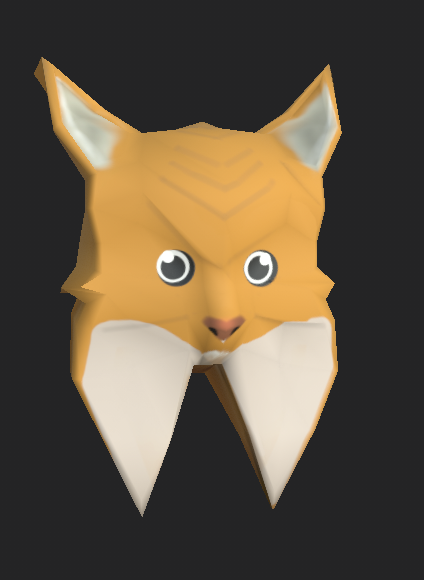
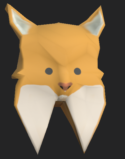
The 3D previously
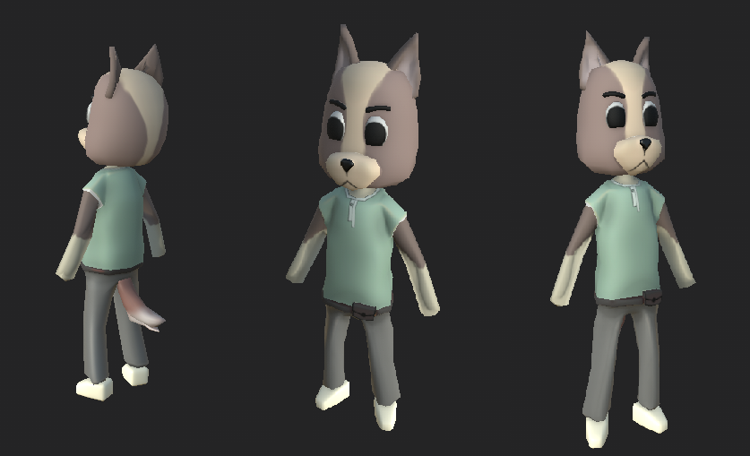
At the beginning there were no rules on creating these characters, some of them had outlines, others didn't. Each character had such a different style that it wouldn’t fit, as we can see from examples above.
After all those mistakes were done, we decided to redesign our art in order to uniform and harmonize it. That was another challenge, but we had strong help from our 2D concept artist Catarina. Mixing all together, it ended up way better looking than it was before.
The 3D in its Current State
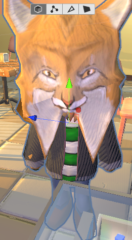
After the concepts passed on it was time for modeling and texturing them. With that done, we immediately felt more motivated and happy to continue working on our project!
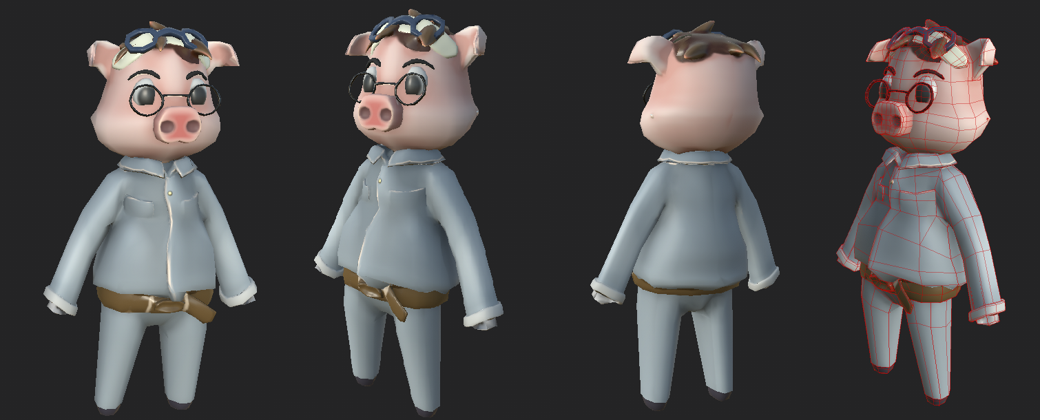
The only thing we had to do next was to add the shaders! We’ve always wanted to add those effects to our game, and the time has come!
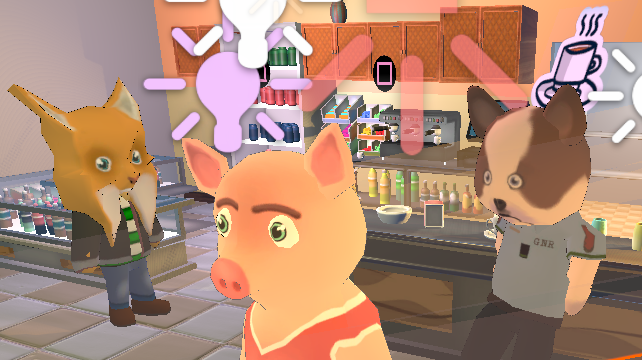
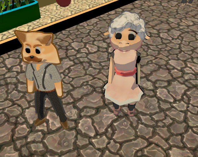
In Game
Finally! These are some of the shots from our last version. You can see that our characters fit in and have some kind of connection with each other. That also makes an impact with their surroundings and it all comes together nicely. Now they look like the residents from that village!
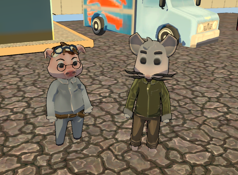
Here we can show something more heavier, but also keep the contrast of the cutest characters and environments that we are creating and developing.
In the future we would like players to come experience our game. Understand the character’s personalities and characteristics just by seeing them. Looking at their design as a whole and identifying with them. As well as the possibility to inspire people with the vibrant and warming art surrounding Chama.
Conclusion
That is all for now! We hope you liked reading our article!
For the next week we’ll try to go for another specific area. You will be reading from our Game Designer as he goes through the ideas of the game’s past, current and future!
Until then you can follow us on our social media below!
Twitter: Twitter.com
Instagram: Instagram.com
IndieDB: Indiedb.com
Youtube: Youtube.com
We hope to see you next week! Goodbye for now!

Character rendering looks awful and doesn't match the nice scenery but judging by the progress you've made so far I'm sure you'll fix it eventually. Please upload some videos too, and good luck with your project!
Yes!! We are working on it! Thank you for the support and your constructive critique! We appreciated!
Well, I'm going to be nicer and say that, yes, the scenery and the models clash. Something about the aesthetic just doesn't look right. Maybe it has to do with the texture used, or that black outline, or maybe the background has to be much more simple.
I'm sorry I can't provide any good feedback but I do like the actual designs. I really think that a more simple and flat style would suit this game. Instead of adding textures, maybe you can try just leaving them flat single colors?
EDIT:
I took a look at your screenshots and saw this one:
Indiedb.com
That one is actually not bad. It looks really nice. Maybe you can learn from this screenshot. From my perspective, I see the characters being more or less aligned with the aesthetic of the background. Nothing stands out and they seem to fit really well from this angle and distance. If the game can look like this, I think it will look really good. Hope that helps.
Thank you Toolkitz!!
We are already aware of these clashing elements, this is not done yet.
We started to redesign the characters and soon all the scene elements too!
We really appreciated your feedback!
Thank you again!