"The Search For Time"
Hello, Geckos! And welcome to our 8th Devlog!
If you miss our last article on IndieDB you can check it here.
Be sure to follow our Instagram page for more content! OddGeckoStudios Instagram
LOGO STUDIES
Today we will show you a few studies for our game logo, and also a few updates of the UI.
Here is how we first started to think of how the logo would look on the main menu.
![]()
We thought it looked good on the main menu, we just needed to change the color palette in order to have it look better.
So we tried a few color palettes and this ended up being the one chosen. It has a lot of room to be improved, these are just tests.
![]()
After the sketch, we added some colors to the logo.
![]()
Then, after a few feedback we make the "TIME" more contrasted. And the end result was this.
![]()
What do you think of the logo? What would you change?
UI UPDATES
Here are a few updates since the last prototype.
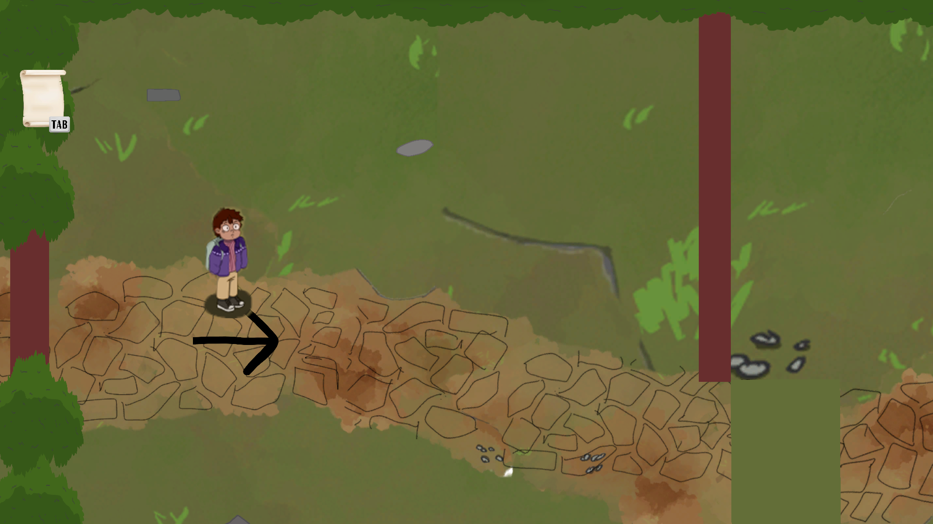
First, we changed the text " TAB to open letter" to a little letter on the left side of the screen.
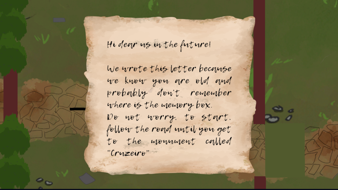
Then we wrote something on the letter to give a little context to the testers of the prototype. We wanted it to look like an actual person wrote it years ago.
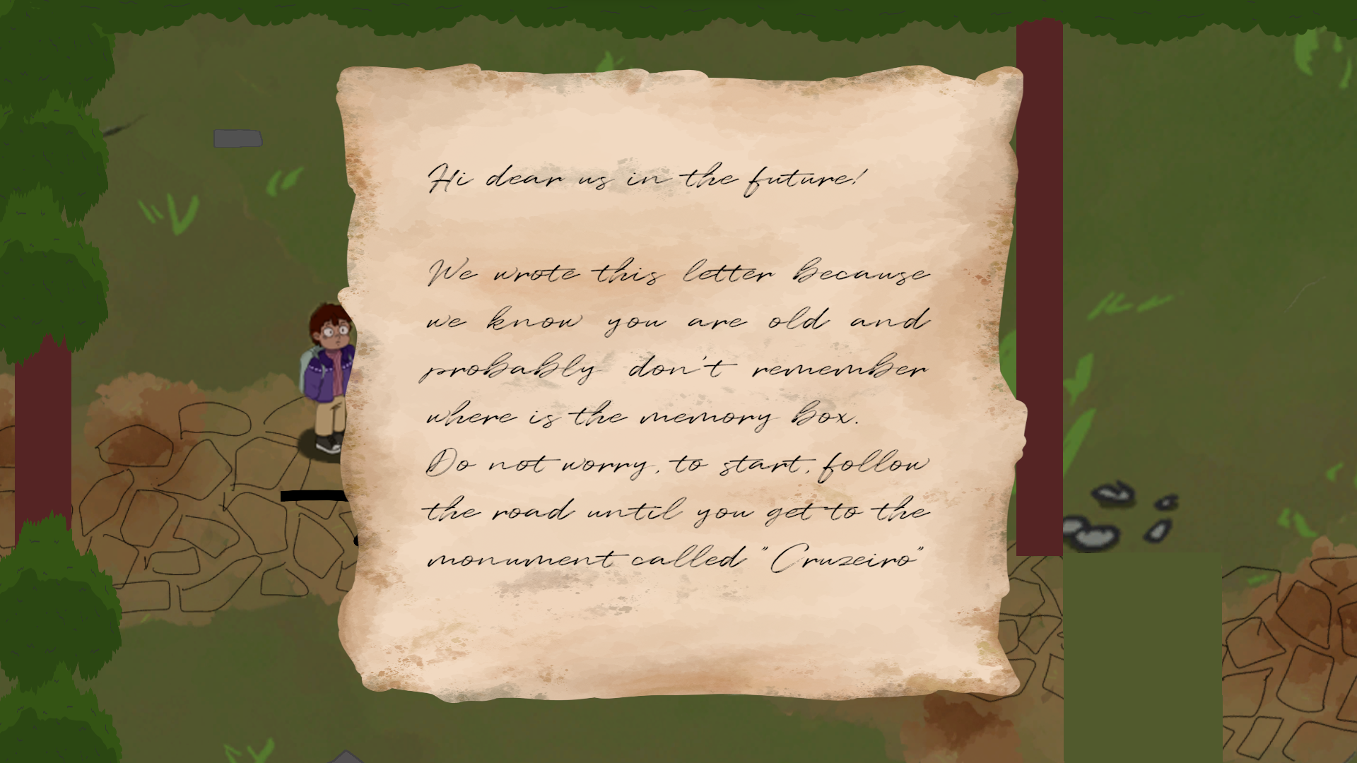
After some feedback, we changed the font because some people couldn't read it
Conclusion
We are working to make the most beautiful and appealing game for our target audience, what do you think of it? Give us your feedback!
Can´t wait to show you more.
That is all for this week, Thank you!
See you next time!
![]()
OddGeckoStudios