The main menu is something that had been bothering me for a very long time. I had little experience creating one prior to this project.
Many would prefer to quickly throw together a temporary menu and wait until late development before producing a quality one. I can see reasoning in that and generally it makes sense to wait with it to be honest. However, in my case it had always been bothering me when starting up the game and the first thing you see is a broken, lacking piece of mess which gives the impression of a imperfect hobby project in an early development stage, far from completion and the hands of actual gamers. That's a very unwelcoming message and for me it really set the mood for the session I was about to spend in the game. Realityis harsh.
It's something about having a steady and nice looking main menu that motivates you to actually start up the game and do what you're supposed to do, whether it be testing, balancing, bug-finding or map making.
Hey look, this is exactly what I expected to see when launching a game.
That must mean that this is an actual game!
Definitely not some obscure prototype tested only by a handful of people. Right.. right?
Obsession & overthinking
Overtime, I got a bit obsessed about the menu and struggled to come up with the perfect layout. It got to a point where I was making a new menu every other week(!).
Even though now and then finding what I believed to be the perfect layout, I'd eventually grow tired of looking at it and strive to come up with something even better. Over-thinking during development doesn't necessarily have to be bad though, in fact I'm sure that in the end it will bring greater results. This is however of course depending on how you decide to go through the development cycle and how much time you have available to reconsider decisions and design. That's one of the few great things about running a project on your own. In a perfect environment, you should always be able to reconsider!
Early ideas
Looking through the older versions of the game, I found a lot of varying versions of the menu. Below I'll show you the very first implementation of the main menu.
Obviously this was still far from complete, but I'm willing to admit that at the time I absolutely adored the menu background that I had managed to create with my then meager photoshop skills. Cringe.
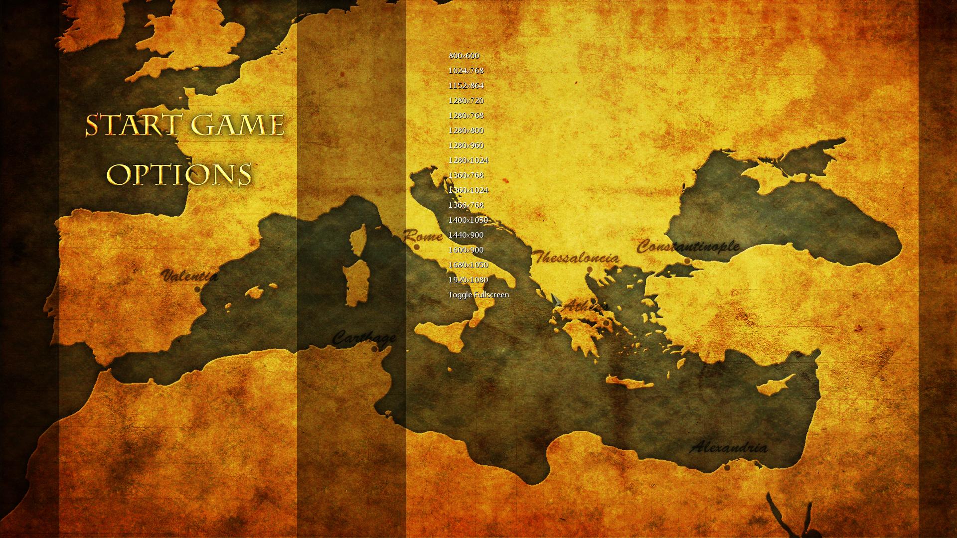
Here's the final implementation of that same menu, before scratching it. I decided to scratch it because it felt way too plain and without identity. Following in the tracks of early RTS games I had tried too hard to craft a classic theme, but ultimately failed.

Therefore I set out for a new style, simplistic and clean, or so I thought. Below I'm showing you the result of that new brilliant idea. More or less a re-skin of the previous one.

It looked better in my head... I realized how bad this one was quite quickly, and scrapped it within the same hour of implementing it.
In the next one, I thought that it'd be awesome with big buttons, you know because -... actually I can't even remember my reasoning for that. I imagined it to be glorious. It was my professional assumption that the previous menus were bad due to lack of context and art. In theory I thought that buttons covering about a sixth of the screen each was a very good idea, let me show you how it practically wasn't.

Sketch upon sketch
I've made another bunch of more sketches that were never implemented. Here is one of them, the one closest to resembling the final menu, it didn't get any better than this before again scrapping the entire idea and leaving the main menu for quite some time. As you might of noticed, I had became obsessed with icons.

But then this was the start of something good. From the ashes of the previous and failed menu and the lessons I had learned from them, the current main menu was born.
The final result
It feels terrible thinking about how much time I spent making all those previous menus and the time that went into programming tailor-made systems for many of them before scrapping them. Nonetheless, that's typical to happen when trying to master something you previously had no experience with. Now I know that I won't make those mistakes again. Common for most of the previous menu was the high contrast, something that I didn't seem to think about then but honestly was one of the biggest problems with them.
Two things that I learned in the process, not only considering menus are:
Always make a sketch first.
Don't implement it right off the bat when you're happy with it.
Below is an attached screenshot of the current menu for the game. I finally decided to have the game run in the background and make quite a minimal menu. I did this for several reasons.
1. I'm terrible at art.
2. It would let people see the results of changing options in real-time (here with always-show-healthbars turned on as example).
3. It was easy to implement, simplistic and clean.
4. People see what they get.
This is what it looks like within the options sub-menu.
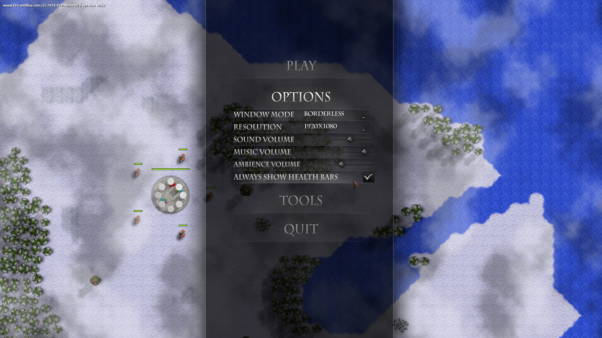
A screenshot doesn't do it full justice though, as it's heavily based on motion, such as when opening and closing the various categories to bring up their options. The game running in the background with its clouds floating across the screen and water flowing in the ocean is also part of this motion. All combined with the ambient sounds really help to set up a welcoming menu scene.
I should probably post a short video with the menu later. If god forbid I haven't come up with another brilliant idea for a menu before that...


yeah menu designs is hard, but you went for the simple sleek design which is always good :D
Agreed. Always sketch your GUI up first, it does not need to be perfect, just try the style out. on paper, in photoshop, whatever you feel like. Like you I learned this the hard way.
It is a lot easier to draw an example of the GUI then it is to program it. Using layers in photoshop can also make it much easier to try diffrent layouts without redoing everything.