The user interface in "Somber Home" serves as the gateway for players to interact with the game world, providing essential information and navigation tools. Through intuitive design and visual elements, the UI enhances immersion while facilitating gameplay mechanics such as inventory management, puzzle-solving, and narrative progression.
UI Flowchart
The UI flowchart for "Somber Home" outlines the navigational pathways and interactions within the game's user interface. It delineates how players navigate menus, access in-game options, and interact with HUD elements during gameplay.
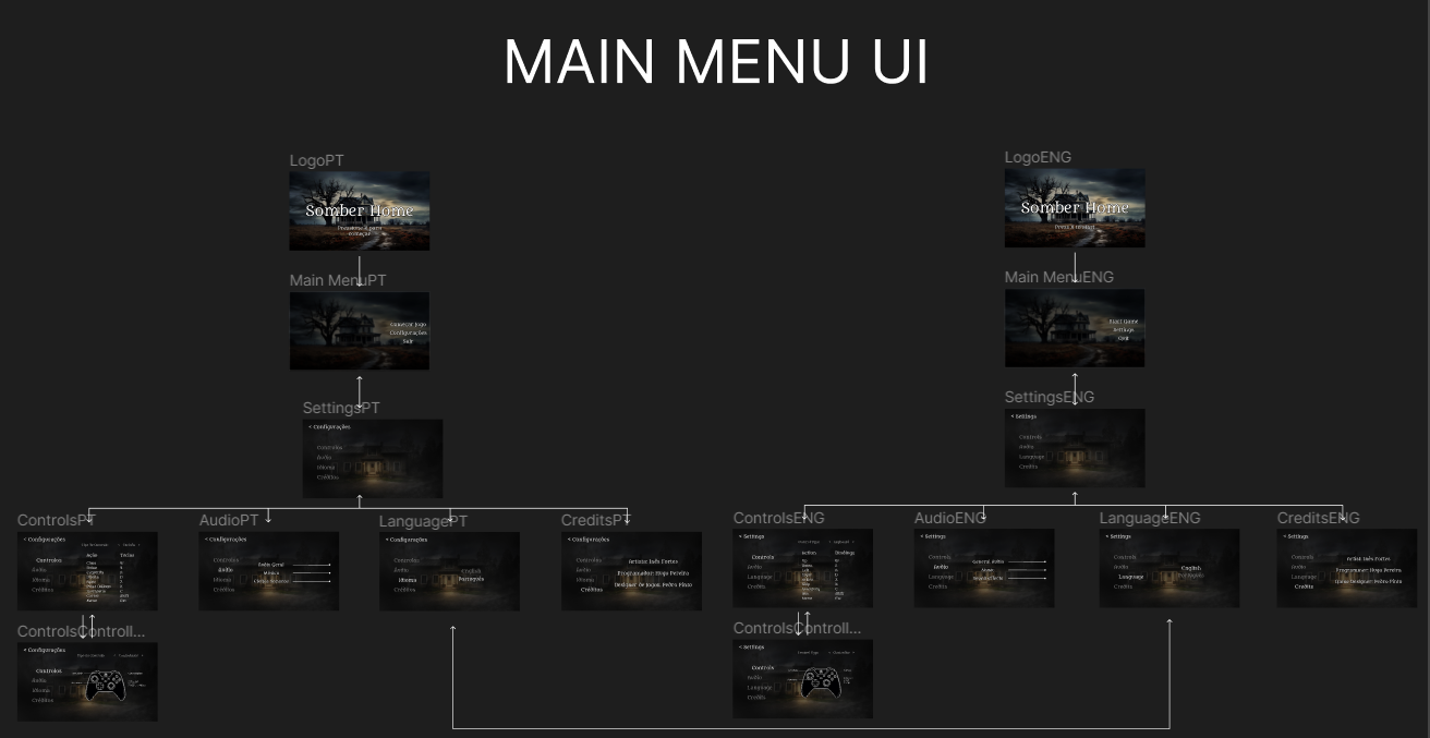
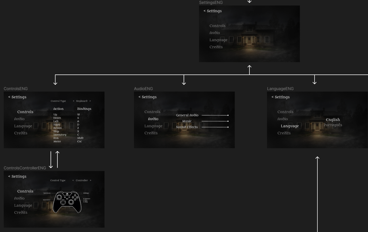
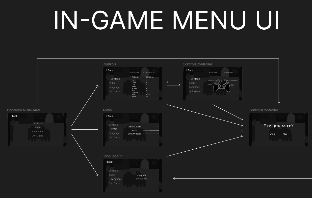
This visual representation ensures intuitive and seamless user interaction, enhancing the overall gaming experience and facilitating players' engagement with the somber world of the game.
Visual Design
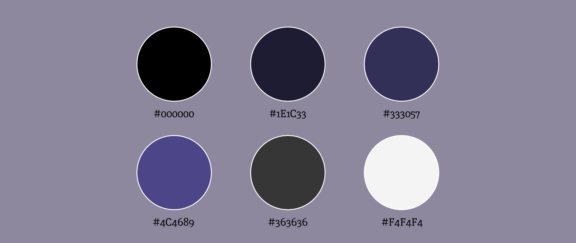
For the UI of this game, we opted for a darker color palette, with some purples. As it is a horror game, we think the darker colors will fit it better, as the main part of the gameplay will happen in the darkness.
![]()
Typography
For the main typography of this game, we researched the most used fonts in horror games. These are usually formal, gothic serif fonts as present in, for example, “Until Dawn”(2015).
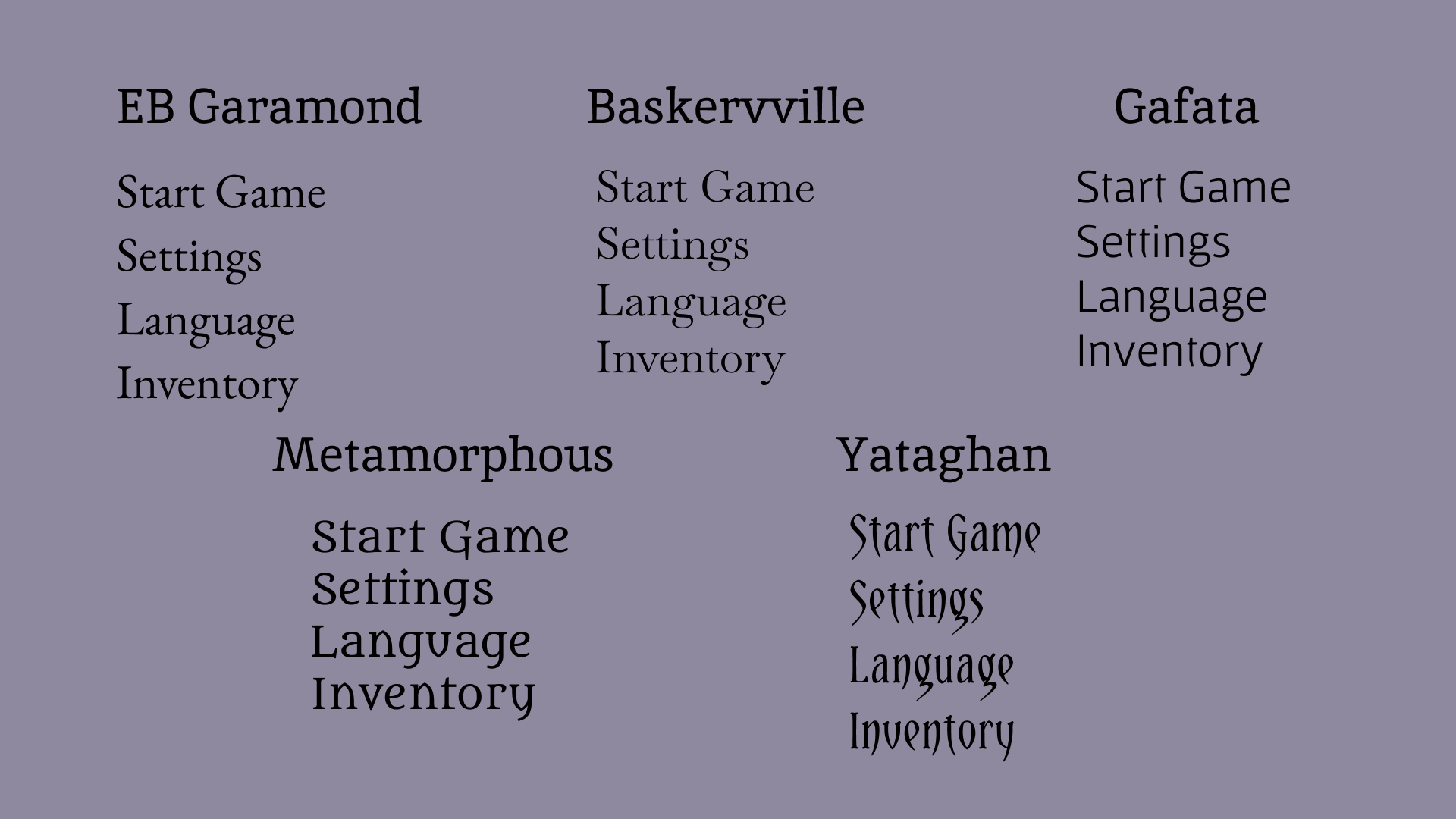
Between all 5 fonts we found to be good for our game, we ended up choosing “Metamorphous”, as it seemed to have a bit of a “personality” to it, but still not being too much like “Yataghan” would be. Apart from that, after testing all these fonts in the screens themselves, we really came to the conclusion that “Metamorphous” was the most fitting font in this case.
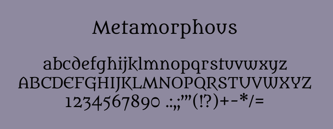
“Metamorphous” is a font in the serif category, made by James Grieshaber, and it was created as part of the digital type foundry for the designs of its author, putting a modern spin on a familiar concept to create a bold and versatile font family. This font is licensed under the SIL Open Font License (OFL).
At the end of this article, I would like to remind you that all the artwork used on this page may change.
Ending this subject, I'll close here saying goodbye to you guys.
See you next Week!