Devlog #5 | Game Logo
Good to be here again Indie DB community!
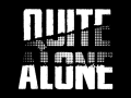
On this fifth Devlog we are here to share our final Quite Alone logo and the changes it suffered in its development!
Quite Alone Logo
We wanted a dark logo, that's our theme. So these are the first approaches we made for it.
Logo Studies

We tried both options, very hard logos with capital letters and small ones with a more handwriting style. We even mixed some of them in search of a good balance.
A very important piece in most of them is the lines slashing through the letters, symbolizing the destruction in our abandoned hotel.
Final Logo

In the end, our final choice was the hard capital letters style. But we went a bit further and added a different texture to the zone that was torn apart, representing that something different is hidden behind the first layer.
Conclusion
On this fifth Devlog we shared our final logo for our game, Quite Alone.
It's not very important for the game itself but it sure is one of the most important things that brings identity to our game!
Next week we will share more information, stay tuned!

With Love (and Fear), Nailing It Studio®