Hi everyone!
For today's post we want to showcase you the user interface that designed for our game. We have chosen a more minimalist approach with the UI to better immerse the player, with the use of simple icons and a thin, more delicate font.
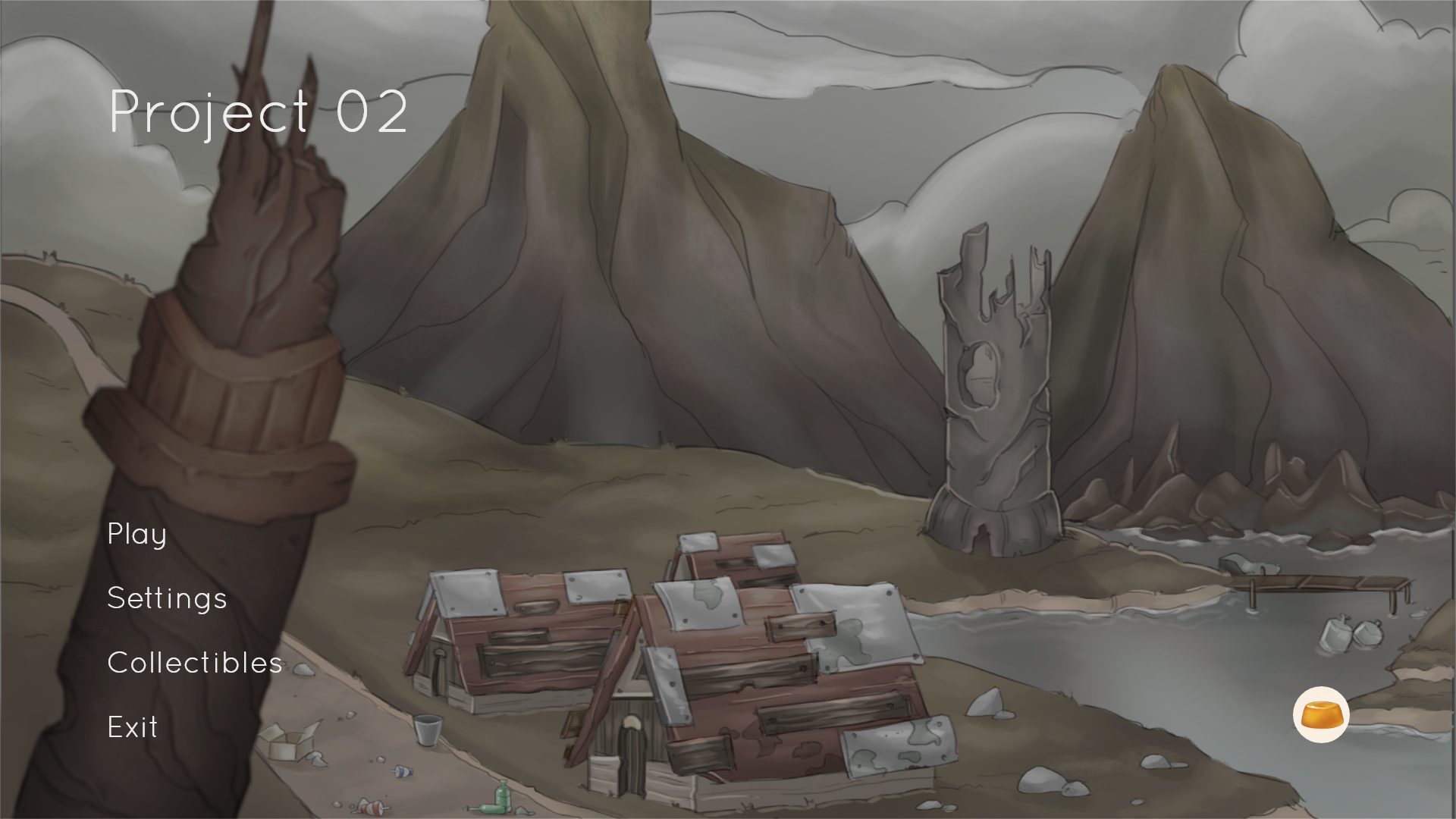
First we want to show the main menu that shows the philosophy of the UI - to have the elements aligned to the left side and close to the bottom of the screen. In this screen the player has the options to play the game, check the settings, the collectibles, exit the game, and in the bottom right corner the logo of our studio that shows the credits.
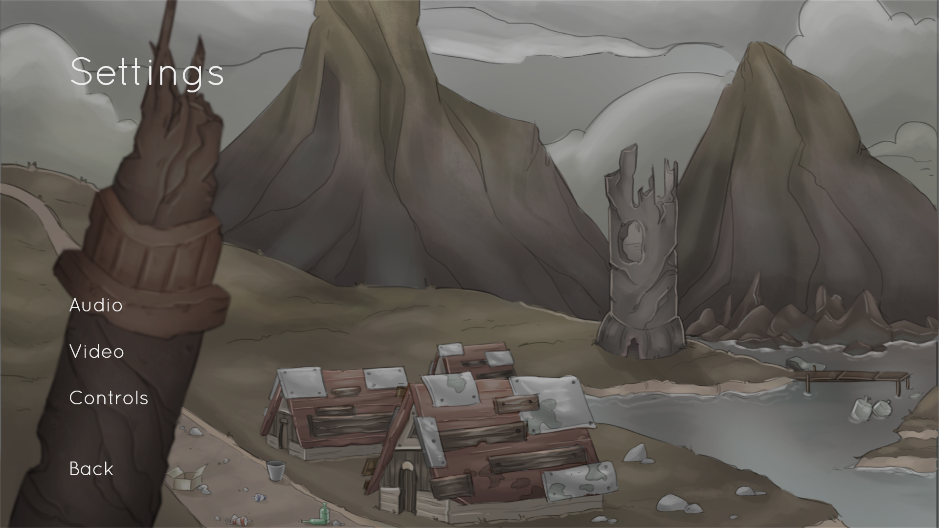
In the settings menu the player will be able to change audio, video settings, and check the controls.
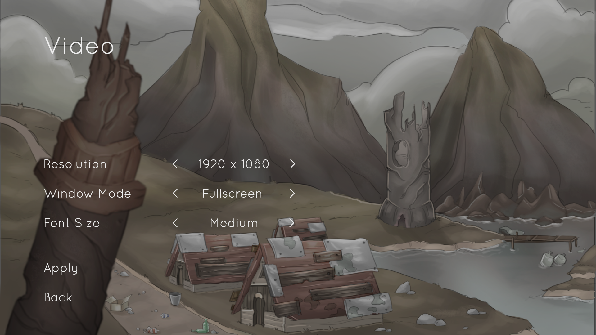
In the video segment, the player can change the resolution, window mode, and font size for more accessibility.
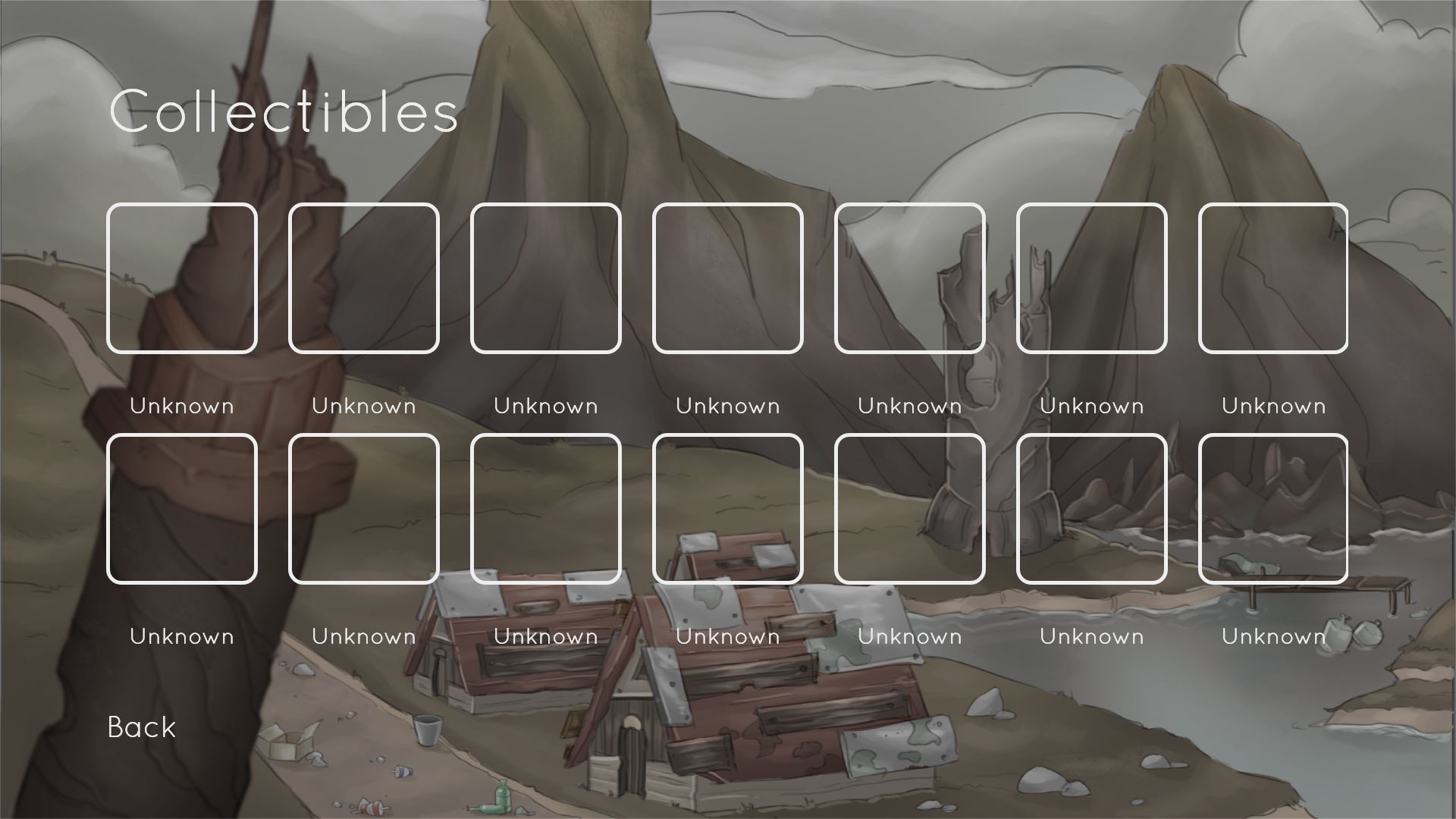
The game will also have collectibles that can be checked in the collectibles screen. It shows the icon of the collectible and its name.
In game the UI is very simple and minimalist. The dialogues are shown centered on the bottom of the screen. Whenever the player reaches an interactable object, a prompt appears next to it with the keyboard key (in this case the letter E).
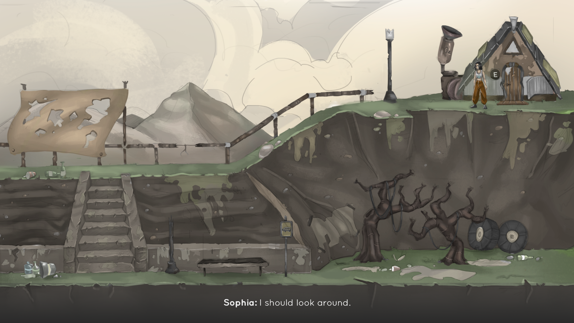
The toxic air areas are represented by green, yellow or orange clouds, depending if it is a cloud where the player can stay more or less time. When inside any toxic air area a circular oxygen meter appears above the character that decays over time.
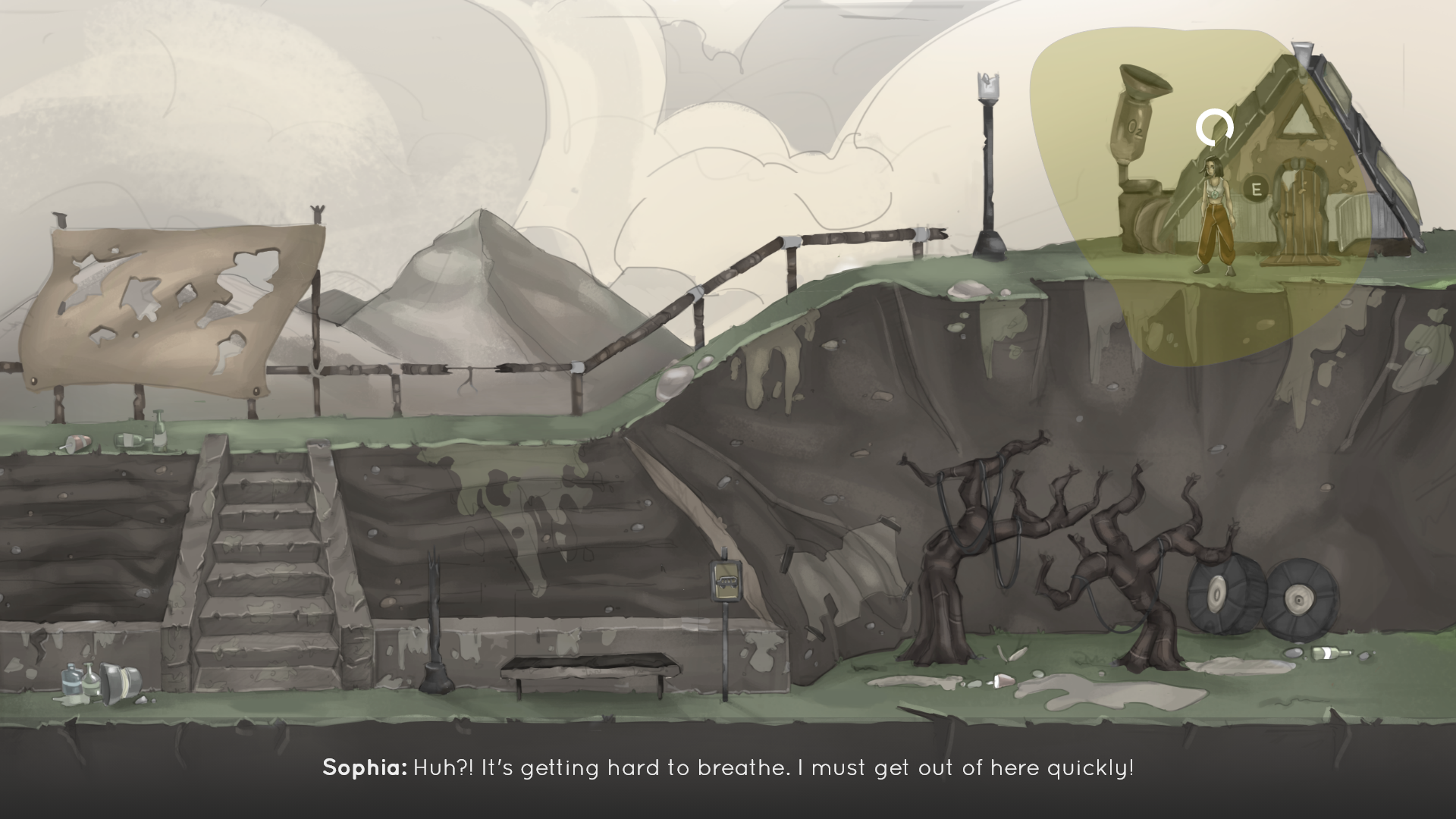
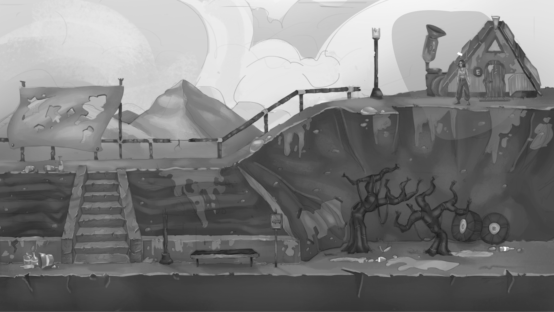
While the oxygen meter depletes the screen begins to lose color until it becomes black and white when the character has no more oxygen.
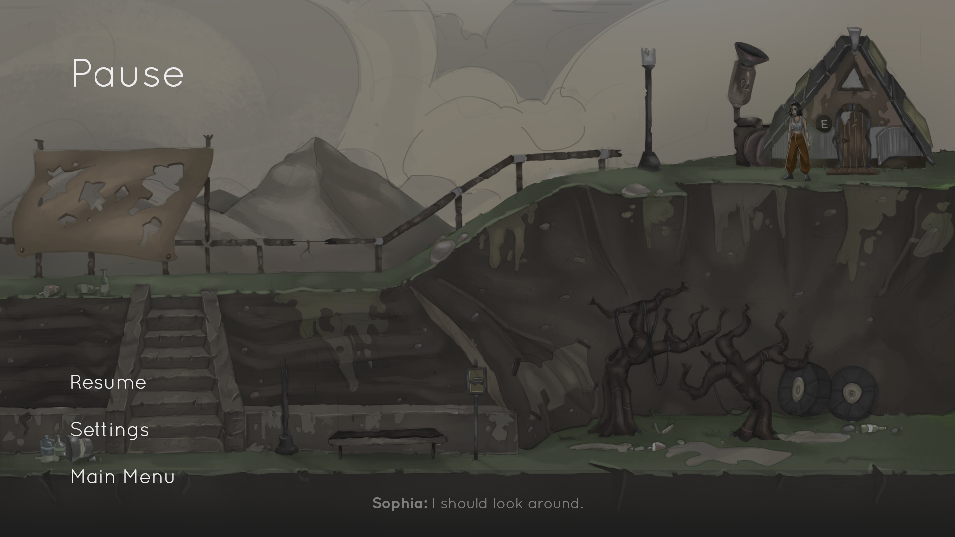
When the game is paused, the UI is very similar to the one shown in the main menu, with the options to the bottom left side of the screen.
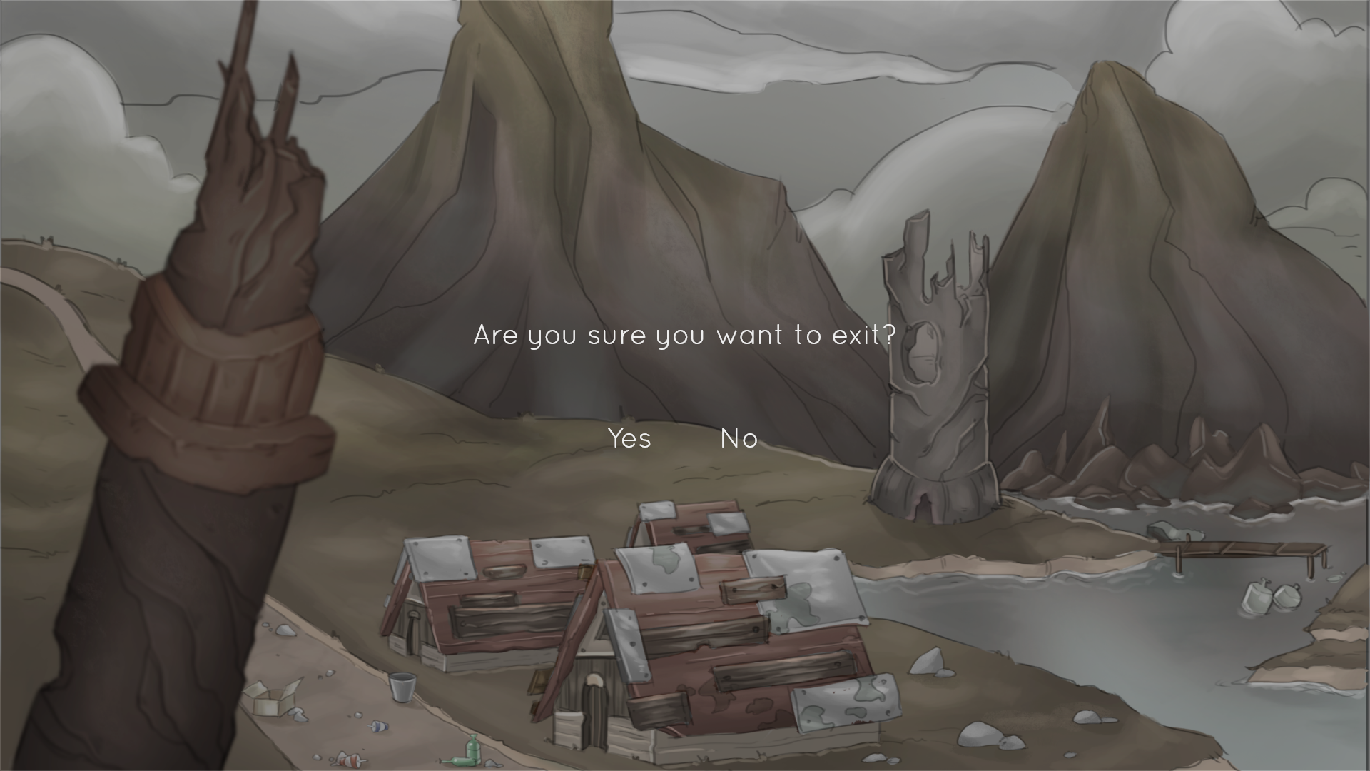
Finally, when the player wants to exit the game a confirmation message appears to avoid miss clicking and losing the progress.
As our game is a vertical slice, we are currently not considering implementing a save and load game option.
We believe that our choice UI belongs to and complements the game style and helps with the immersion of the player.
And that is all we have to show you for this post. Stay tuned for more updates!
The team,
Lis Breeze Games

UI looks intuitive enough and the minimalistic design does not distract from what is important. I always prefer the minimalistic approach.
Game looks great so far. Keep it up!
I don't want to lie to you but something is missing here. To many gray colors is only accessible for space type games, not for games of nature type. But if this is an Main idea, then that`s it. Also menu of game is very poor, kind for mental users. You can at least use of transparent rectangle beneath them. In long term run you will make very good game from this material, but only if you have heart to withstand heavy criticizing and more.