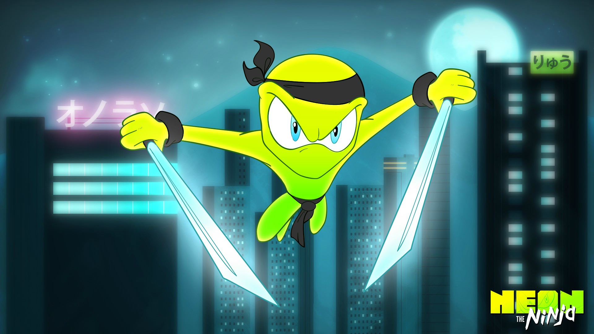
Recently, I was motivated to create a brand new promo image for the game. Something dynamic and iconic. Something that pushed the art style with lush colors, shiny glares, glows and blurs.I love how the image turned out but when I compared this Neon with the one that is in-game it was a bit of a let down.
"We can rebuild him."

So I tried to bring in the elements that I really loved in that promo image in-game.
- I added a glow to his swords but tried to keep it looking like a glare off of the camera more then a light source emanating from the swords I'm going to try and fluctuate the glare depending on the animation to enhance the effect.
- His brow is much thicker making his head shape more iconic from a distance. When you combine the more exaggerated brow with the blue eyes there's an insanity to his stare that's a lot more interesting.
- His suit has a lot more variation in color. In previous versions the simple gradient insinuated just the one light source. Now his suit will look more reflective and should really liven up his animations as he twists and turns.
You might notice that the majority of Neon's look hasn't changed. The hardest part is sorting out what is working from what isn't but I think the more time you spend with a character or art style the more obvious the little things become.
This is the perfect example of the kind of polish that while a bit time-consuming can really enhance the production quality of a game.

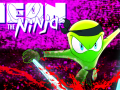

Great job, the new version does look a lot better. The glow is a nice touch, and the brows poking up over the bandana looks great. His color is much more eye catching as well. Though I think his original pose might've looked better. He looks more ready for action in v.1.
I agree I like the idea of the original pose but since he's holding the swords "backwards" it was really weird animating them.
One thought could be having two phases/animations to the idle stance. Where he's more ready and has a more open aggressive pose like the first one until enough time has passed that he goes more relaxed.
Actually yeah I really like that idea because it's very sonic the hedgehog were his last phase would be that he's bored.