Hi. My name is Nathan Hawthorne, and I’m one of the 2D artists working on INT. You may have noticed that in the last few weeks that on our website and all our social media outlets, the INT logo has changed. In this blog I’m going to talk about the journey the INT logo has had from the start of the project to now, and why and how we ended up with a new one.When INT started, the temporary logo we used was simplistic capital letters, colored white on black – INT.
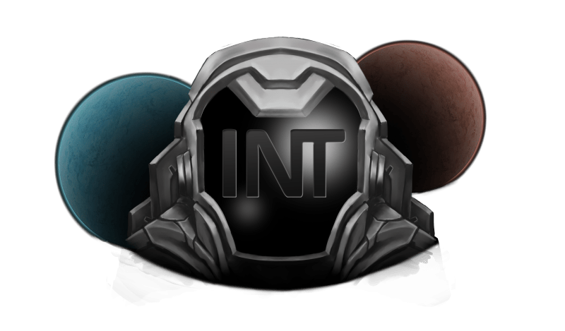
But the entire team agreed that we needed more than this. So we had a meeting where we sat down and discussed at length what we thought the logo should look like. We needed something that shouted three things core to the game: that it is set in space, that you’ll explore space throughout the story, and that there are two interstellar factions in conflict. We decided to go with a future space explorer’s helmet with the letters INT embedded in the visor. Behind this space explorer are two planets, each the colour of a faction (red and blue), on opposing sides of the explorer. This painterly logo lasted around half a year and became familiar to many of the early supporters of INT.
We soon decided that this logo was not fully representative of what the game entails – although it involves exploration, the game does not center on individual outer space travel or spacewalking, as could be inferred by the logo. So we set about redesigning it. The new logo design was once again a team effort, with many of the 2D artists on the team contributing designs. One of our main aims for this logo was to keep it much simpler than the last and to lose the painterly feel in favour of something more graphical.
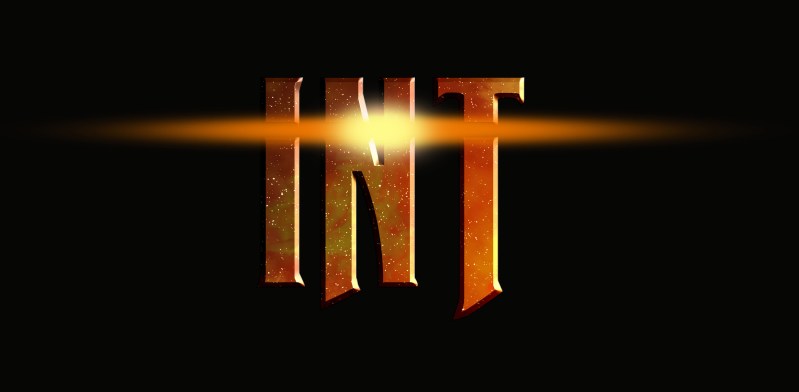
We ended up creating over a hundred proposed logos, but with each set we narrowed down the design more and more. When I created the final set, I was aiming for something that shouted that this game was about space, and thus included a star-filled image of space. I also wanted the letters to be shaped in a way that reflects danger and adventure, so I chose Calibri for its sharp, knife- like appearance. The light that stretches across the gap near the top of the letters represents the excitement ahead – an adventure spans across galaxies, which you can join.
From the mind of Nathan Hawthorne
A Concept Artist working on INT


