Hello IndieDB comunity!
We spend a little bit of time creating the design for the Icon tha represents "Caracazo" and we want to share our progress.
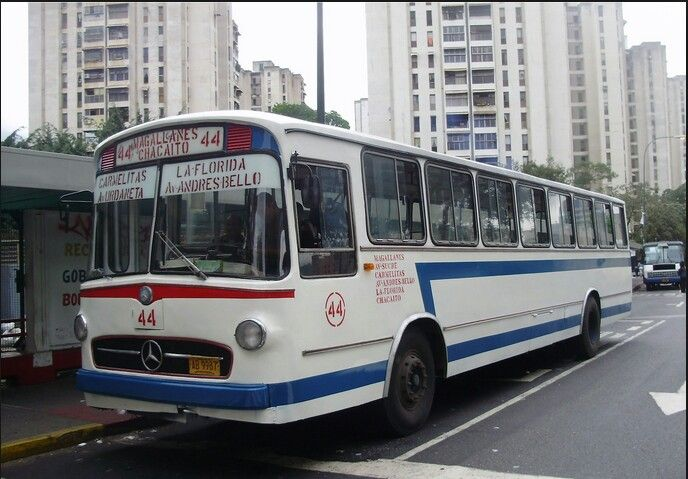
Image 1: Iconic 1980's Caracas Bus.
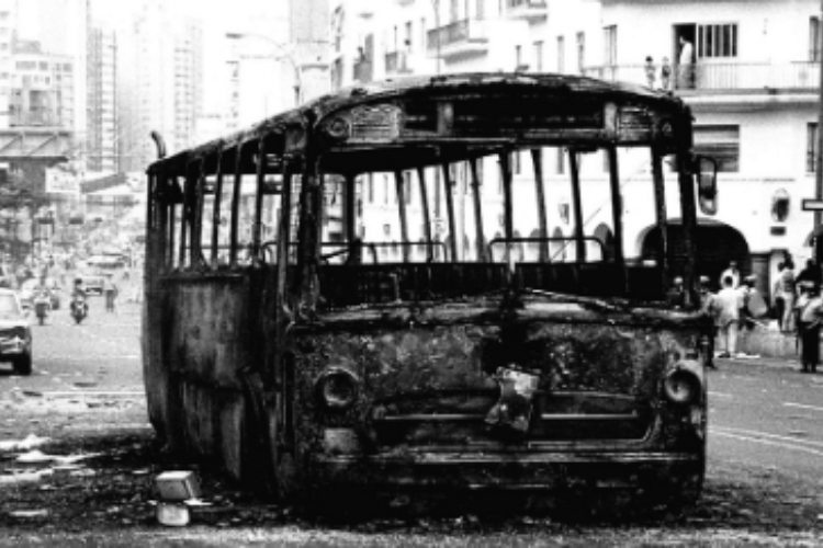
Image 2: Burned bus during riots.
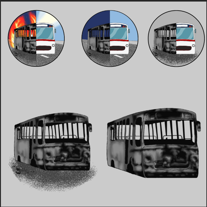
Image 3: The progression of the Icon Design.
As you can see we had a clear idea from the beginning, the buses that toured the city of Caracas during 1989 had a very characteristic and representative design and colors of the city at that time, but in addition to that the buses also became a symbol of the Caracazo , since during said event there was a massive burning of buses by rioters.
So we started playing with the idea of a bus along with the background divided between day and night, to also represent the two phases of the game. However, that was a very overloaded design, so we started working only on the silhouette of the bus.
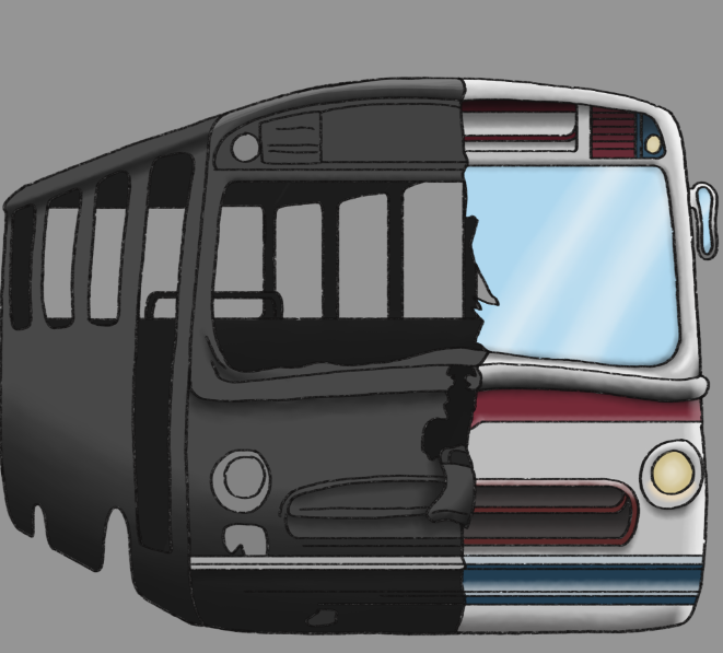
Image 4: Bus silhouette.
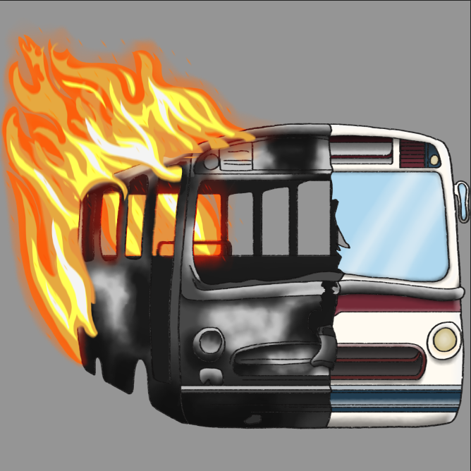
Image 5: Icon color studies and adition of details.
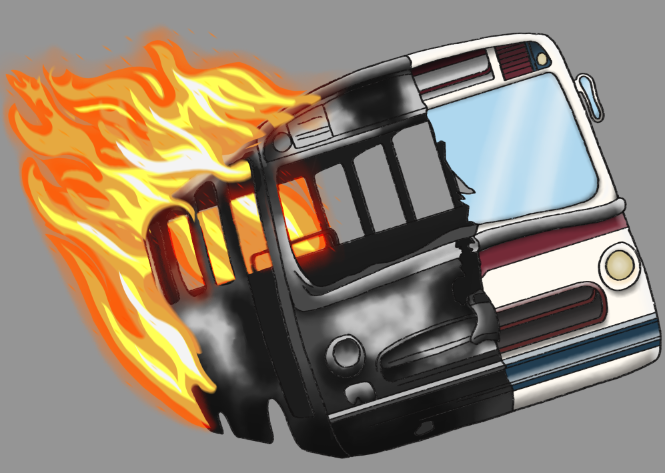
Image 6: Current Icon design.
After working on the silhouette, we worked on dividing the bus into a burned part and a colored part, in order to make said division between day and night while making the shape of the bus more recognizable.
The last thing was to work on the color studies, the details and the position of the icon to make it symmetrical.
We will probably still touch up details in the design of the icon to perfect it, but this is the idea that we liked the most and that we have worked on and are proud of.
We hope u enjoy our today's article, see you soon!
Have a nice week and stay safe!