Our biggest challenge behind the scenes is our HTML/CSS framework. The main issue we had was that, as we implemented elements into a fully working interface, it was not dynamic enough, nor was not easy to mod; so back to the drawing board we went.
One of the aspects we had to review was our element shape framework. Previously each element type had its own class variant for each shape type (vertical_Pill, horizontal_Pill). Now, however, the same theme class names are used no matter the element (tm_Pill). Another aspect we reviewed was the separation of the element styling from the layout. Before our button stacks were an element in themselves; now the button stacks are just a layout wrapper containing buttons we can choose within.
A few months ago we showed a video illustrating the visual, and some code, aspects of our UI (check it out here). Since then we have expanded our theme-sets to include two more common shape types, along with newly designed and re-designed base elements, as needed. Our themes also include a reverse layout for LCARS, elbows do not always point in one direction! All of this change have been due to the reshaping of our backend framework.
The team has been working on creating full interfaces with this new framework as the game progresses. With our visual styles and elements now set, we can now, mock up how we want an interface to look, function, and feel; which has been a very rewarding part of the process. It is a great collaborative experience; team members freely create demo samples and we then pull the best ideas together.
One of the advantages in our UI layout mock-ups is that our interface is practically one hundred percent vector. This allows us to store elements and layout segments in Illustrator. Any member can put together a mock-up in a fraction of the time it would with bitmaps. My personal goal is to have the entire framework rendered in the vector format. There would be no bitmap images to stretch, distort ,or pixelate; simply crisp smooth images, even at our lowest supported screensize.
So, with this in mind, I take our first “what we want” elements and slim them down, tweaking the interface to remove the limitations of web technologies and LCARS. Two of the core objectives within the team is that the UI has the feel of what is seen on the show and that is it still usable, as the user is the priority.
We informally categorize different aspects of each interface into a few categories such as aesthetics, framing type, essentials and appropriate HCI layout. Building from this point, decisions are made about what types of LCARS framing and look can be maintained without distracting the user from the game itself. Next we approach things, such as aesthetics, and add the details users would expect to see in a LCARS environment.
This is not an overnight process but it does allow us to perfect the interface for the user by utilizing the many diverse talents on the team. One of our newer base elements came from the need to be able to easily create and update certain elements of the aesthetics. Who knows? Maybe those random numbers seen in the movies/TV shows might actually mean something! Of course, this information would be presented properly within the UI - it wouldn't be very nice of us if we hid information from the user.
Two of the biggest decisions taken by the team, which has been debated back and forth, is that the scroll bars do not need arrow buttons and that we had to adapt the right aligned scrollbars to our LCARS inspired format. As inspiration we took a leaf from third party scrolling plugins as well as from current mobile and desktop interfaces. We've been able to come up with an unobtrusive way to handle scrollbars that can not be integrated in the virtual design.
Lastly, I want to highlight the progression of the UI framework in the future. With STE using cutting edge technologies we are always on the lookout for new tricks tips and feature. One of the features I am really looking forward to is the CSS variables. This new CSS feature has the potential to reduce the CSS load even further and will allow for very easy species styling. You can download the Canary version of Chrome to test them out!
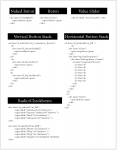
Examples of the HTML building blocks used to construct the UI for Excalibur
There are loads of exciting things happening with the Excalibur project UI and we can't wait to show them to you!
- Aricwithana.


I'm excited! :D
Same here, was pretty interesting to read I love these kinds of updates