Warbanners is a turn-based tactical strategy combat game mixed with RPG elements set in a brutal fantasy universe.
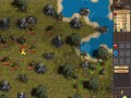
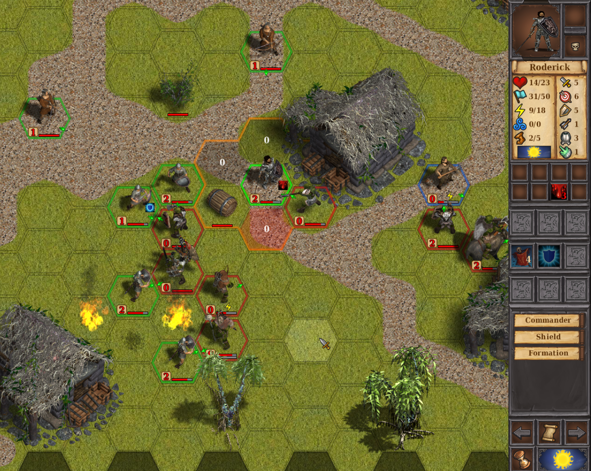
battle in village
(view original)

Post a comment
Warbanners is a turn-based tactical strategy combat game mixed with RPG elements set in a brutal fantasy universe.
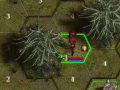
IMO there is too much visible interface markers around units. There take attention from unit itself. Making harder to recognize unit.
At first glance i see big 2, 0 ,1 that are AP (i presume). then red bars. then green and rex hex frames, then special icons (blue shield, blood drop), at the and i see shield guys.
can you post the same screen "naked"? only units without even hex grid - no interface at all. For comparison.
frame around the units I've made more transparent. The rest of the information needed - without it is unclear what is happening on the battlefield
Tank you for feedback!
could you try to put markers instead of 2,1,0 ?
I mean when unit has 2 action points, it show two markers f.ex. ᐁᐁ
when has 1 AP - it show ᐁ. If has 0 zero, then nothing is display.
instead of all this big 0 zeros on half of the unit would be nothing.
A propo, why do opposite site has visible number of AP anyway? its system "I go with all unit then you go with yout all" isn't it?
Also full health bar could not be display. this way player know;
no HP bar = unit in perfect condition, not damaged.
it "clean" the interface and is more informative.
Thank you!
"I mean when unit has 2 action points, it show two markers f.ex. ᐁᐁ
when has 1 AP - it show ᐁ. If has 0 zero, then nothing is display." - impossible. At the unit can be 7 AP!!!
"instead of all this big 0 zeros on half of the unit would be nothing.
Also full health bar could not be display. this way player know;
no HP bar = unit in perfect condition, not damaged.
it "clean" the interface and is more informative. " - Great ideas! I try.
"why do opposite site has visible number of AP anyway?" - IMHO, OD is the same information necessary for the player, as well as other characteristics of enemies. Or hide all information about the enemies, or all of the show.
you can use small and big marker = 3x small
1 AP = x
2 AP = xx
3 AP = X
4 AP = Xx
5 AP = Xxx
6 AP = XX
7 AP = XXx
at least you could hide all zeros AP. (same idea like with health bar).
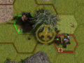
opposite team AP info, during your turn:
numeric AP, provide only one info for the player - if enemy has evasion +1 or not. But this information is useless, because player dont know the base value of enemy defense.
so if enemy has ?+1 evasion, player need to R-click (or hover mouse over) enemy to check the evasion value ANYWAY.
"at least you could hide all zeros AP. (same idea like with health bar)." - Yes, I try. I like this idea! I will soon lay out a screenshot.
"opposite team AP info, during your turn"
if the show AP, then all units. Otherwise there will be confusion.
Mediafire.com
Thank you. With all I agree, but the numbers display the AP clear