Over the last two weeks, we’ve been working hard to improve the visuals in the game. One reason is that I want to release a trailer to let people know about the game. It’s a lot easier to show the game off if the graphics look good.
I’m not done with making the graphics better – we’re maybe 50% of the way there. Still I thought that it’s interesting to show you where we’re at right now. First, I’d like to remind you of what the game looked like originally:

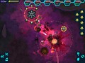
Yay for programmer art! I thought that I did ok with AotPZ, but it’s not nearly well enough. Let’s fast forward to today (keep in mind that a lot of the art is still unfinished, like the bottom bar):

Just yesterday, I put in a lot of the new sprites into the game. Carlos has been working hard on them for the past week. You can see the new hive and tower images on the above screenshot.

I’ve made so that you can have different types of walls. It really makes the game more lively.

If you look carefully, you’ll see that there are shadows under the buildings and units. This was something that I threw together in an hour yesterday, just to see how it looks. I like it quite a bit, actually; I might spend more time to make it look better.
Well, that’s what I’ve been up to for the past week. After I finish off the map graphics, I’ll move onto effects like explosions and animation.


Looking great! Looking forward to playing this.
Looks really good nice clean design :D.
I actually prefer the way it looked before, much more clean and not so much clutter.
The new graphics look great! Except the bars in the top right don't fit with the rest of the graphics. I would suggest changing those.
nice D;
Fib, the game interface is still in the middle of being changed. It's going to look completely different when I'm done.