Quick Mini Log!
Quick Mini Log!
Hey, WizardWizard 2.0 was has been released, and is more stable.
Little art bits have been added, and I'd love to hear some opinions! :D
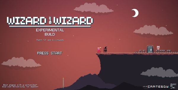
How does this title screen look? To cluttered?
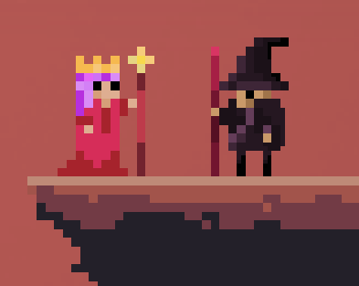
Thoughts on the yet to be named princess?
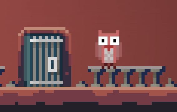
I thought these little guys might be an occasional pretty spice up, I might incorporate into the story. Thoughts?
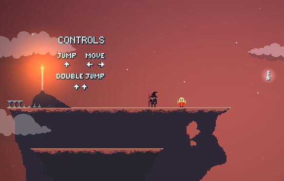
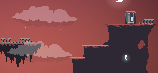
These are ruins scattered around the levels, my concern is they look to cluttered and out of place. Thoughts?


I think it looks fine. The owls are cute. I don't really think the menu is cluttered, but you'd get it even smaller if you dropped the line break in experimental build. Maybe the ruins look a bit off because they don't have any red tones even though all of the light is red? Aside from that I think they are nice, they should definitely stay!
It looks nice.
Especially the owls.