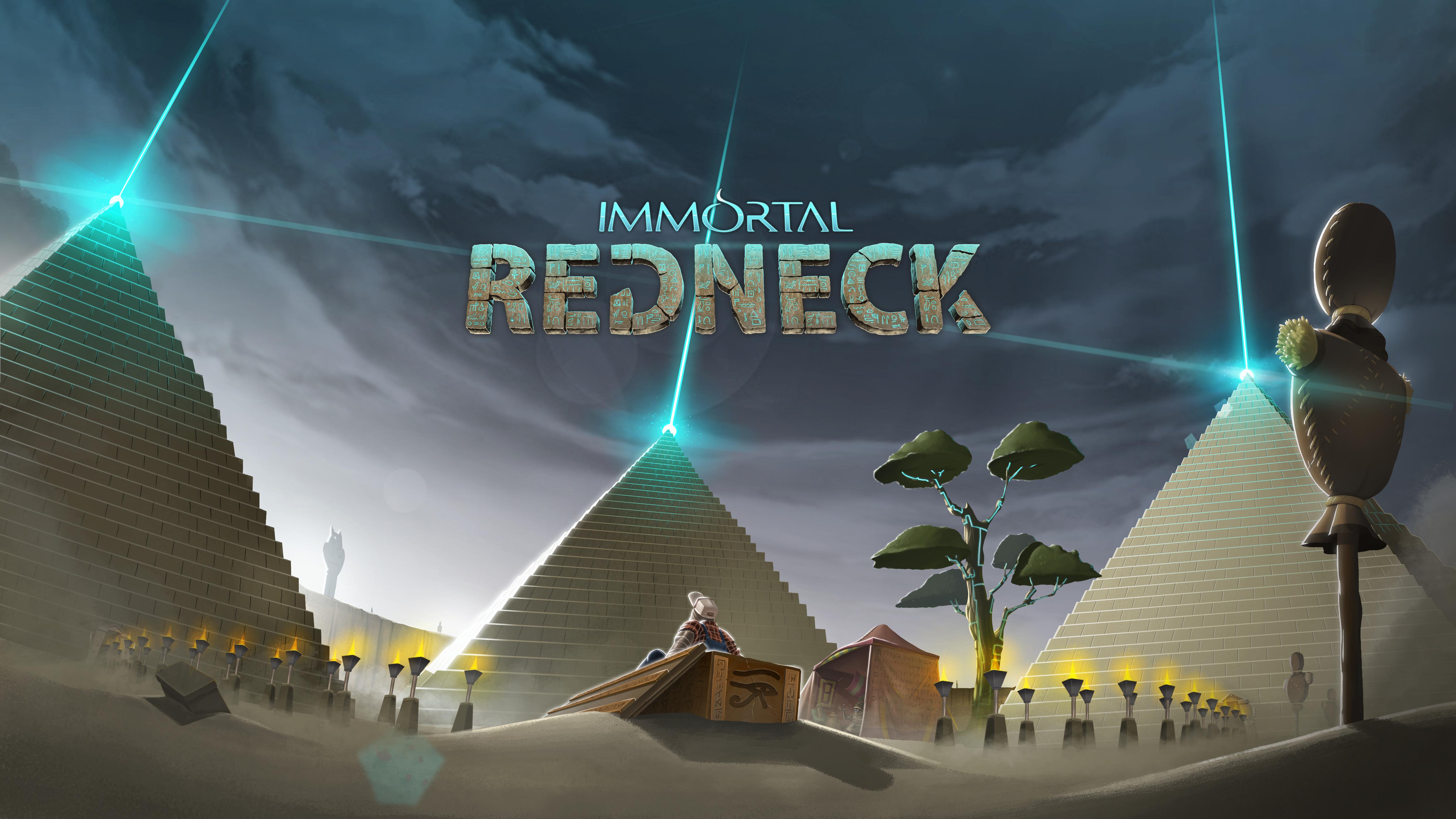
Hi there! Having a nice day? I'm Bruno, the Community Manager of CremaGames, and I'm here to show you the Immortal Redneck logo.
We’ve been having a hard time lately in CremaGames because we had a fight. Okay, not a literal fight, but we’ve spend a lot of time around one particular aspect of Immortal Redneck: the logo. Choosing a nice logo is damn hard!
Since the first we started developing Immortal Redneck, our 2D artists have been working on a logo, and after a lot of different versions and ideas, we have THE logo, the definitive one. Given it’s been such a hard process, we thought it would be a great idea to make a short devlog about why we chose this one and what other ideas we had.
Our first sketch were very different from the final logo, of course. They were fast drawings just for making up our minds about the name.
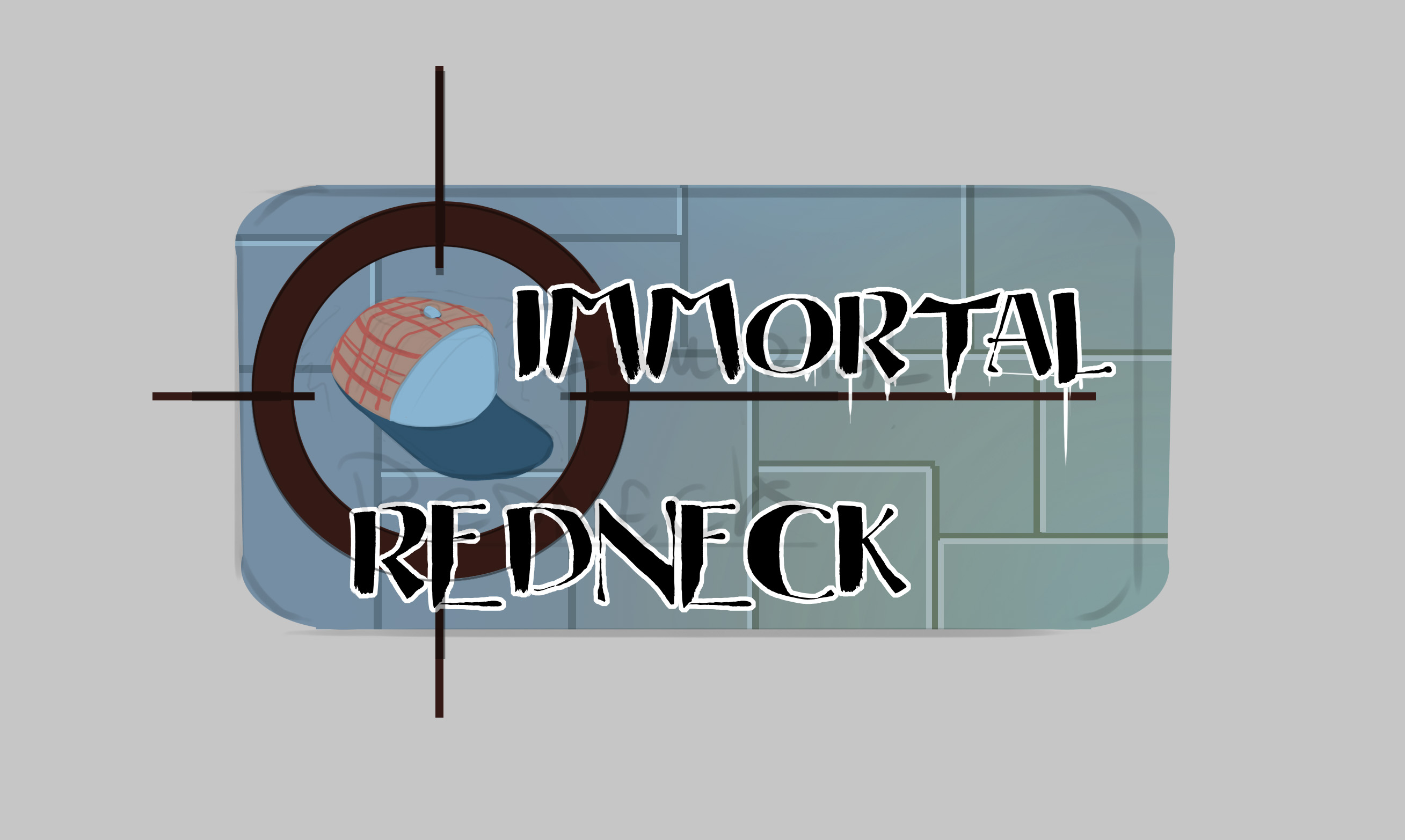
You can get mummified, but you can’t lose your dearest cap.
We thought it was better to emphasize the redneck over the immortality.
I don’t know what to say about this one.
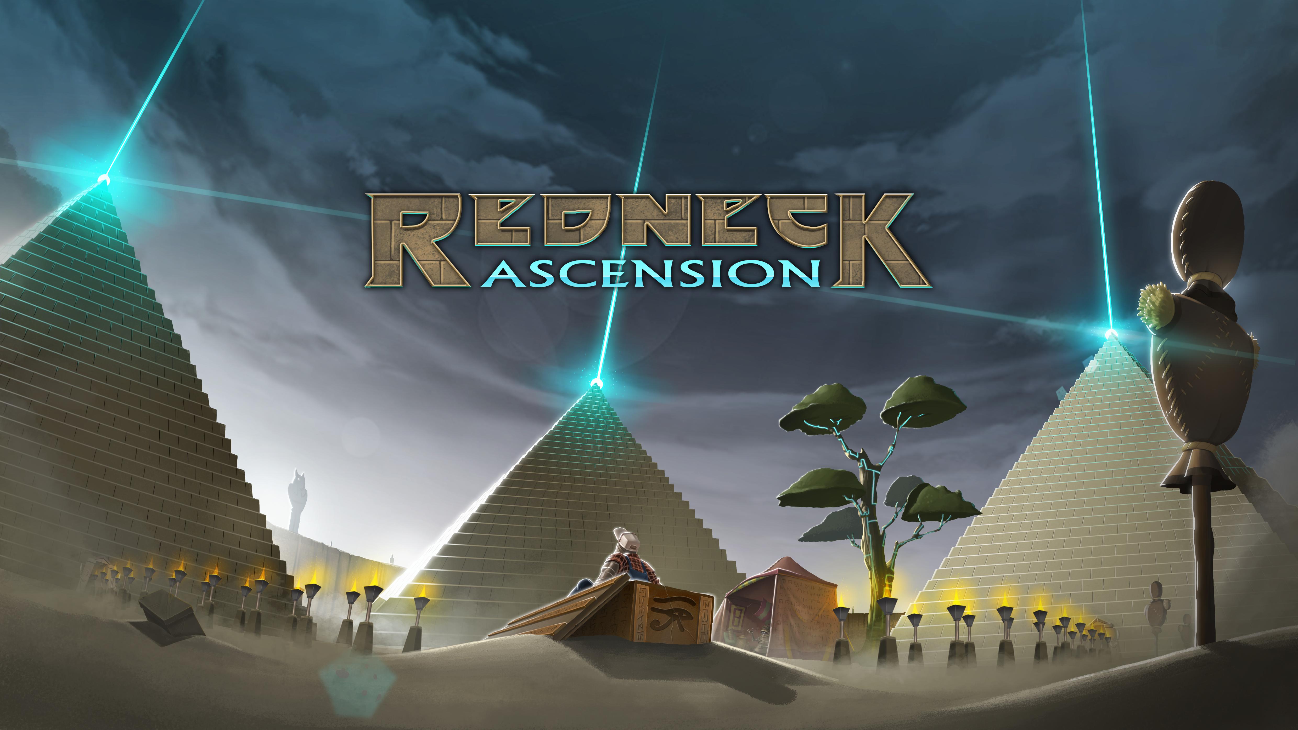
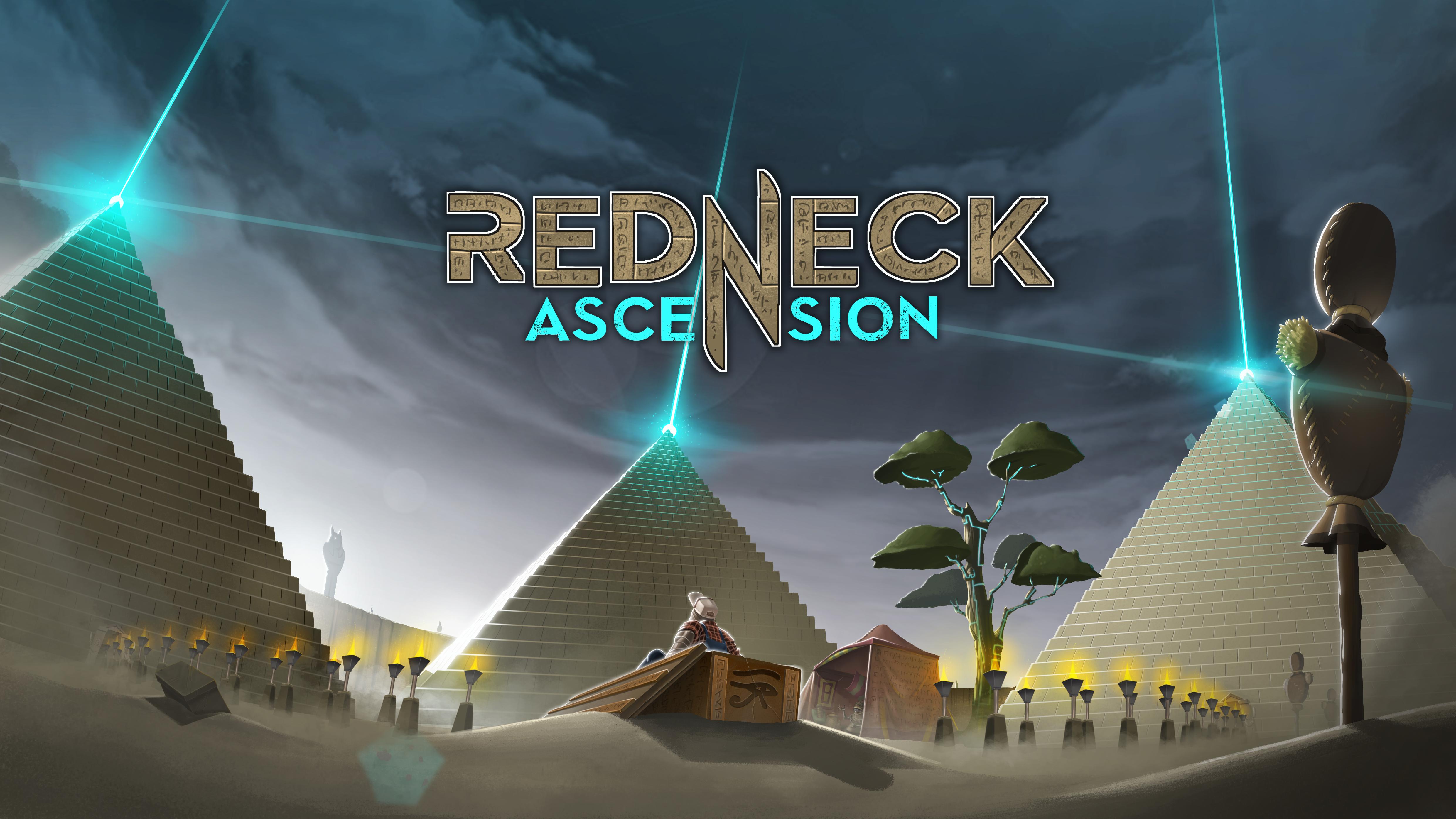
As you can see below, we didn’t. We tried another name for Immortal Redneck. The one that stayed the longest in our minds was Redneck Ascension. It’s a little to silly now that we look back and doesn’t depicts the game that well.
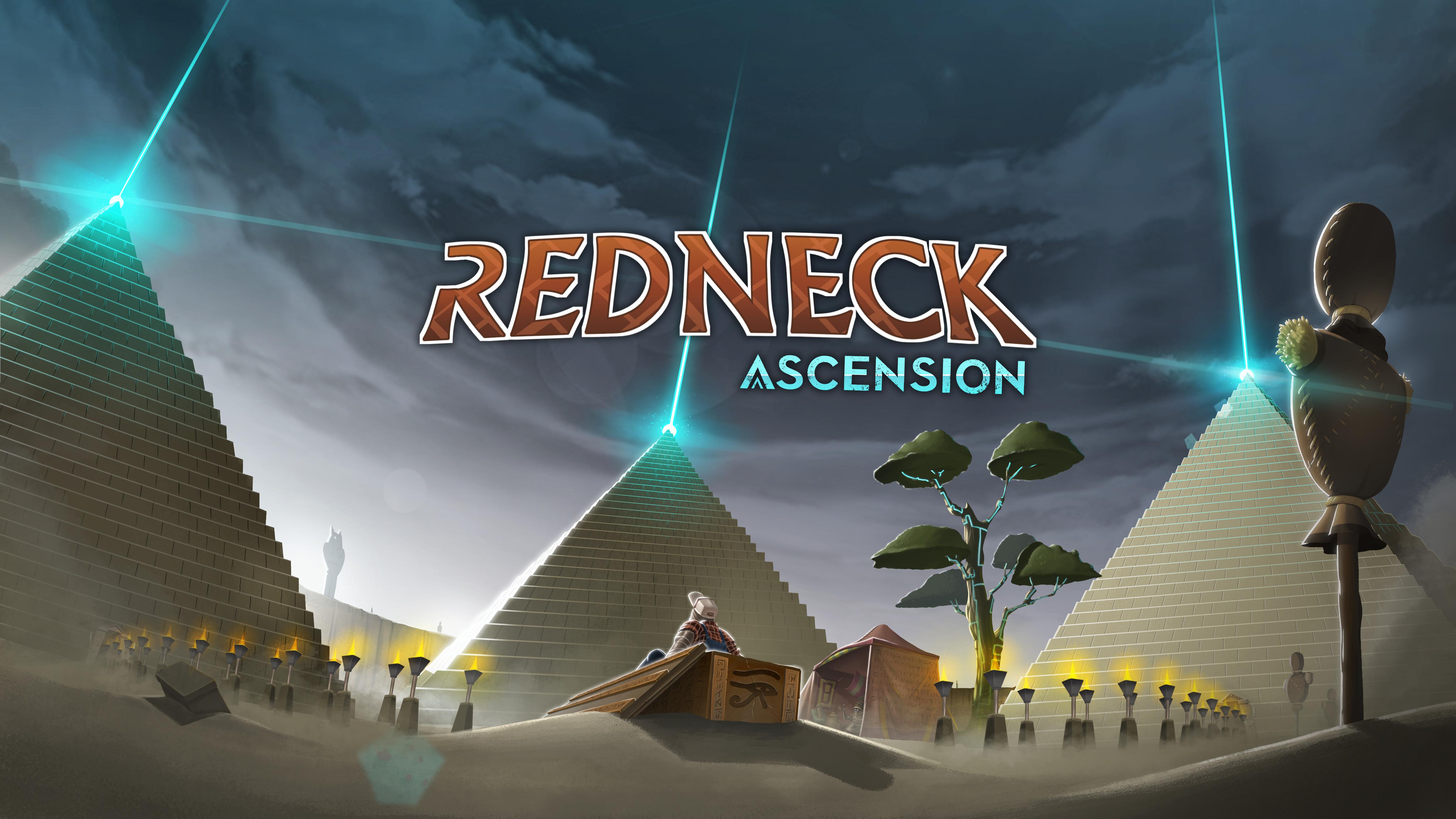
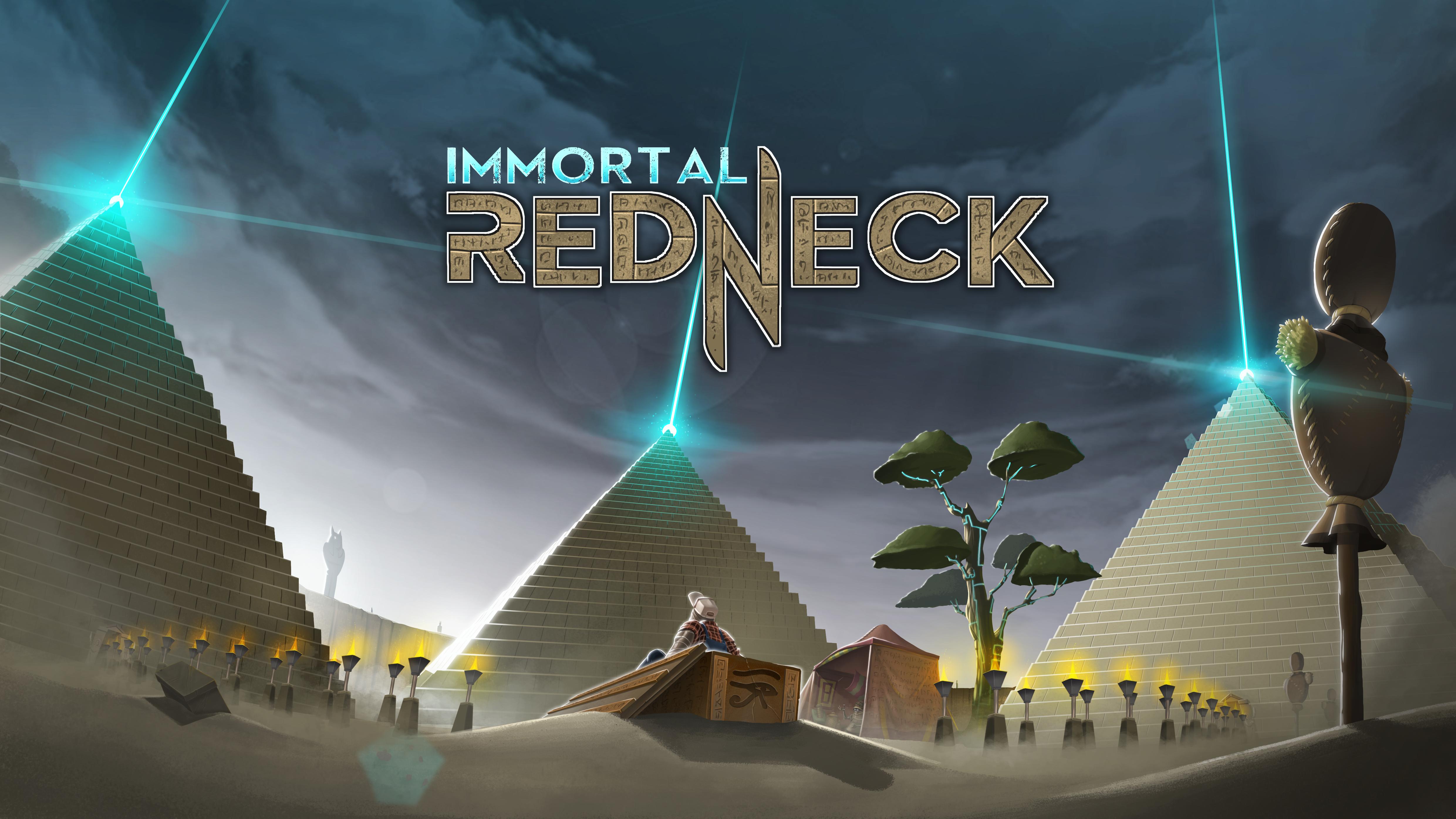
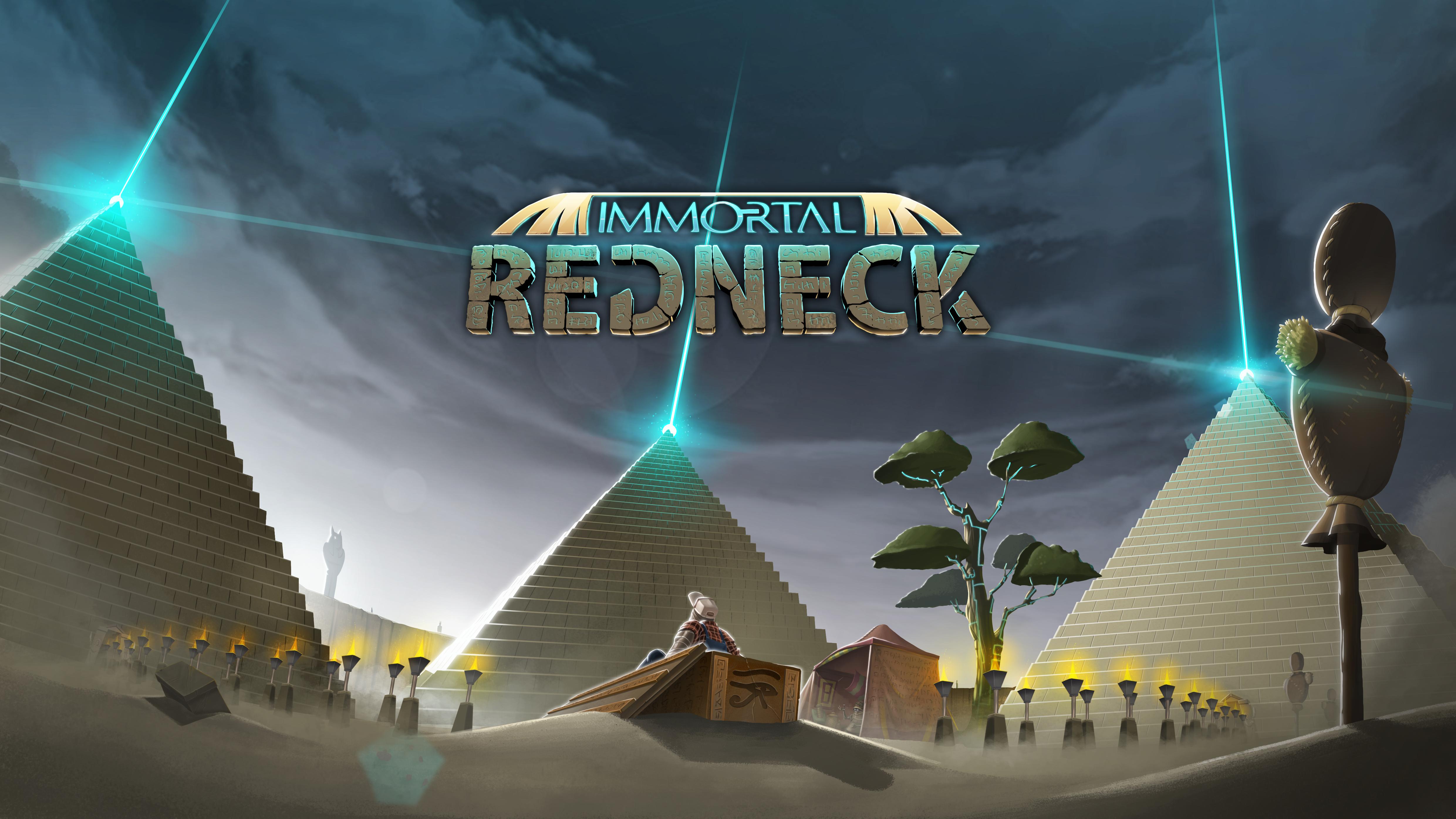
We stayed with Immortal Redneck in the end because it’s self-explanatory, silly enough and sounds well. We tried a lot of different styles and ideas about what elements we should emphasize in the logo itself.
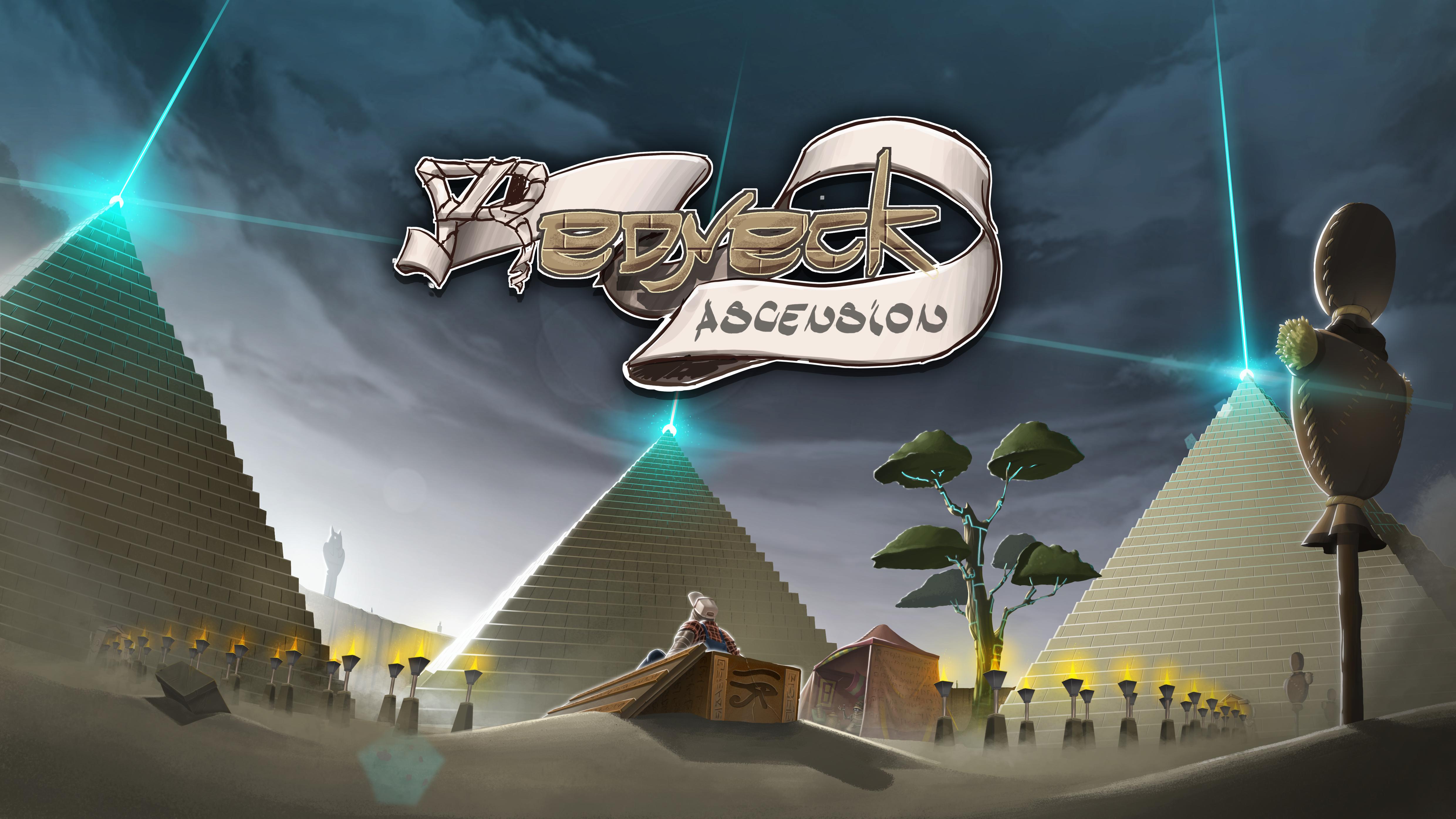
Quoting the author: “If you show this one publicly, I will kill you and everyone you love”.
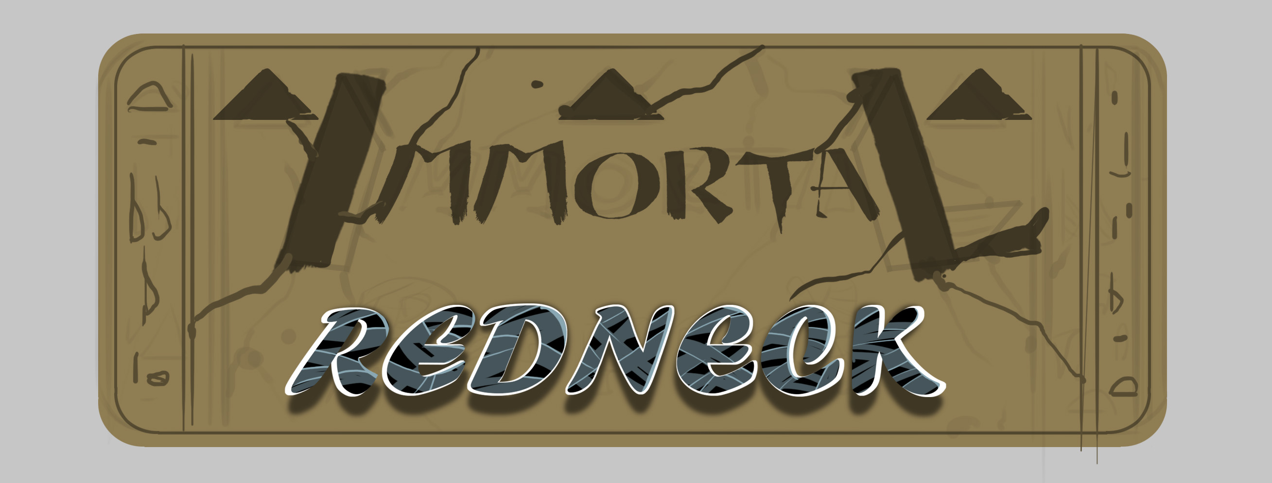
We thought it was a good idea to insert the pyramids in the logo, since the two M would look like them. It made the name a little confusing or incorrect, so we abandoned it.
The burning immortality
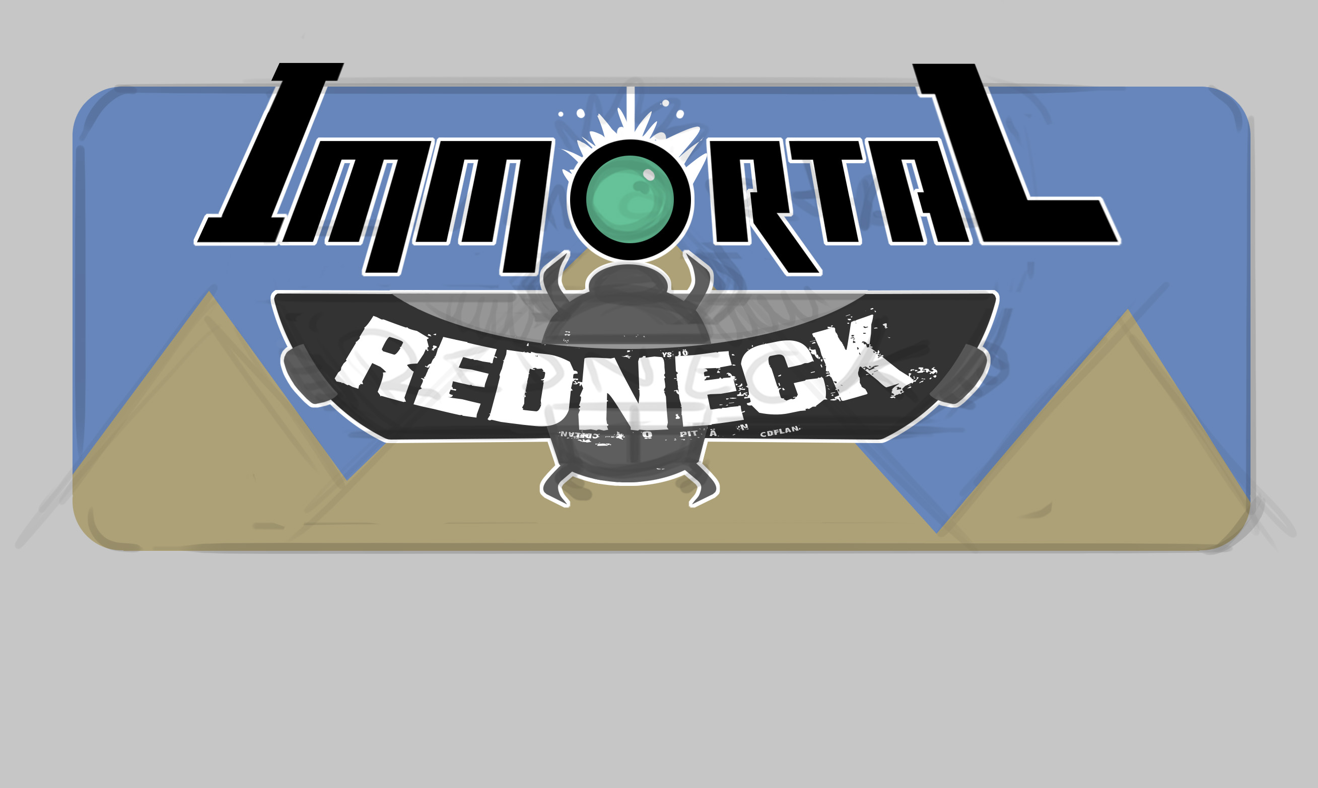
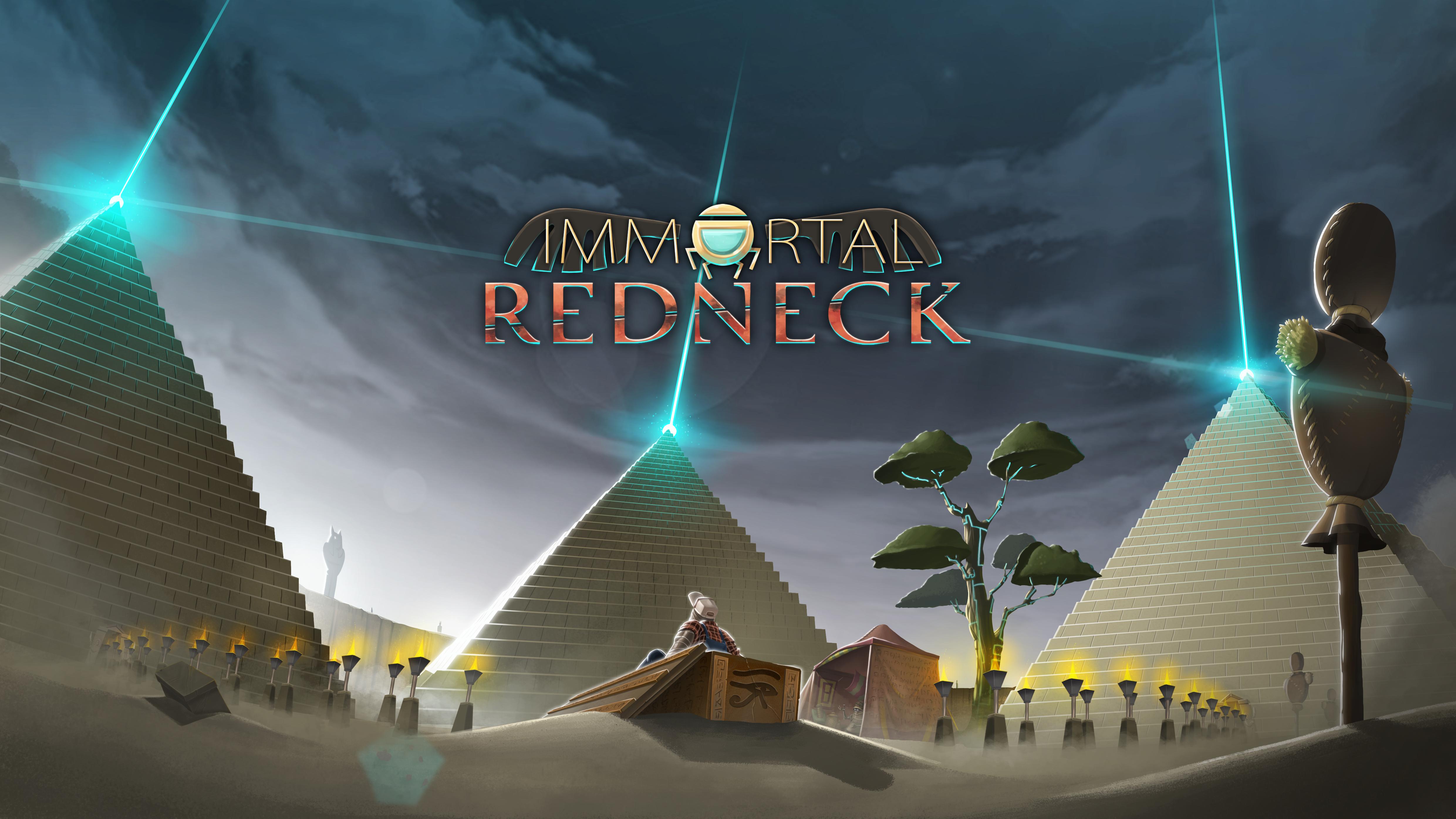
Oh, and one day, someone said: it needs more egyptian references. This was the result.
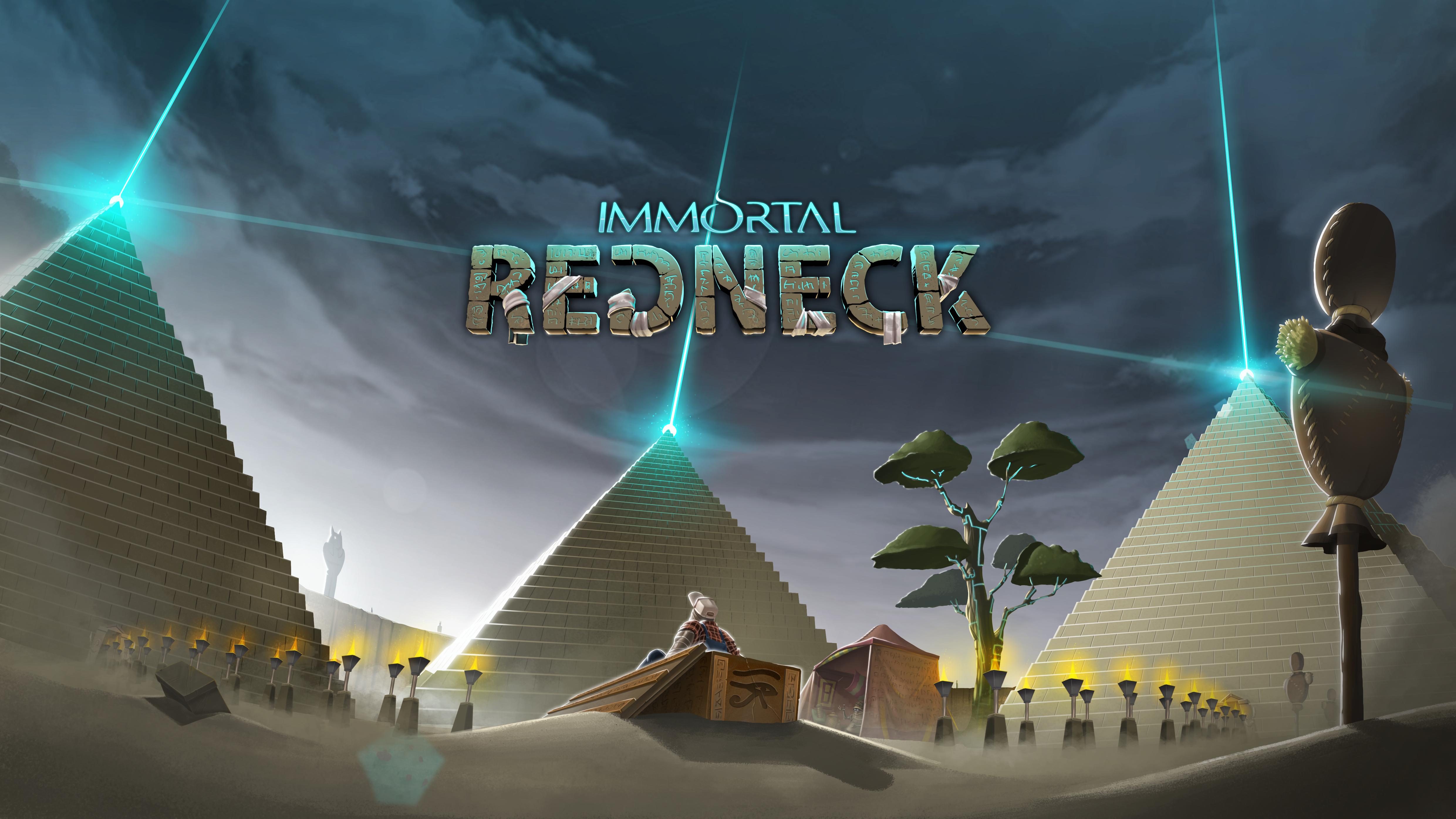
We also thought about incluing bandages in some parts of the name since the redneck is completly mummified and it would be a great alusion. We really liked the idea, but in the end, it was just a little too messy and distracting.


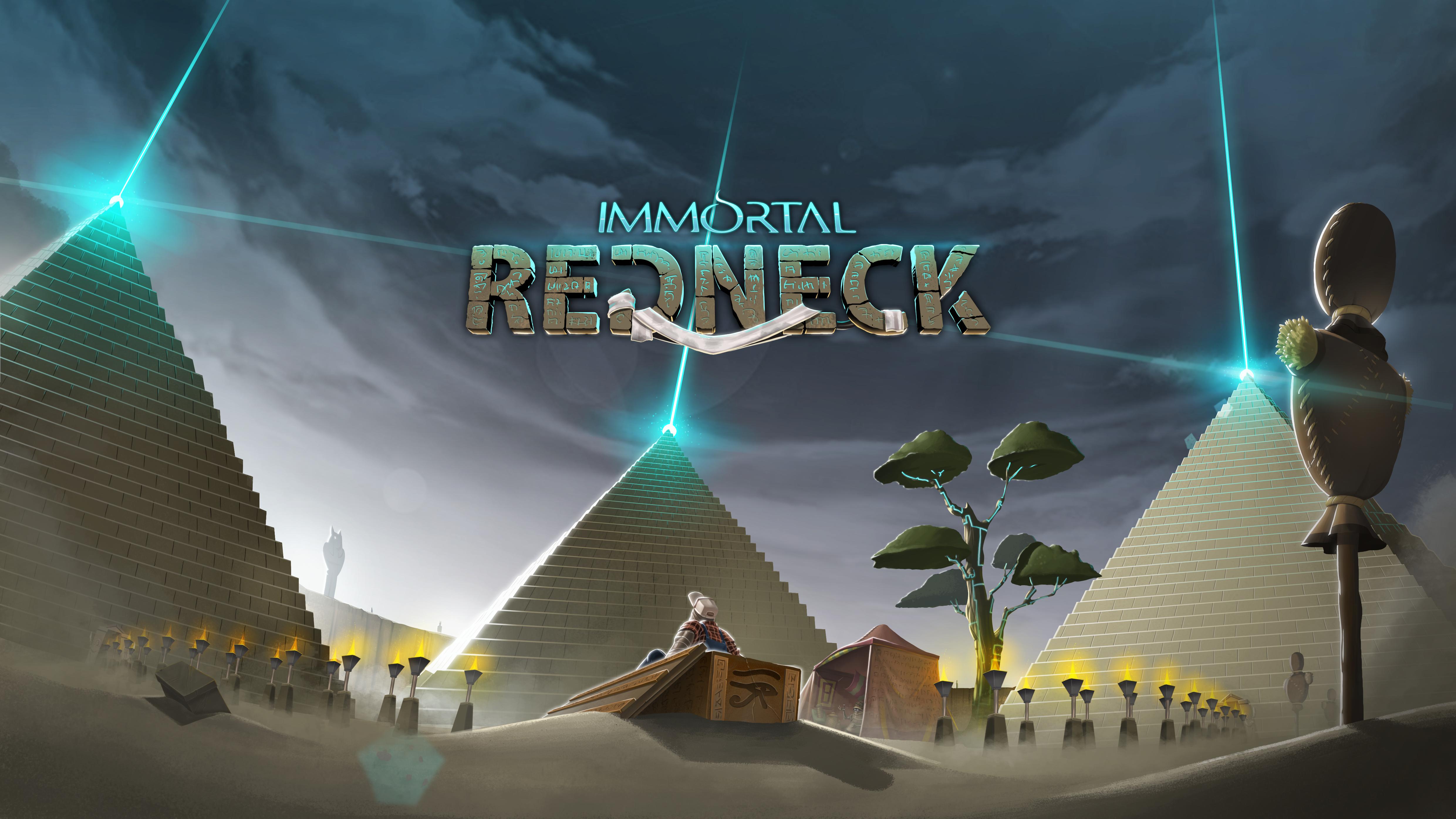
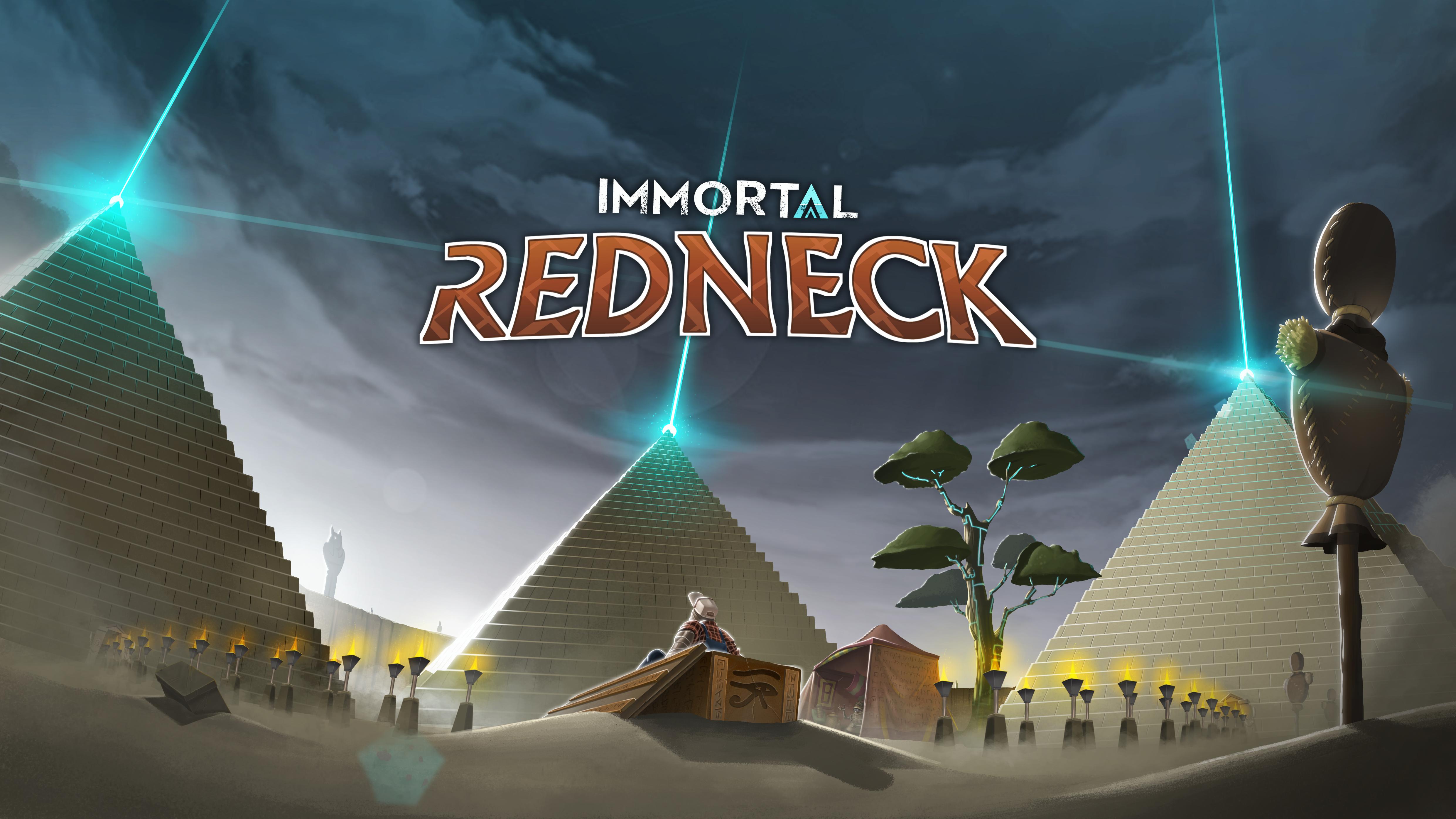
Finally, we found one that liked all of us and that seemed like the best one. Yes, we just erased the bandages from the previous logo, but that’s because a 2D team was working on it already as a possibility. So here it is: the definitive logo for Immortal Redneck!
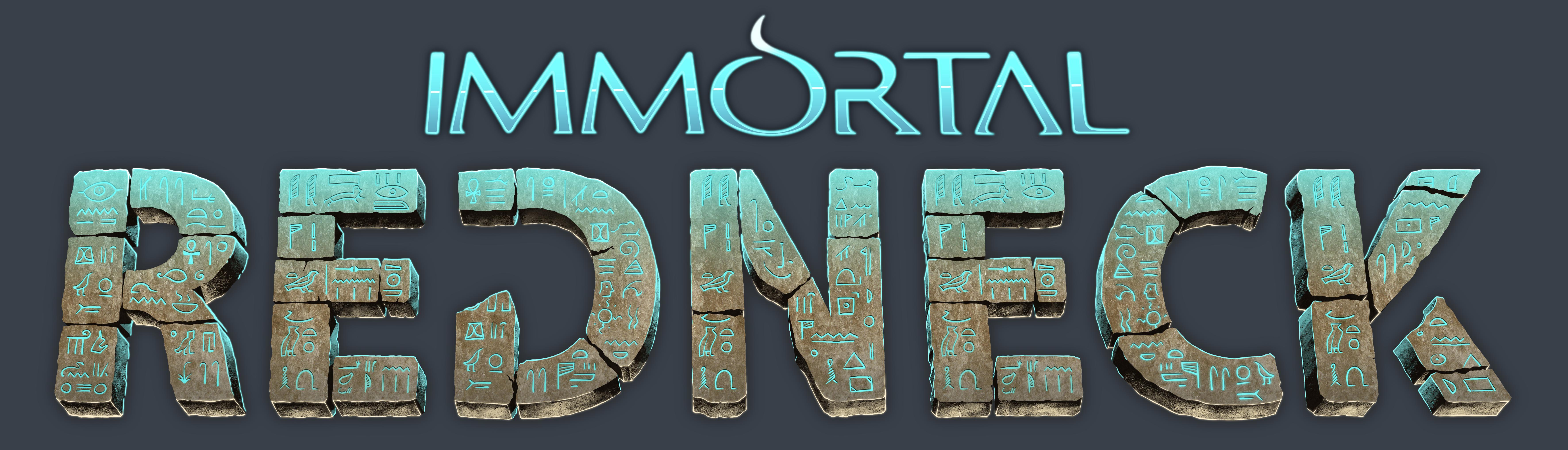
And here, the logo alone:
Do you like it? We really hope so. The logo is one of the most important aspects of a game, at least when you have to promote it. We think it really makes you think about all the strange, ancient adventures you’ll live once you start playing.
If you want to know everything about our game, don't be shy and follow Immortal Redneck on Twitter and Facebook.


the last
I would say most of them look nice, it's a hard choice. I'd go for this one Media.moddb.com.
I like the one most under the text "Quoting the author: “If you show this one publicly, I will kill you and everyone you love”."
Thanks for your comments! It really was a hard choice, but it's great to see you all are having a dicussion about which is the best logo, haha.
This title is very offensive to some peoples. Maybe you should consider changing it before the angry PC crowd destroy your project. And before you dismiss my comment as over-sensitive, ask yourself what would happen if this game was titled "Immortal ******"? Both terms are racial slur and in most context completely interchangeable.
Personally, I don't care whether you mock white trash or ghetto scum. It's just something to consider if you aim for a larger audience.
I like the one with the toilet paper. It hint that the game is humorous and could lessen the impact of the concern I have raised above. Good luck.