Introduction
Oh, we’re live! Hello, my fellow indie explorers!
This week we went into something super important, but not in the way of the game working, of its presentation. Louzan’s Logo studies! You will see this as soon as you even search for the game, so it was important to make it as amazing as possible!
“Hol’ up a minute... can’t find the last one”
Studies - Logo
If I had to say that there weren’t many concept art tests for Louzan’s logo, I would be lying to everyone right now. So I won’t!
After the hard task of finding the perfect font, there were tests to study the best colour combinations, text position, shape, and size.
![]()
Final Logo
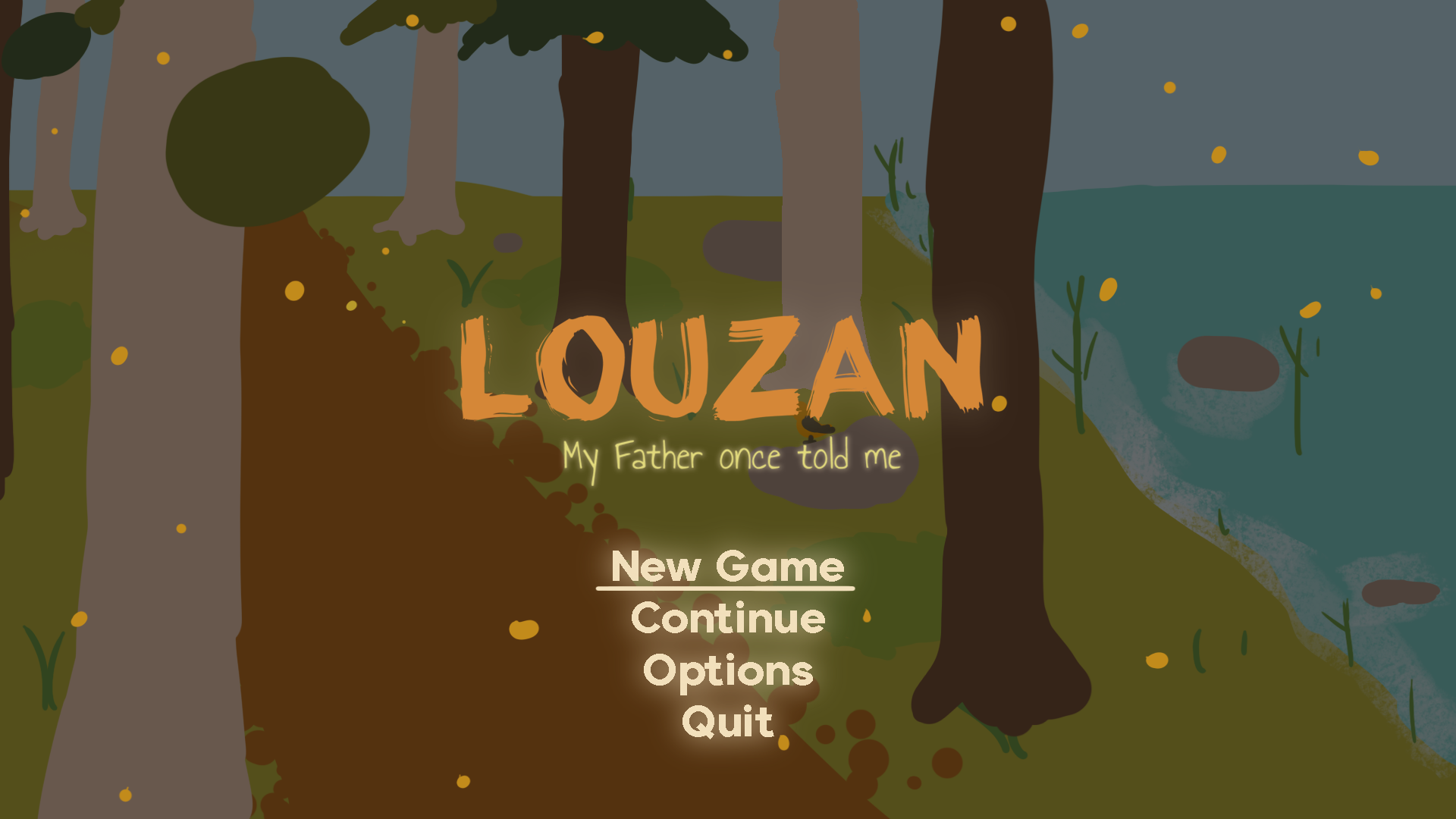
After this, it was a smooth drive to pick the best one. There is a smooth brown colour for the game title and a light green shade for the subtitle. Wood, grass, nature! All that is essential is there!
![]()
You may be wondering what it will look like on Louzans main menu. Well, here it is!
Conclusion
This week we continue with the studies, resulting in Louzans logo and the final look for the game's main menu.
We hope that you enjoyed all the progress so far! That is all for now!
Like always, stay safe out there! :D