Hey everyone,
let's dive right into what I have been up to recently. Everything presented here will be within the next patch, which will be published in a couple of weeks. So, less talking, more moving images!
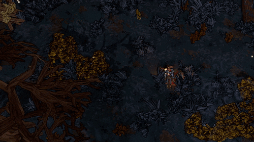
I overhauled the visual effect of interactive objects like the workbench when vision onto them is blocked. This (optional!) feature is not entirely new, but the old version did not support readability that much. Here is an example:
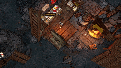
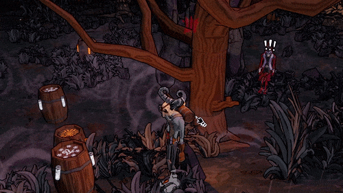
As you can see, the workbench (as well as the fire on the right) have a slight outline and transparent color when occluded. The same also goes for enemies.
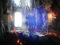
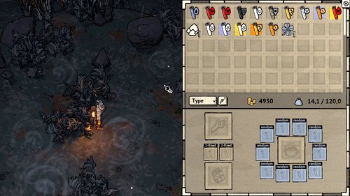
The second and a lot more work-intensive task was working on the game's UI. When I initially designed it, I wanted it to be vivid and colorful. But it turned out that when everything is colorful, it is hard to see what is important. So I stripped away a lot of color and ironed out a new design guideline. So here is the new inventory as an example:
I could not bring myself strip away all the visual fluff, which is why there are still decorative elements, e.g. in the character sheet and quest log:
I would really appreciate some feedback on whether I should streamline these elements even more. I'm looking forward to hear your thoughts and hope you have a nice weekend!
Alain