I dabbled with different letter designs and posted a first attempt more than a month ago.
Between the words I placed a flying ship pulling a crate, but it seemed too unorganized.
This was the first design:

The feedback through reddit was really helpful, and I decided to change the design to a landed ship below the title. The letters were still a bit chaotic though. Not all letters were evenly thick and some letters were more distant from the rest.
This was the image I posted back then: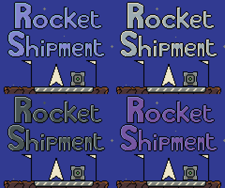
I posted the result on reddit again and the helpful feedback I got was amazing! One user even took the time to draw out a sketch on improvements I could implement. I took in all the helpful advice I could get and tried to apply it to the design. This is the result:

I'm very happy with it, and am still open to suggestions by the way.