
Greetings fellow indie gaming fans!
I felt it was already past time to have a go at another feature article of Office Management 101 and figured I'll talk a bit about the part of the game that probably gave me the most headache in the beginning - the near-isometric (also called 2.5D or 3/4 perspective) style that has been popular in the sim/tycoon genre. Just for the sake of convenience, even though it's not actually a correct usage of the term, I'll refer to the projection as ‘isometric' from now on.
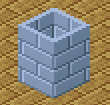
I decided to go with the tile based isometric low resolution graphics straight from the start. It seemed an interesting thing to look into and I had fond memories of games that made use of it. At that point I had no idea how much more trouble that would cause on the development side. Not to mention I had no idea how to actually draw isometric pixel art.
When you google pixel art, most of what you find is isometric cities or buildings, so I figured there's gonna be plenty of references that could get me started. I also had some isometric pixel art tutorials bookmarked over the years and was pretty confident that there would be a lot of articles about the development of such engines as well. The Tiled map editor has an isometric mode and LibGDX, the Java library I use, can easily load those maps. Sounds like it would all work out easily, right? As it turned out, not really. To be honest, I actually regretted choosing the isometric style several times down the line while tearing my hair at yet another problem.
My naivety got a punch in the face right away. Most references I found weren't tile based or weren't up to the quality I was hoping for and most games use different variations of the style. The tutorials only covered the basics, like boxes or circles, but I didn't even know what size should I make the tile and how high should the walls be so they align well to each other or how to approach the lighting of the tiles. It took a lot of experimentation and redoing things to find the appropriate sizes and shapes to get started.
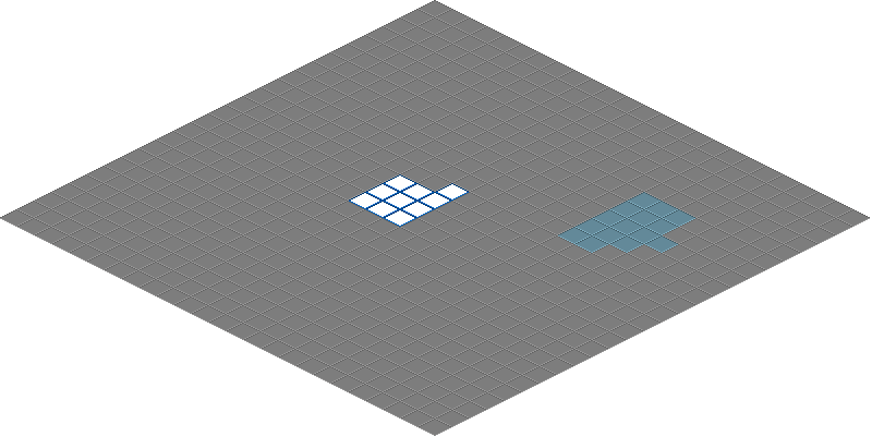
This is what the first test grid looked like:
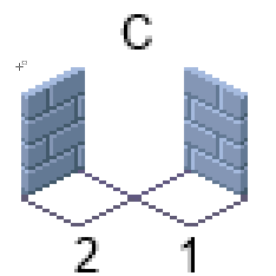
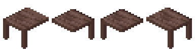
Then I faced another problem. Since I wasn't going to make full tile size walls, but thinner ones, I had to align them either to the top parts of the tile grid or the bottom. Again, having no proper reference I picked randomly and went with the bottom alignment (A on the picture below) and had 3 (horrible looking) wall tiles - two sides (A1 and A2) and a corner tile (A3). Then I created two layers in the Tiled editor, one for the floors and one for the walls.
History of the walls, with the tile grid added:
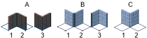
After testing some, it became more sensible to align the walls to the top parts instead, resulting in B on the picture above. I then realized that solution isn't going to work perfectly either. Mainly because of corners. It hit me that not every corner is gonna have the same wall tiles, so that would either mean drawing each combination of corner tiles (B3) possible or coming up with an alternate solution. It also had another ugly looking corner side-effect demonstrated below:
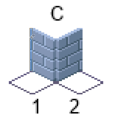
To fix it I had to pretty much throw out the existing isometric renderer in LibGDX and redo the rendering part myself. Since placing two wall tiles in the same spot wasn't possible, I first created another wall layer in Tiled, then made the renderer check for overlapping wall tiles and made it so corner wall tiles are combined partially on rendering. That way I ended up needing only 2 tiles for each wall type (the two C tiles). The tile size changed a bit in the process too.
An animated representation of how the renderer combines the tiles for a corner:
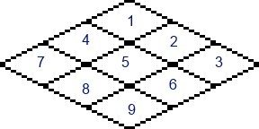
That was relatively simple though, compared to what came next - objects, namely employees that moved around. After days of trying drawing different character styles, I finally picked one that seemed to suit me, but when I put them in the game I couldn't just draw them below or above the wall layers and be done with it, instead I had to render each character depending on it's position while rendering the wall tiles. It also turned out LibGDX was rendering the isometric tiles in an unsuitable order for my use.
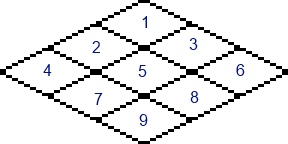
Left one is the default LibGDX rendering order, the right one is the one that should be used:
As long as the characters and objects are always in the middle of the tile, no additional calculations would be needed, but my characters walk from tile to tile. So I needed to have a way to calculate the z-index or depth of each wall tile and character depending on their x and y coordinates. I did find some tutorials on that, but as my luck would have it, they were not much use to me, since LibGDX doesn't use the common coordinate system. In digital world most systems use top left corner as the {0, 0} point, but in LibGDX {0, 0} is the bottom left point of the screen, pretty much like in conventional math. And math is definitely not my strongest subject, so it took me a lot of trial and error to find a working formula. I never did get it perfect and there's still problems when the character is a bit wider, so to have overweight people in the game, I'd have to fix that :) I got a formula written down on a piece of paper that would maybe work, but I have yet to test it.
To save myself from the same problems with furniture, I made it so that the furniture is always centered on the tile and bigger pieces of furniture are split into multiple tiles like this:
Yet another problem emerged when I was suggested to add some background to the simple cutout floor that I had so far. Just a static background seemed like it would be boring, so I decided to make the cutout look like it's actually a part of building, by adding ground and additional floors. Only way to achieve it with Tiled seemed to be adding a layer per floor, but it quickly became a mess and quite a hack to render properly. It looks way better than it did before though, so I left it that way for now, but first order of business after finishing the alpha version of the game will be making my own map editor that would support all that properly. I hope that would also mean that players could create their own maps and scenarios, which would be a nice feature to have.
As I added the background tiles, I also created the window tiles that are partially transparent. Again I didn't want to draw each combination of window and wall tiles, so walls behind windows are also rendered only partially.
Even after all those problems, looking at the current state of things, I don't regret going with the isometric style anymore. I think it will help the game to stand out a bit from the rest and that could make a lot of difference in the indie market. If any of you plan to give the isometric style a try, I wish you luck and patience. Be prepared to face some heavy problems when going in, but if an inexperienced game developer such as myself figured it out, I'm sure you'll be able to as well as long as you give it time. There's also a lot of ways to make your life easier, like make the wall base full tile size, if that suits your game.
I did skip some smaller stuff on the subject, but if you have any questions feel free to ask. Leave a comment here, contact me on twitter or drop me an e-mail (riho@tulevik.eu).
Anyway, thanks for checking this out, hope this was useful or at least interesting for some of you.
Until next time,
Riho
![]()
@tulevik.EU | officemanagement101.com | DevLog on TIGForums


+1 really great article, thought about using "isometric" for a game someday an i think that this may really help me.
Thanks. If you get something going, I'd love to get your input on what you did differently or how it goes.
"After testing some, it became more sensible to align the walls to the top parts instead..."
Can you explain why you chose alignment on the top instead of the bottom?
To be honest, I don't remember my reasoning other than finding out that it's how x-com seemed to do it. An example: Repo.openpandora.org
Interesting. I'm currently placing thin iso walls at the bottom, seems more logical, but I can't find any advantage to the top. Really, it doesn't matter that much, and you could even do both.
Do your characters move freely or are they confined to center points? I've been having another problem with freely roaming objects and thin walls: Getmoai.com
I agree that the alignment shouldn't really make much of a difference.
My character movement is a bit confined as they move straight from tile to tile, so they're always in the center of the tiles x axis or y axis and there's no diagonal movement. Aside from the calculations, that makes pathfinding and animating a lot easier as well. Here's a gif showing that: Tulevik.eu
I think this was the article that helped my maths the most Ericlin2.tripod.com
I've seen some devs use several hacks to solve those problems. M.I.N.T for example Forums.tigsource.com
That's why I'm going the TOOE route visually. ISO rendered tiled background and destroyable environment sprites of arbitrary size on top. Tactical turn-based RPG.
Excellent dev blog ! I really like how the game look like.
This comment is currently awaiting admin approval, join now to view.