
As you can see from the comparison renders, the Rifle has undergone significant changes, while still keeping some of the basic framework. We felt the old Rifle was too bulky and boxy, with soft, rounded looking edges that made it appear shapeless in parts, and that some of the details were cluttered and noisy.

The new Rifle, which will be in the upcoming 186 patch, has been trimmed down, both in width and height, and the slimmer look should not only help it to match its gameplay role better, but also have the added benefit of freeing up extra screen space.
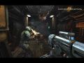
The barrel has been lengthened so that it can be seen extending beyond the front section of the gun, which has a much better feel when aiming and firing the weapon in game.
The bolt lever was increased in size to make it appear easier to grab onto when cocking the Rifle, and the shell ejection port has been moved to the opposite side of the gun so that the spent shell casings no longer eject into the Marine’s face.
The Grenade Launcher attachment rail at the front of the Rifle was beefed up, so that the segments are clearer and the rail feels more like a substantial part for the GL to mount to and there have been quite a few other cosmetic changes to the details, shapes, and proportions of the various parts of the Rifle.

Since the Rifle is the staple of the Marine’s arsenal, we felt it was worth the additional time and effort to revisit and revise this particular game asset. We think this new design feels sleeker, tougher, and meaner then the old one and we hope you agree as well.
As always, if you want to get in on the beta, and try the new Rifle design out for yourself, you can pre-order Natural Selection 2 from here


Looks better.
Looks a lot cleaner. The comparison shot really doesn't do justice, though. It looks smaller; however, I can tell it cleaned out the POV and HUD. Detail look really nice, too. Nice job guys.
While I appreciate the overall design change in terms of less screen space and being sleeker overall, I prefer the barrel (probably incorrect terminology, but I mean the front end) design of the old one. I just like how it's all business like someone said "Okay, it shoots bullets, it doesn't win beauty contests."
The old one looks like a bigger meaner weapon but the new version does look sleeker.
I agree with Elementalist. Being too clean makes me think more of someone who hasn't seen war, as opposed to someone who's mass producing weapons to fight one.
Bulky is sometimes better!
Awesome design guys! Now just fix the performance. I want this to play at 60 fps maxed on my windows ME system!
Like the new one, although it lacks the beefy front. So great job guys!
Haven't played in a bit...I guess I should. :D
Why not include both versions in the game? The new one being an "upgrade".
ehm, why dont you include both, and have them different stats, letting the player decide what rifle for what role he chooses?
Impressive.
imho, the original was better. It looked more 'chunky' sort of like the pulse rifle in aliens, big, bulky and badass.
Needs more heatshield... This one looks to slim.
I agree with these guys. Personally I think the new one looks great, but it lacks the Spray & Pray Assault-Rifle feel (though TBH, the assault rifle acts more like a SMG than a rifle in this game). The new one looks like it should be a semi-auto or burst weapon instead of a fully automatic gun. I honestly think that you should keep the original model as the start-weapon for the marines, then use this as a 'Marksman's Rifle' for mid/late game. Especially because the new one looks different enough to be made by the same people, for the same people, but for a different function. ;) Just my 2 cents.
EDIT:
Anybody else think this looks a little bit like the shotgun?
The old one looks like a Machinegun, The new one looks like an automatic rifle wich is what it's supposed to be.
So yeh I think I would like to see the old one as an additional weapon with different pros and cons applied to it.