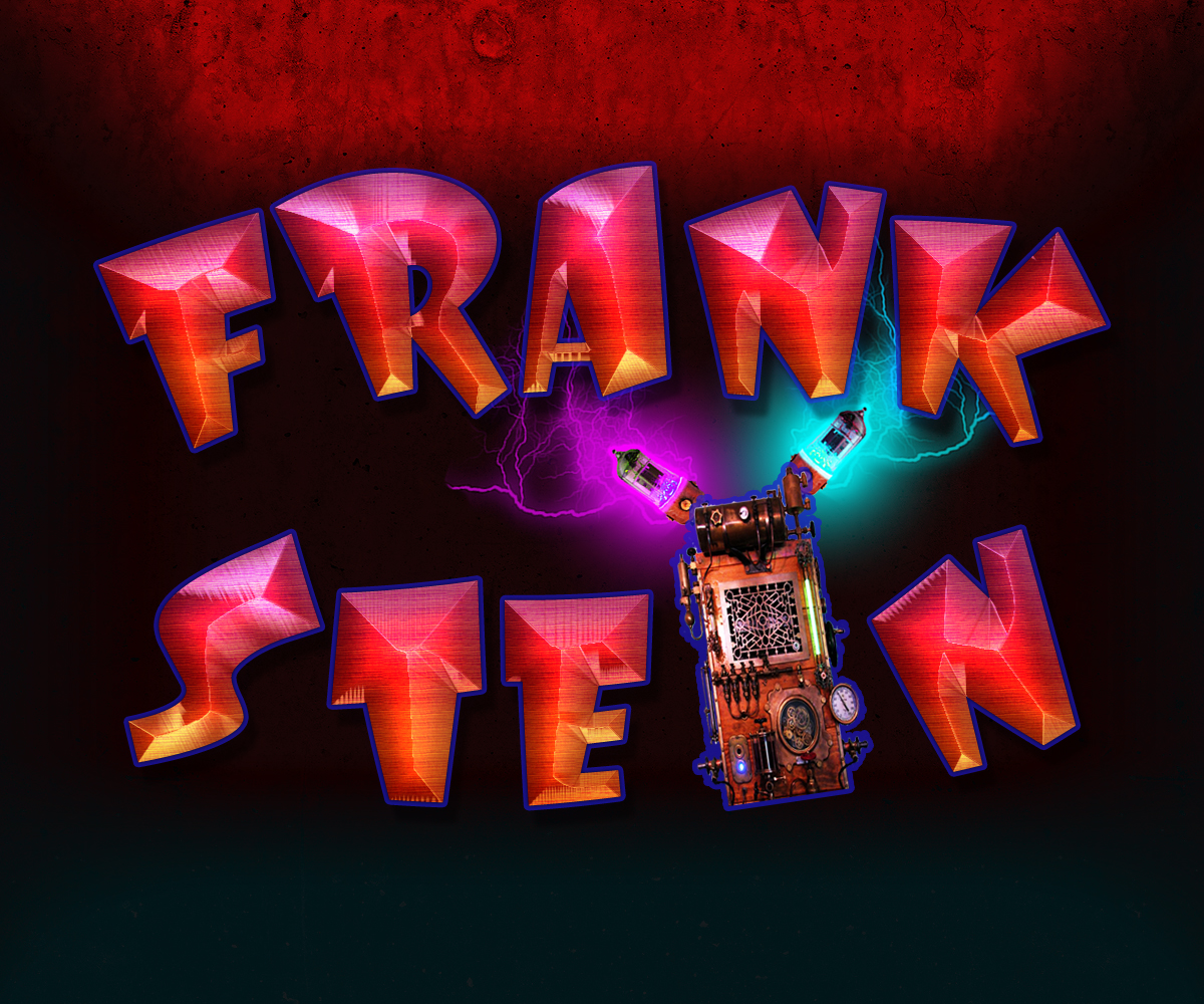
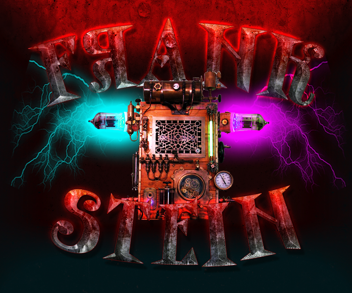
We’ve been through several iterations of the Frank Stein Main Screen Logo, as you can see, below. Before finally, happily, sticking to the main logo with the chiselled text and frank Standing in the centre.
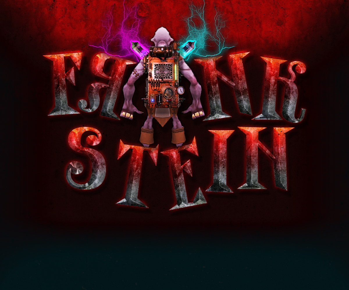
We wanted Frank to stand out in the image, after all, he’s going to be your new hero. As quirky as the game is intended to be, the slightly, overly, cartoony styled text didn’t really work with what we were looking for. So we played around with different text styles, colours, positions and what we wanted in the logo to try and convey some information to the player.
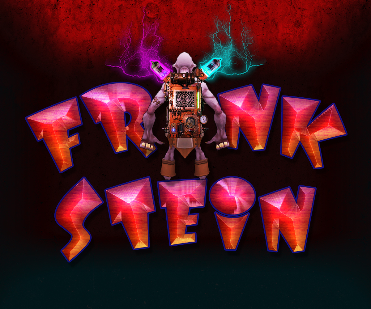
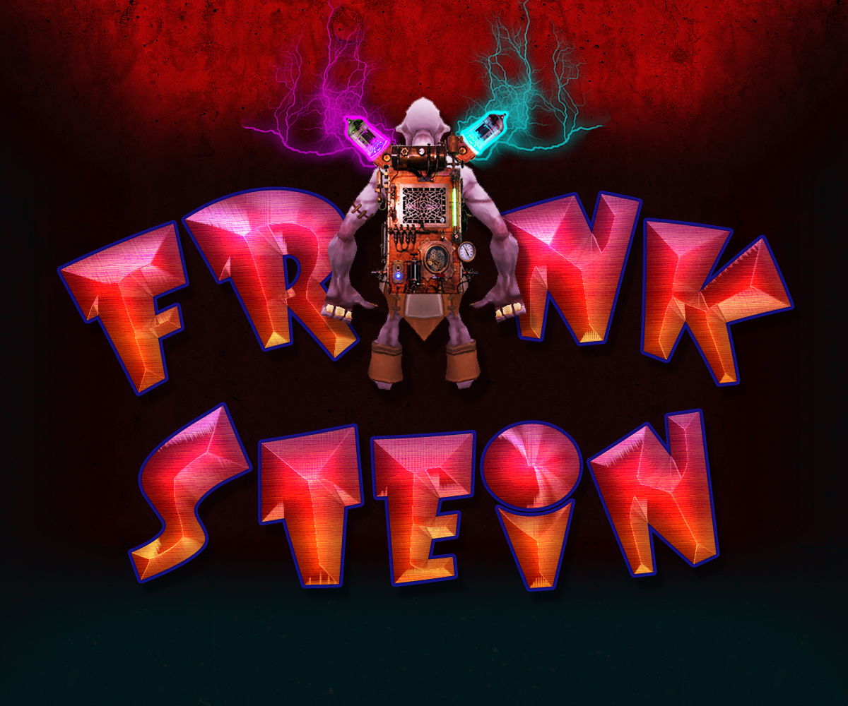
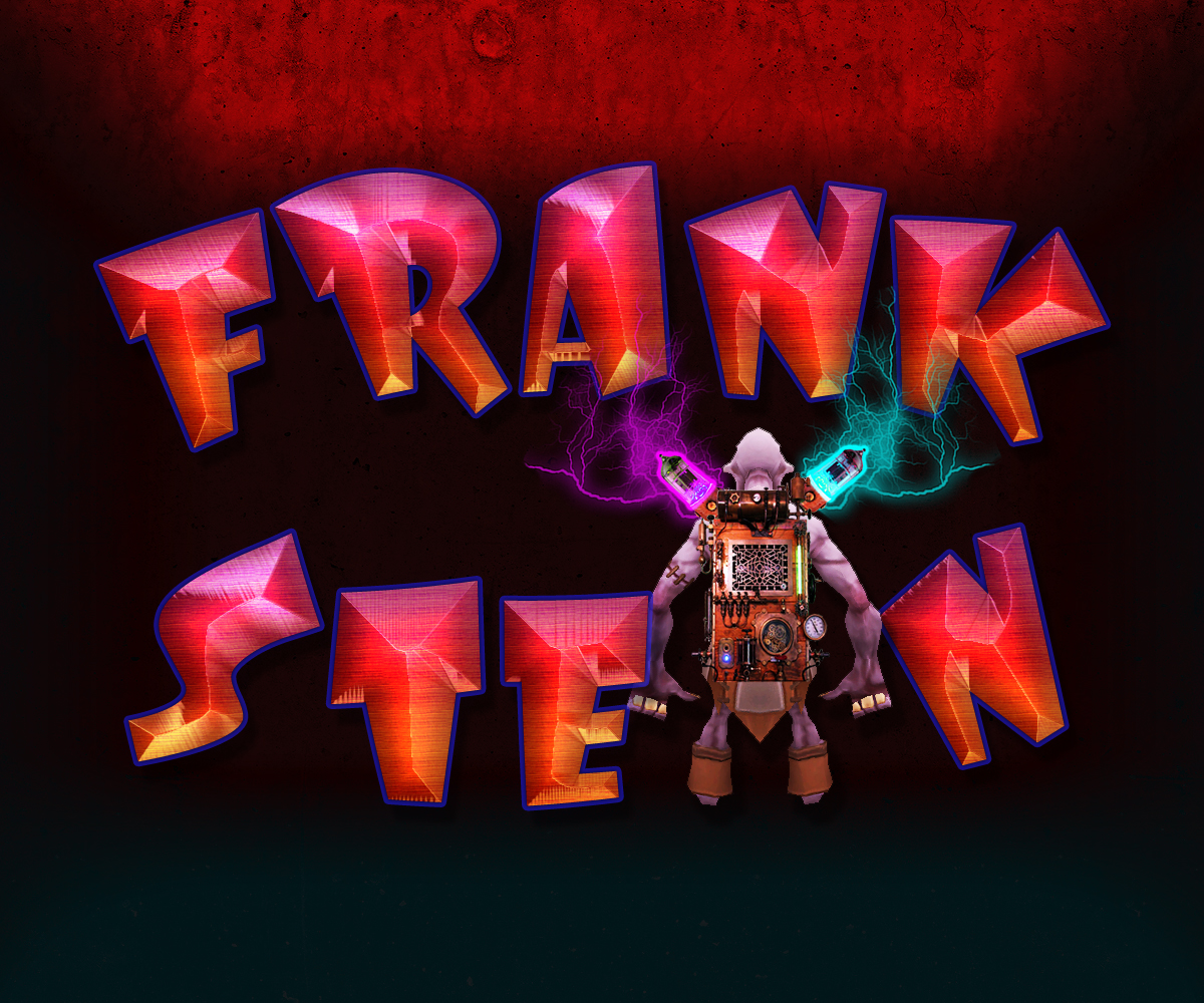
We may, still, iterate further on the design by including more of the games puzzles, bosses, and encounters to further show players what the game entails.

This comment is currently awaiting admin approval, join now to view.