Time to show you some of the progress we’re making. Here is something you’ve never seen before: the in-game Head-Up Display (HUD)! We’ve shown you some gameplay footage in the past, but that was lacking a real HUD. True, it had a basic health meter, but that was more like a band-aid solution and was never intended to be final. Now, during the demo-sprint we can present you with the latest version of the in-game HUD:
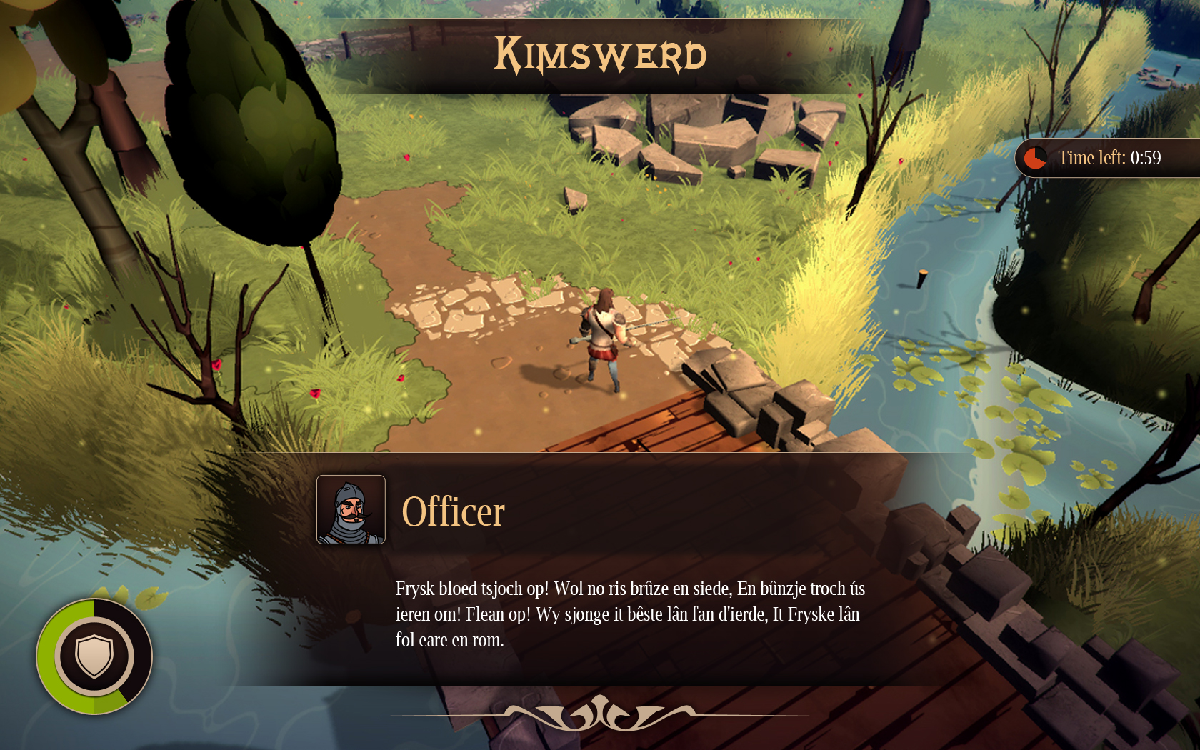
What are we seeing here? Quite a lot actually. This is a mockup that contains all of the HUD-elements you can encounter. From top to bottom, left to right:
- Location. The name of the village will fade in the screen for a few seconds at the moment you enter it.
- Timer. Some objectives will require you to do something within a certain time-limit. To keep track of the remaining time, a clock and timer will slide in from the right side of the screen.
- Health. Every warrior needs some! When you get hurt, the amount of damage you’ve taken will darken, and then disappear completely. Inside of the ring you see a shield, meaning your followers are in defense mode. In attack mode a sword will be shown here.
- Conversation. People like to have a chat with you. What they’re saying will pop up from the line below. This Officer is actually singing the Frisian Anthem for some reason…
Since this is a mockup of all of the HUD-elements, the screen is quite full. Note that when playing the game it will be a lot easier on the eyes. When playing you will only see your health meter most of the time.
And what about the startmenu you ask? Well, nothing much to say about that, except that it looks awesome:


The game is looking really nice. Keep up the good work!
The Ui looks pretty lovely, really like the HP-Bar, but I dislike the timer, Somehow the round border dosnt seem to fit, and it dosnt feel right that its connected to the end of the screen, while all other frames arent. Id go with a similar fade-out like the other 2 quadratic ones have.
Also be careful with the gradients, your whole art goes with stylized vector like shapes and colours, Im not sure if its such a good idea with the fake volume the gradients bring to your frames.
Main menu looks really good, just give the "of the" a warm tone, it stands out too much, and it just dosnt fit. If you had "cold" areas in your composition, it would be fine, but like this you only break the 1 tone image :)