In today’s post we’re going to give you a bit of insight into the process of getting the visuals locked down for a Block. Internally, we refer to any interactive game elements as Blocks, and everything outside of the gameplay space as Props. The word block doesn't necessarily mean it is a block, it just refers to the fact that most all of our game elements fit into a one tile grid space the size of a block.
Consistent visuals is important for all models that are put into Burnstar, but the Blocks we are especially picky about. While props must usually just match the art style and sometimes snap together on the grid well, Blocks must do that and more. The Blocks have to meet certain criteria such as being something that the player can quickly pick apart from other game elements. They have to convey to the player what they might do, without the player having ever interacted with them. They can’t be too busy or too simple. They need to look good repeating and in nearly any combination with other blocks. Shape and color both play an important part. The shape of the object helps the player understand its purpose and can help the player immediately recognize the object when trying to analyze the puzzles. The color again helps the player pick them out, but also helps group the object with other like objects. I’ll give an example of that in a bit.
Below you see a concept sheet for our Pickup Block. The prototype version was a really simple blue box mesh with a handle on top and a red arrow pointing up indicating you could pick it up. It was good enough for testing, but the final art for the game obviously couldn't be so simple. We started with these concepts:
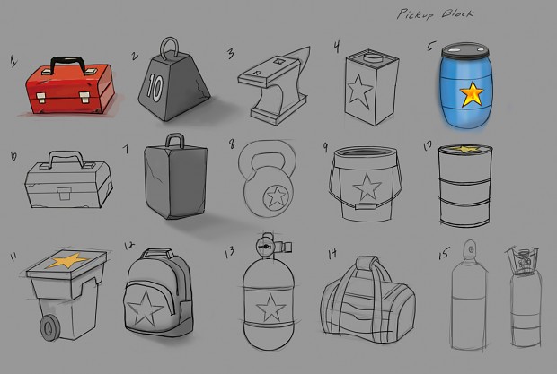
We debated each one briefly, and our favorites were #2 and #5. The color blue worked well with the previous block, and since there was nothing else blue in the game at the time, we decided it really helped it stand out. Since this block couldn't be burned, the color blue just seemed to fit, as blue is not naturally associated to burning things by most people.
In the next image you will see the progression of the concept to the final model and how many iterations and attempts were made until we were pleased with the result:
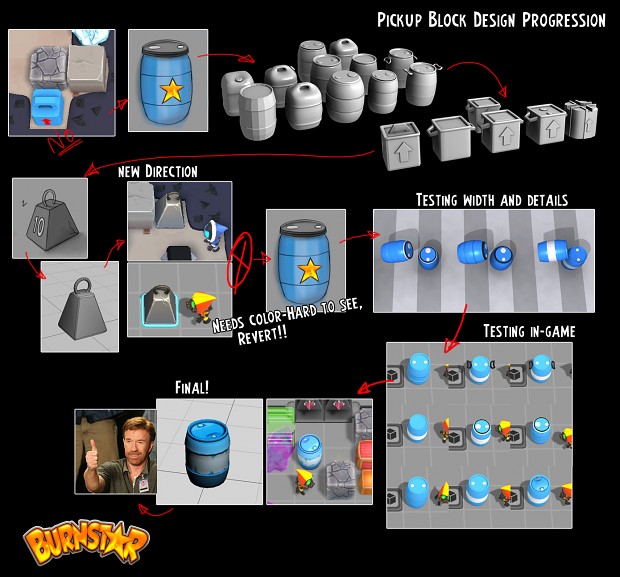
We started with the barrel. After playing with several iterations on the barrel shape and style, we wanted to see what other shapes we could try. We next tried a sort of plastic container sort of thing, but it looked too much like a cooler, and also too much like all the other block shaped blocks. Afterwards, we tried the style of #2, but it ended up not looking like something you could pick up. It was also flat grey, not the right color, and attempting to make it have some color and stand out just made it look like some weird metal cowbell.
In the end we decided that our first attempt was the best really, so we went back to the barrel and made a few more mockups of our favorite one until we landed on the final product. It fit our needs. It stood out in both shape and color, it wasn't too noisy or too simple, so it didn't distract from the puzzle was still easy to find. The round shape helps it sit on floor switches and still allows the player to see the state of the switch. And finally, because of how we introduce it to the player, you quickly learn that barrels can be picked up and moved. With them being the only barrels in the game, it’s very easy for the player to remember their function.
This whole process took a bit of time as we bounced it back and forth and tried iteration after iteration. The final product though was worth the time put into it. For Burnstar, being able to easily read and understand the game board is an important design goal, especially when the player is dealing with a deviously difficult puzzle.
If you enjoyed this article or the game demo, go vote for us on Steam Greenlight! Also, for this and our other DevBlogs, be sure to check out our site: Burnstar-Game.com.