Hello again everyone!
Today we will share with you all the early design and concept for Breeze of Chimes' UI!
Breeze of Chimes - Ui/UX Design
Design Philosophies
To us, the most important thing to achieve while creating our UI is accesility and clarity, we want players to be able to easily use this UI even if they don't speak english.
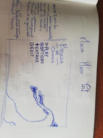
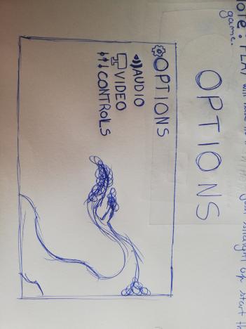
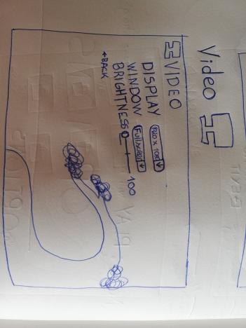
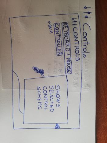
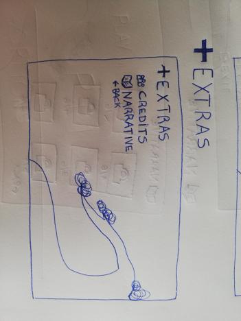
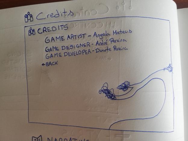
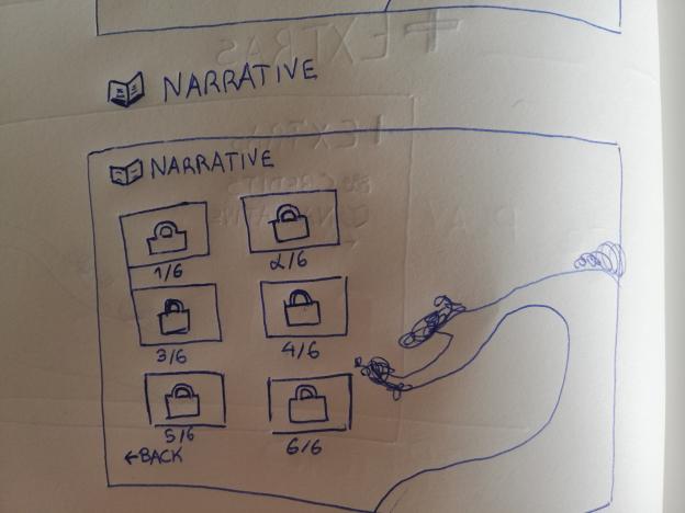
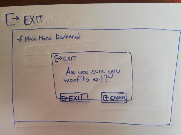
To achieve this we use icons in the main menu and submenus, so that people who don't know english are still able to understand what that specific menu stands for, since icons are universal.
We used industry standard icons and words for people to have a better understanding of the menus, and to be the least confused possible.
This isn't exactly a design philosophy but the menu has an animated background that is part of the In Game World, adding to it's aesthethic and beauty.
If we manage to have time for this, we would like to have that animated background change on each menu, but for the vertical slice this is unlikely.
Social Medias:
Twitter: twitter.com/hopokistudio
Mail: hopokistudio@gmail.com