

Compare Forum.unity3d.com
I wanted a "Powered by Unity" screen which looked kinda retro, in contrast with the more modern scheme of the actual Unity logo. I drew on Window 95 as well as a lot of the "programmer art" tendencies of a lot of mid-90s software designs for this; mismatching shadows, overuse of gimmicks, poor shading, etc, tied together with a bright and discordant colour scheme.
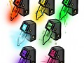
The logo itself lost it's sharp angles for a more vertical orientation, and had colours introduced reminiscent of the Windows logo. I tried a few curved versions, but they stopped looking like the Unity cube.
The background is a common gradient toning of the 1990s, which is still included in a lot of programs, including photoshop, the same way the Utah Teapot is still a base primitive in most 3d programs. A subtle cloud effect in the background gives the rough, textured look also frequently used in the era.