Most UI is designed in terms of pixels, with the assumption that a pixel is a constant unit of measurement. This is troubling because, depending on the user's resolution and quality of their display, a pixel can vary dramatically in size. This is especially a concern in full screen video games, where no matter what the size of your screen is, people love to max out their resolution. I think we've all been in the situation where we have had to squint to read text that becomes tiny at ultra high resolutions.
So what is the solution? Here's a rough outline of how we are handling it in Overgrowth. Let's use the item browser UI as an example:
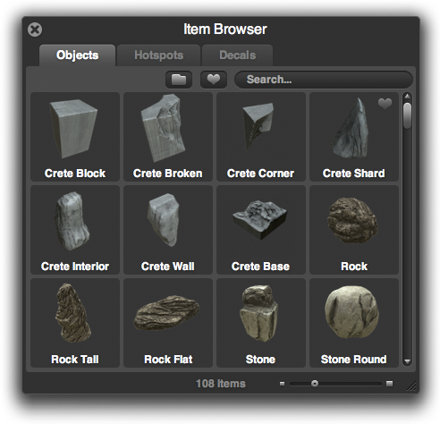
Let's use that as the reference for how the item browser is supposed to look. However, to someone with a high DPI display, or who has cranked up their resolution, they might see something more like the following:
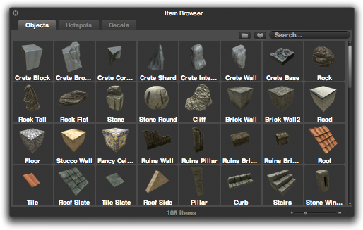
This is pretty tiny and not very usable. The user can resize the window to make it wider and taller, but that won't make it any easier to read -- it will just make yet more objects fit into the viewport. How can we solve this so that you don't need a magnifying glass to read the text?
Well, it seems like the sensible thing to do is make it bigger. If we scale up the UI based on the DPI and resolution, this will at least make the UI the correct size across different displays. Here is the original UI scaled to 2x:

Click image to enlarge
However, this looks terrible! We are merely scaling up a raster image, which introduces tons of artifacts and is almost not even more legible. It's like watching a low-def broadcast on your shiny new HDTV. We can do better.
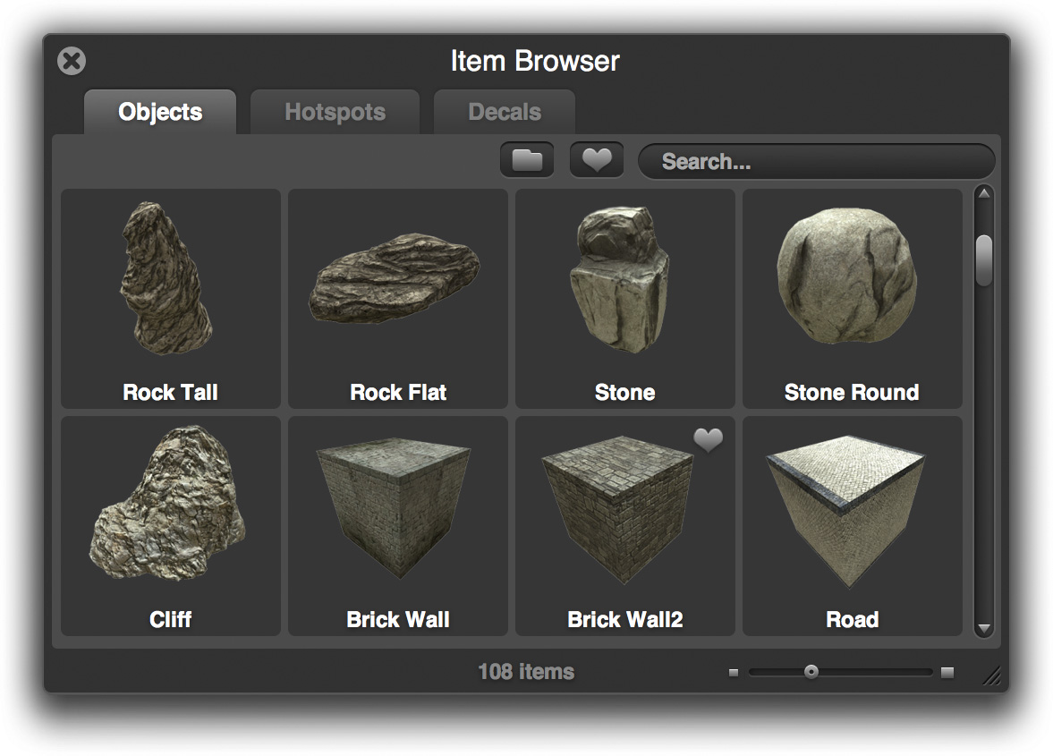
The text is the biggest problem, so let's tackle that first. Luckily, text is easy to scale up. Most fonts are defined in a vector format, meaning they are defined in terms of geometric primitives. In other words, you can change the font-size all day long and it will always look crisp. Also, there's no reason for the object thumbnails to be blurry. When we (and community member Hale) made the thumbs, they were taken at a very high resolution, so it's easy to make them sharp.
So let's try this again, but this time, we will adjust the fonts so that they are still crisp and use the higher resolution thumbnails:

Click image to enlarge
This looks much better, and is now legible at any size. However, eagle eyed readers will note that something still looks a bit off here. Namely, the jagged and blurry edges of the scrollbars, the close widget, and a number of other elements. Here's all the problem elements together:
These ugly edges have no business in a fine game like Overgrowth
This is easy to solve if you design for it from the beginning. There are two ways we are solving this. Firstly, for some images, we use SVG (scalable vector graphics), which is an open vector format. Like fonts, SVG images can scale to any arbitrary size, so they are invaluable when creating a resolution independent UI.
However, many of our images are created with Photoshop vectors, which, while resolution independent, can't be interpreted by WebKit. Therefore, we rasterize them at both an oversized HD resolution and a regular resolution and down-sample the HD version when necessary.
Here is the result:
Click to enlarge
If there's any interest, I can post a more technical discussion of the CSS involved to accomplish this in WebKit / Awesomium. (permalink)
Track us on ModDB (visit our page)
Please join us here too:


Very good job indeed. I know when i play games, sometime the devs dont think too much on the text and forces me to squint so i can see what it says. But you guys actually worked on it, for that you guys are awesome!
I really hope that the gameplay lives up to all of the technical innovations that you guys seem to be putting a lot of extra work into, where big companies just wouldn't bother.
Actually at this stage it probably doesn't even matter, because otherwise modders will use all this for awesome things for sure ;) Epic
really cool! the UI is coming along beautiful!
One your best ideas yet :D
Wow! You guys really think of everything!
Overgrowth team likes to look into their own games and try to build onto them, while compared to other teams and companies who tries to build something else, leaves it half done, then move on to new and different work from scratch.
It really depends on the team's intention or goals on how successful and how they build their game.
This is another great little article. You really do think of everything.
There's a simple rule to 2d game graphics, The higher the resolution the easier it is to support more screen sizes- always make sure you're operating at the highest possible resolution that modern monitors can support- this way your graphics will look better when scaled down and you'll be able to play with them more- scaling up is much harder than scaling down.
Another thing to be aware of is use vectors where ever possible because vectors don't ever suffer from this issue, in fact most developers are using flash based GUIs which are 100% vector based, this means that they can support ANY resolution imaginable. If you have to use Raster, always go for the highest res, if you have to use vector, always plot it out at the higest res as well- it always makes the end product look much better and photoshop actually works pretty well with this method.
Occasionally you'll get an irregular screensize, so you'll need to have graphics that can be scaled down to facilitate those resolutions.. this applies to all 2D graphics and also should apply to 3D textures as well.
The higher the resolution of the original image the more you can do with it and the better it looks in the end. Great article.
I think it would be easier for you guys to post everything you arent going to improve, because you guys are going into crazy detail. I will buy this game solely based on the incredible work shown here.
it is phenomenal... I mean I suffer as a perfectionist and yet the level of detail and effort put in by the overgrowth team dwarfs even my endeavors
silly thing to point out here, but if you're rasterizing the vector images to bitmap images for use in game (or whatever they're used for) then it's not resolution independent, you just have it select different images based on user settings (LOD).
I only know of one game engine that does resolution independent GUI's & that's because they're all fixed @ a certain resolution & scales the GUI to the screen res/aspect ratio.
BTW, your item browser looks a lot like the model browser in Bryce. :)
That's true, at a certain point our rasterized HD images would become pixely themselves. However, you'd need to be well past 1080P for that to happen. ;)
That means your team hates Eyefinity, doesn't it? >_>;
You guys really think things through, great job
Reminds me of Garrysmod's Spawn Menu color. But that's a good thing :D.
There was commentary included in TF2 that brings up the same thing.
I'd love to hear how they solved it!
nice job, it's good to see some people are thourough enough to make their game look excellent, even the smallest details
It's my responsibility at work to check the UI in all Xbox reses on our game, this article was very interesting and informative. Thanks!
This may sound absolutaly terrible of me, but what about the setting, what about characters, will we ever be getting something other than a tech update.
Looks great, and boy are SVGs useful.