JayTholen
Jay joined
This member has provided no bio about themself...
My Blogs
Welcome to the first of what I hope will be many posts chronicling the development of Hypnospace Outlaw.
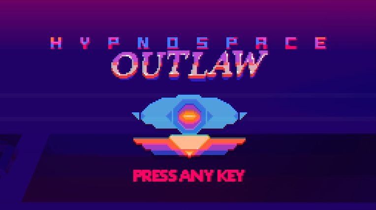
This original logo was whipped up in about 30 minutes and is pretty bad design-wise. I like the colors, but there are too many of them. It looks especially bad over a light background. It also has an ill defined shape, and there's little compositional balance. The symbol at the bottom is present throughout the game,with this version being ripped from directly from the game's splash screen.
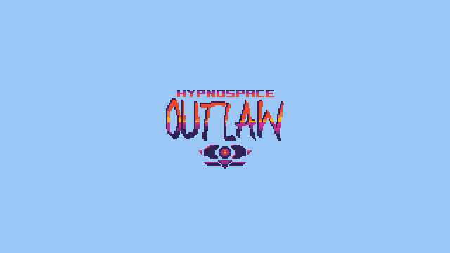
Spent a little time reading up on logos and whipped up the following design:
Dark version with the same palette, though the colors are shifted a step lighter to accommodate a dark background:
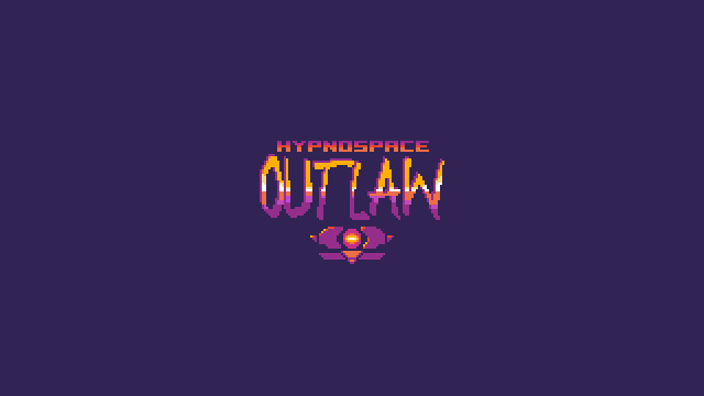
The HYPNOSPACE font remained (though it was ensmallened a bit here) because it was used in the first Hypnospace game (here), and the OUTLAW was changed to feel more wild. The spacing was adjusted so that the shape sort-of evokes a Superman 'S' diamond vibe. The symbol at the bottom was reduced to its basic elements and no longer dominates the logo.
The palette now consists only of colors that are repeated in the game itself. Gold, fuchsia, and powder blue appear consistently throughout. The shape is also easily recognizable with detail removed:
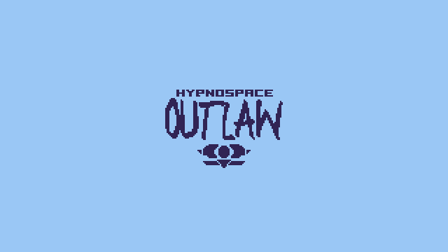
A vectorized version of the logo would work just as well as the pixelly one. It could still change, but I think this one is gonna stick. I'll be animating it in a future post.
Profile
