Devlog #2 The dark side of delayed turn based system.
Previously I talked about the positives of the delayed turn-based system, now let's see the negatives, and how I tried to solve those.
Let's talk about the elephant in the room. Compared to a traditional turn based game, the player will need to keep in mind not just what is happening right now, but what will be the situation when their action resolves. It is a lot of extra information, what the player needs to be aware of, yet not be overwhelmed by it. This was actually kind of a problem in Final Fantasy Tactic, from which a lot of motivation from this system came from.
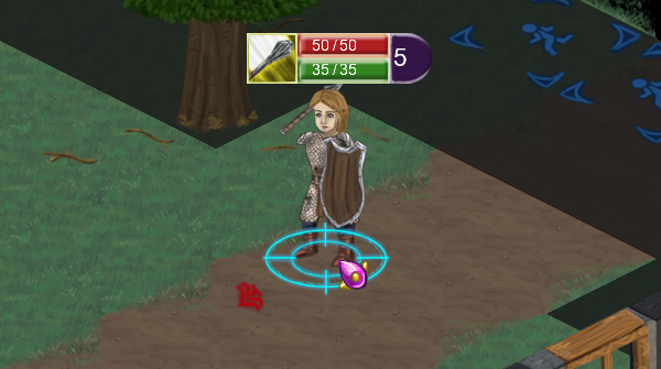
So to solve this, I needed to rethink the UI, more specifically, how we can convey this extra information to the players without confusing him/her. To recap, here is the picture from my previous Devlog:

In this picture, let's take a closer look at its hud. To the left, you can see the command the unit is currently doing, and to the right, you can see how long till the command resolves. Also, you see a red arrow on the tile in front of the unit, it shows that that tile is under attack and from where.
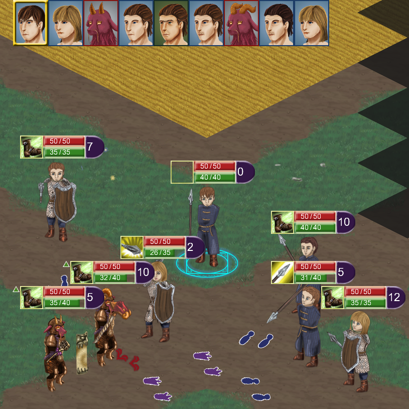
This worked in the beginning, when we had only simple attack commands, and only had a few units on the screen. But in a busy combat screen like the below example, things got confusing very fast, especially for a new player.
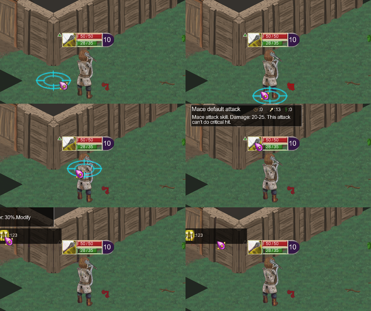
So, we started to filter out only the relevant information to the player. First, if the player has a command selected we only show the hud for the active unit, which is waiting for the player command. In addition, I wanted to make sure, that the player has a very easy way to access to any relevant information as fast as possible, without any extra mouse click, so I started using hover over as an important way for the player to gather more information. As such, the other unit's hud only appears if the player hovers over them. Also, take a look at this gif, how much extra information the player can gather with a simple hover.

The first thing you can see is that if the player hovers over a unit that is attacking, the actual attack arrow on the ground changes (also, if something would hide it, it would pop up), to make it clear which arrow belongs to this unit. Then the next thing that is happening in the gif, is that the player hovers over the skill icon, to get a detailed description of the skill which the character is doing. Then the last thing that's happening that the player hovers over the green up arrow (meaning the character has a positive skill/status effect) he can see those effects icons, and hovering over them shows a description of those effects as well.
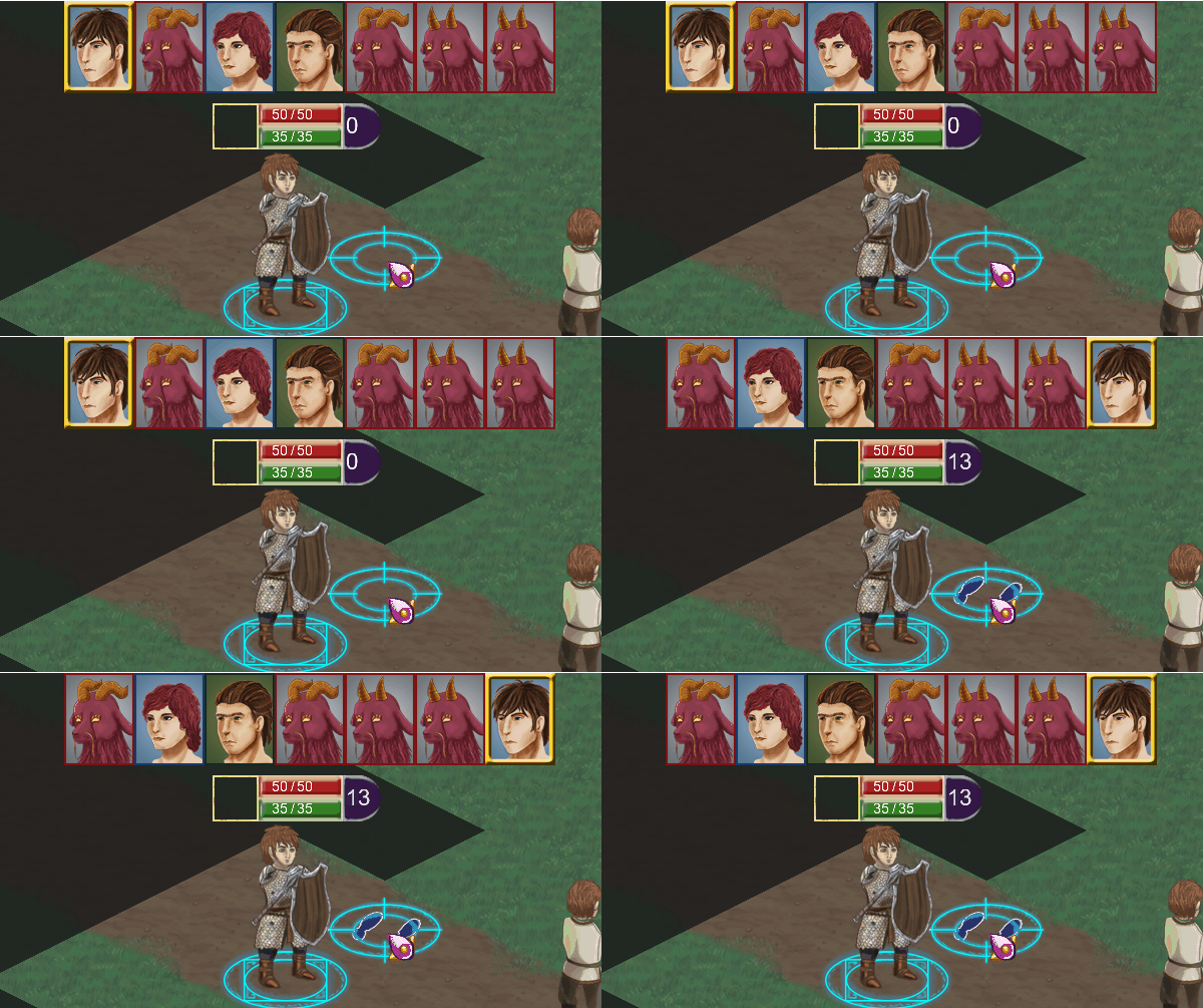
Another small thing that was useful, that every action require 2 clicks. One click to select the location, then another to confirm. It is helpful for the player, as he can correct a misclick, and in addition, we can show a few extra informations when we know the exact location of the command, for example, when the player will come again. See the example gif

After we put all of this into the game, our (albeit very small) playtesting showed the players could finally concentrate on playing with the system, not taking a bunch of time to understand what is going on the screen. Of course I'm very excited to see what the bigger community thinks when they get their hands on it. In case you want to try it out yourself, you can wishlist the demo here.


