Fonting is hard.
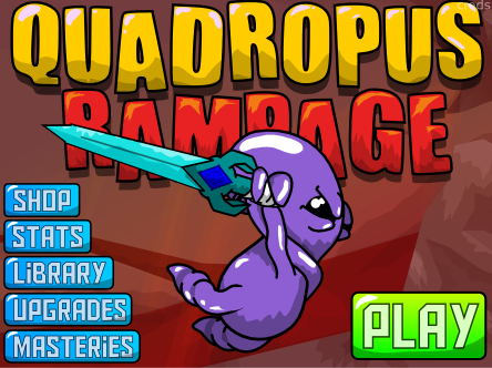
We finally managed to find a font that aptly gives Quadropus Rampage some more character while keeping to the simple vector style graphics. All it seems to have taken is some jumbled letters and BLAM! Off to the menu races.
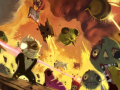
Once all the effects are in it will look as though he's skydiving, the background shakes slightly and a flurry of detritus blows upward. Plus! He'll have a nice angelic glow. BECAUSE WHY NOT.
If you've got any feedback on it we'd love to hear it. My personal stretch goal with this game is to make UI's that are more internally consistent. So far, following a few rules I literally wrote out to constrain myself, I've managed to keep the in-game and main menus similar in feel.
ONWARD! TO UPGRADES!