Hey guys, Fatih here. I am the artist working on Imagine Nations. Today, I will be talking (or writing, rather) about what went into creating the look of the game so far and why we went with this particular look. Voxel worlds and sandbox games just are perfect for each other. A great example of this is Minecraft and people calling it "digital Lego's". So naturally, from a game play standpoint, working with cubes just made sense.However.. As the artist I am, I always think something can be improved visually and taken to the next level. A popular approach is to use pixel art textures or vertex colouring, but I felt we could expand upon this visual style.
1
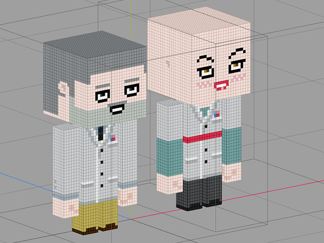
1. So what I did was to try and make it look and feel more organic, more alive. For example all characters, props, objects, etc., even though they have a blocky base, are curved and rounded up a bit.
2
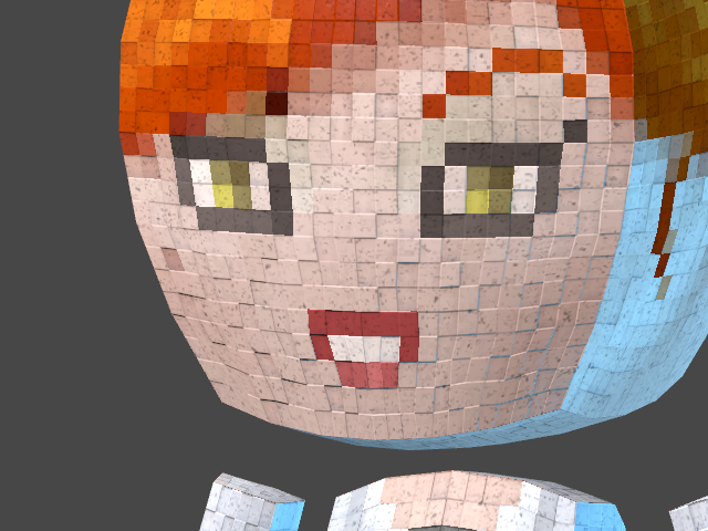
2. Instead of just using the simple "cube" or pixel look, I wanted to take it a bit further, make use of all/most of the basic tech that is used in modern games. I did this using normal maps and overlay textures. For example if you look at an object from up close, you will see some detail, that you normally wouldn't see on a pixel/voxel.
3
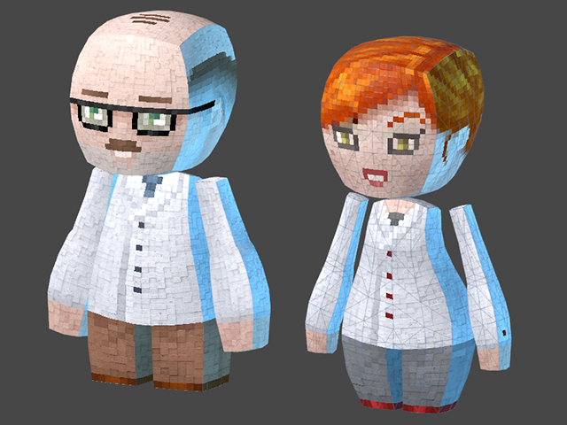
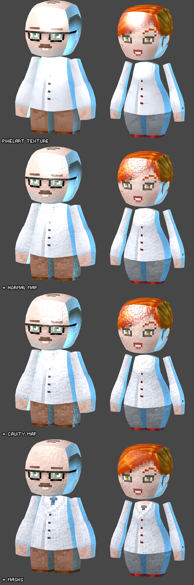
3. The use of normal maps also allowed us to optimize the models. Instead of using a block for each "pixel" (see image 1), we could have a standard game mesh, but still retain the "built from individual blocks" look (see image 3).How the base shader works is as follows
- We have a standard Pixel art like texture, to fit with the theme of cubes/voxels.
- A normal map is used to really make the pixels look like they are individual blocks.
- A cavity texture is used to further enhance the effect of the normal
map, separating the "pixel blocks". A cavity map is a similar to baked
in Ambient Occlusion. - A masks texture is utilized, to overlay details onto the model. This
allows us to not simply have each "pixel block" be a solid color, but
have them have a bit of detail as well. This texture also controls the
specular intensity. - (Note: the masks texture is basically an image file that contains 4 grayscale textures.)
4
4. Also because of something called Mipmapping, the models look really nice up close, but when you zoom out the individual blocks effect, created by the normal map, becomes less and less. This is nice because it avoids having things look grainy and cluttered on screen. Basically what happens is that it essentially switches to just the Pixel art textures. Off course this is not the most effective way to do this. Down the line, using LOD (level of detail) shaders will make this more optimized.Apart from the look of the world, we also utilize various camera effects.
For example:
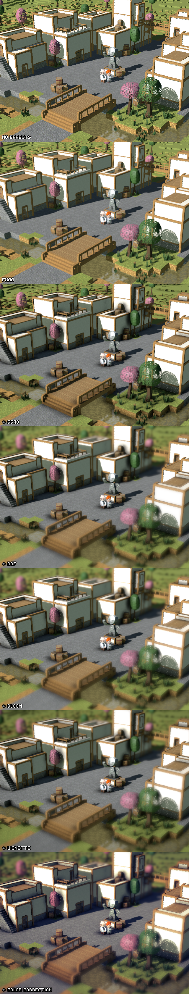
- FXAA (anti aliasing)
- Screen Space Ambient Occlusion
- Depth of Field
- Bloom
- Color Correction.
Basically most of the standard effects used in modern games today. (Note: The Depth of Field and Vignette effect in the overhead shots has been exaggerated a little, trying to emulate a "Tilt-shift"
effect. The in game camera will not have the effects this strong.)Here is a breakdown of the various Camera Effects applied to a scene.
5
5. There you go people! This is basically what we came up with from a visual standpoint.
Hope you guys found this interesting!
Cheers!-
Fatih
Imagine Nations www.imaginenationsgame.com
Kickstarter
Steam Greenlight


Very interesting article, looks like post-process effects can really improve the graphical quality of a game. Good to know. Nice work!
Thank you for the kind words. Ill let Fatih know.
I was hoping the normal mapping would look better but It makes the characters look kind of bubbly. Is there a reason why you want the characters to look like blocks with the new models? I think they would be perfectly cute and fine without the squares.