Tomorrow, we go to Future Publishing!
For the last few days, we've been responding to your feedback on the backgrounds. But first, an important decision - white or green?
YOU decide! Vote now!
I've actually really enjoyed having people vote on this: we'll publish the results soon. If there's anything else that's similar to this I'll throw it open to the community as well!
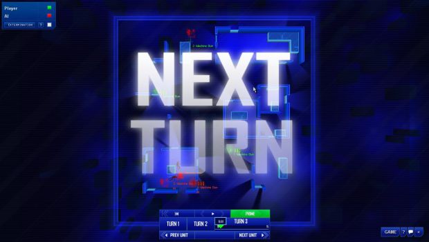
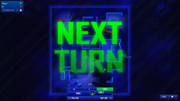
And now, our response to the backgruonds. We decided, partially based on your feedback, to change direction with the background and go for something based on deeper blue, subtler lighting. I have to say, I had always planed to pare the backgrounds down a bit, and that's precisely what I think we've accomplished. This look is really nice: I hope you guys like it because this is the way we're going now!
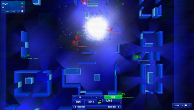
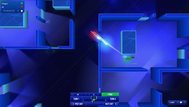
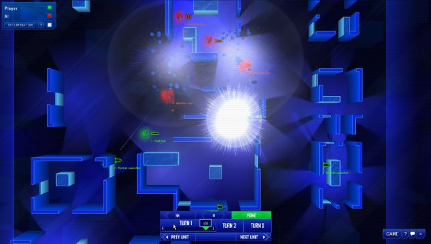
The shifting lights give it a nice feeling of motion (video soon), while the atmosphere is retained. Very happy with that!
Wish us luck tomorrow - a lot of journalists will be looking at the game and hopefully getting ready to write us nice previews.
Thanks for getting involved with the game - hopefully we'll end up making something that you really enjoy.
Please come and visit the Facebook page for unbelievably frequent updates.

(This button will take you straight to our IRC chat room where you can talk live with the developers of Frozen Synapse!)

(Please track our updates! We try to make each one as amusing and informative as possible. Remember, don't click this button if you are already tracking - it will make you stop tracking! This is the opposite of what we want!)

(If you join our mailing list, we will use it only to send you important Frozen Synapse and Mode 7 Games updates. These will be very infrequent and guaranteed to be interesting! We will never, ever give or sell your precious juicy email to any naughty people - promise).


Looks really nice. Absolutely love your visual style. I voted for white.
Thank you!
I vote for WHITE !
and im still tracking this game, good thing this game gets updated every day just so it won't look dead :D
when its released im totaly downloading it.
Cheers mate - good to see you around a lot on here.
Looks great, deffs white :)
Ta!
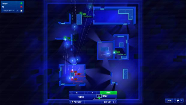
Too voted for white. Those large messages immediatelly gave me a digitalgasm when i first saw them. They describe the mood of the game more than anything else i've seen. I do however think that they need to be a bit pared down, slightly smaller fonts (but not too much) and perhaps higher transparency (again, but not too much).
Thanks Lyx - we might tweak them but TBH I'm pretty happy with them at the mo and there's LOTS of other things that need tweaking!
I voted for green.
A rare fan of green! Thanks for voting.
White, looks much cleaner that way.
Cheers - not too late!
White looks much more clean. How did today go?
Our demo yesterday? Very well thanks! Coverage should come out soon in Edge and PC Gamer.
White is my vote too (sry if late).
Thanks!
My vote's for White. It's a better fit for the UI.
Though, you could have the color of the "NEXT TURN" dialog correspond to the color of the next team.
Both teams plan their turn simultaneusly and the consequences too happen simultaneusly, so there is no "next team" :)
Yeah a LOT of people don't realise that you are always the green team...that's what happens!
Well, white is kind of a neutral color, so, doesn't matter wich team colors you've got if it's just for the HUD and stuff, generally.
...I voted white. =D
WHITE IS THE WINNER with 74% of the vote! Thanks everyone.