Skelattack will have a lot of NPCs hanging around! Each one will be different from the last, whether in the type of creature they are, or just general personality. This gives me a lot of freedom.
Here are some important things I must consider when designing for this game:
Simplicity
While it’s a nice daydream to design a character with 50 spikes on his back, a forehead tattoo, ammunition belts strapped to his chest, a nose ring, and a golden belt buckle with a clever slogan on it, you must keep in mind the final size of the character on the screen. Although it’s an interesting design idea, reducing that down to a sprite that’s 100 pixels tall leads to a ton of readability issues and will just look like a mess. That rule will not be true for every game, but we indies need to be careful.
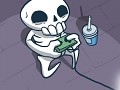
Let’s look at Skully (the main character) to get a better idea.
"Hi there!"
He’s so simple! Keep in mind, simple does not equal boring. I set out to make a recognizable character who is also interesting to look at. Large facial features allow me to easily show his emotions to the player even when he’s shrunk down for the final game.
His arms and legs are much more simplified than an actual skeleton, and this was by choice. It makes him easier to animate as well, and Skully has more animations than any other character in the game!
[ The design ideas I'm using here are also present in the world of advertising. Think of some of the most iconic logos of the last few decades: Nike, Apple, McDonalds, Pepsi, Playstation. They are incredibly memorable due to their simplicity. These brands must be able to display their logo on a billboard or on a tiny business card without loss of quality or legibility. These same concepts can apply to character design. Of course, no rule is carved in stone and you must do what's right for your project! ]
Outlines
As a young artist I would outline EVERYTHING in black. There’s nothing wrong with it, really. As I learned more about color I decided to drop that approach in favor of color-based outlines. A book shelf will have a dark brown outline, a stone statue will have a dark gray outline. I do this with everything in the game now. It’s a little extra work to touch up all the outlines, but I really like the end result. It makes the graphics a bit softer, and really seems to tie all the characters into a scene.

Shapes
There are no limits here! When making concept art for Skelattack’s characters, pretty much any shape/size you can imagine would have some value as a character. This really comes in handy with the various skeleton characters: change the shape of the skull to be more elongated or have sharper edges, increase or decrease the height, change the shape/size/location of the eye sockets, etc. There are so many variations to be made, and it can be fun to get out of my comfort zone and create some truly odd characters!

Have fun with it!

Props/Clothing
Outside of the shape and dialogue of your character, I use props and clothing to tell a non-verbal story. A particularly gentle rock character has a flower growing on his head to exaggerate his gentle nature. An exploring skeleton has a sun hat and backpack to show that he’s ready for adventure at a moment’s notice. Any props I add will be simple, but easily recognizable. Take a look at this jolly fellow below. As mentioned already, the flower on his head gives a gentle touch. His wide body, wide-set eyes and soft smile give the feeling that he wouldn't harm a fly. If this character were not made of stone, he'd essentially be a large teddy bear!

"I want a pet cat."
Character props can also reference furniture that belongs to them in a particular scene. Here, we see a rather depressed skeleton drinking something with a high alcohol content after greeting the wrong end of an arrow. A solitary candle lights the area. His props reinforce his current mood with subtlety. He doesn't say, "It really sucks that I have an arrow in my face...time to get drunk!" He doesn't need to say this awkward bit of dialogue, because his props say it for him. We are free to have him say other things.

Paper vs. Digital
Obviously, Skelattack is a digital game with digital assets. But many of my ideas start on paper. I can carry my sketchbook with me all over the house and out into the world, and sketch as I please. It’s very informal and fast, which is what I prefer when ideas start forming. Once I have some things that I want to work with, I’ll scan the page and take it right into Photoshop to work on it further. Depending on how well-formed the idea is in my mind, sometimes I hop onto the computer and start concepting there. Being comfortable with both mediums is crucial to my workflow, and now I can work on Skelattack no matter where I am in the world.

A page from my sketchbook.
At times, I prefer paper as it keeps me on my toes and forces me to be more thoughtful in my choice of lines and shapes. Other times, I enjoy the freedom to make many mistakes while working on my Cintiq. The end result is the same, so it doesn't matter how that foundation is created.
That’s all for today. Thanks for your time, and I’ll see you around!
~David


Very nice art! I love your style and can tell you put a lot of thought in to your characters.
Keep up the hard work!