No one likes talking about a game’s HUD.
Most of the time, players don’t even notice it unless it’s actively getting in the way of their gameplay experience. And yet, a tremendous amount of time and man-hours go into making them. Creating a HUD that manages to convey the tone and style of a game alongside all of the information a player needs, WITHOUT getting in the way of their experience takes a whole lot of time, patience, and creativity.
So let’s talk about it.
Depths of Sanity - our underwater, metroidvania nightmare - just entered Early Access after 3.5 years of development, and it took a whole lot of refinement to get there. One of the hardest components for our artist was the HUD, which went through many redesigns over the course of development.
Our game takes place entirely underwater, with the player character Abe piloting a submarine for the majority of the game (except for sequences that take place in a diver suit).
Bennett, our artist, wanted to use that unique concept to drive the look and feel of our HUD and all of its elements, while still conveying information to the player quickly and simply.
Here is how he approached it:
HUD Year One - Pre Alpha
The first HUD I made was designed to look like an old green monochrome monitor, as if you were reading the information off of the sub's screen. The concept was to make it seem like a “cockpit” view of the submarine’s vitals, and it was something that we tried to maintain across versions as it evolved.
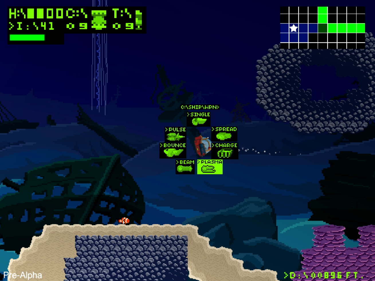
One of our earliest story concepts had the ship’s computer as a villain, so we kicked around the idea of messing with the player's HUD as part of it. This lo-fi, almost DOS-like version allowed us to mess with the player in a lot of ways, allowing the computer to send you messages in the text of the HUD and override any of the information you were seeing.
However, we ultimately moved away from that story concept, and by extension, this HUD, which was visually dull and stylistically harder-to-read than it should’ve been (particularly the map in the upper right). So I tried again, using a classic as inspiration.
HUD Year 2 - Pre Beta
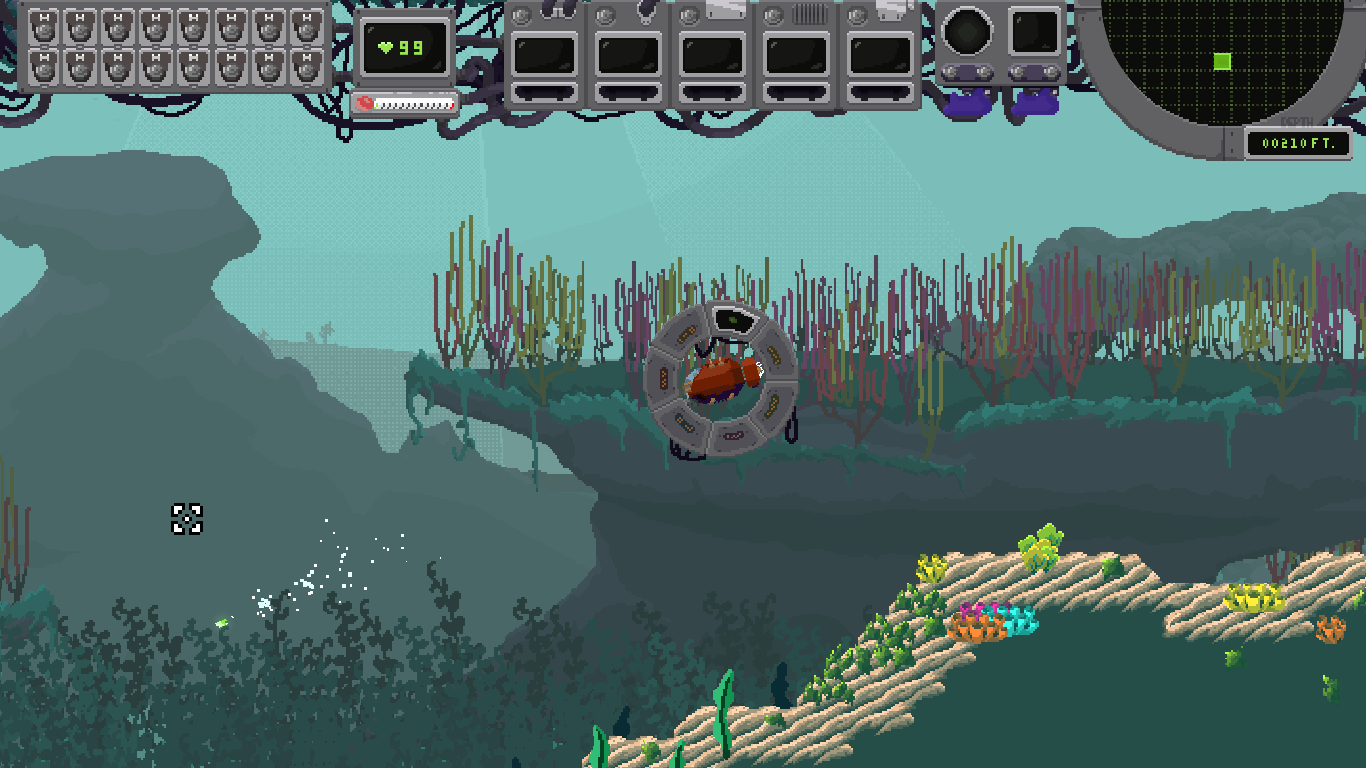
The second major revision lifted heavily from Super Metroid as a guidepost. The current version still largely follows that format, which helped me to focus and clean up how we showed important information to the player.
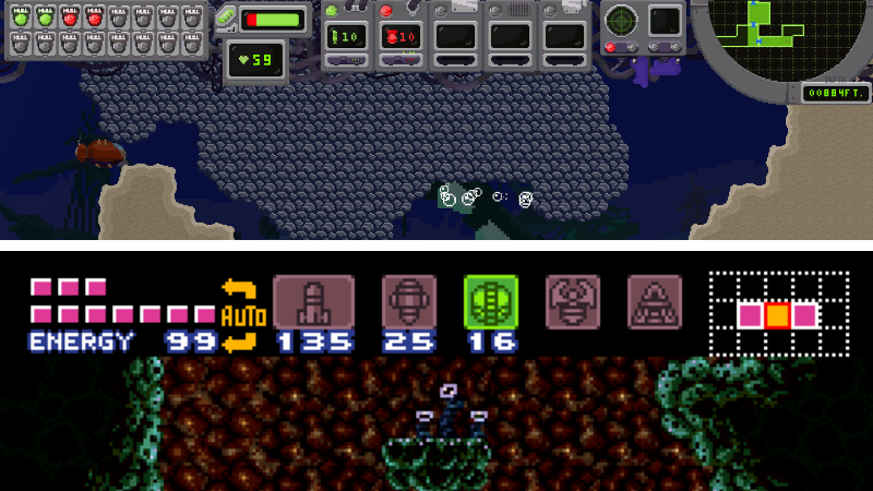
One of the things I wanted to do was have a full HUD from the start, but with many of the indicators not working - i.e. the empty cartridge slots, closed switches, etc. I thought it would be a cool way to build anticipation for what kinds of weapons and abilities would fill it out over the course of the game.
This build of Depths also had an additional HUD at the bottom of the screen that indicated which primary weapon was currently equipped. Some of them even had special animations that would play when the weapon was being used.
While I definitely liked this HUD from a pure artistic perspective, we wound up moving away from it. The lower portion took up too much screen space and was quite busy, limiting the player’s field of view without providing need-to-know information. Also, it was kind of redundant with the weapon wheel.
Speaking of which...
The Weapon Wheel
The weapon wheel went through multiple visual iterations during the first version of the HUD. The original concept was a drop down menu system, like you were finding and running a DOS program on a computer. Admittedly, I liked it a lot stylistically, but it was way too cumbersome to actually use.
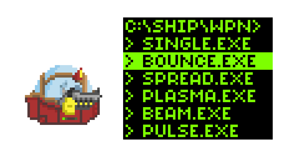
Sanity prevailed and we eventually swapped to a wheel format, but we were still using words to select the weapons, which was both unattractive and didn’t make sense with how the look of the ship was evolving.
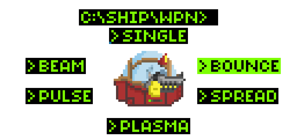
Early versions of Abe’s ship had a gun on the side, and the gun would change based on the weapon selected. In this version, we used green silhouettes of those weapons instead of words for V3 of the weapon wheel ( you can see how this looked in the very first screenshot at the top of this page).
However, the look of the ship changed dramatically over development, eventually causing us to remove the visible weapon changes for a variety of reasons. The final change came our Early Access HUD.
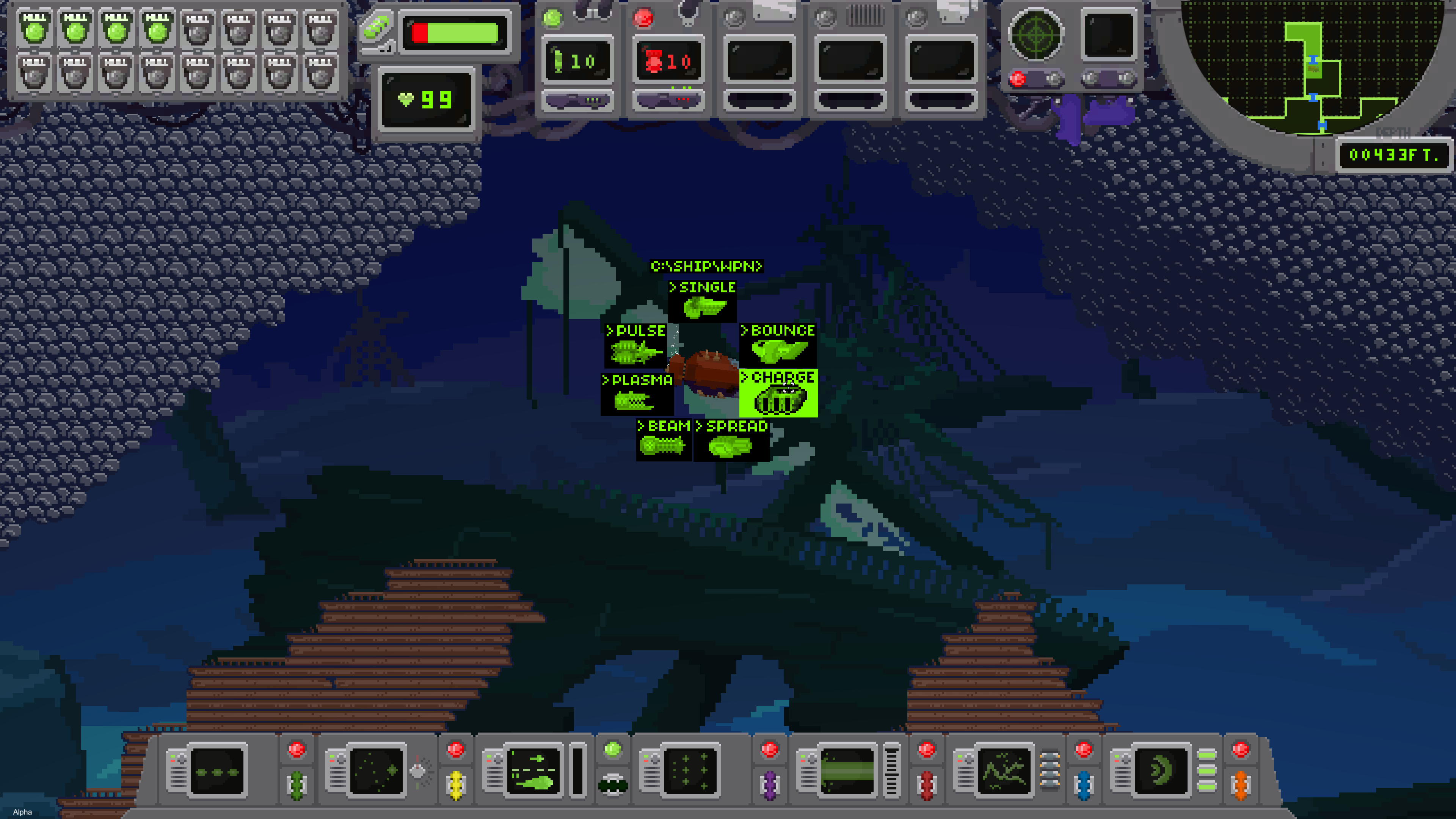
HUD and Weapon Wheel Year 3 - Current Early Access Version:
This year, we wound up simplifying the HUD and the weapon wheel significantly. The wheel was paired down to simple icons to help you determine which weapon you were using (for instance, in 2nd screenshot below, we use a “bouncing ball” icon for the Bounce Shot).
The overall HUD also got a lot of nips and tucks. The biggest was that we peeled away the bottom portion, freeing up space that we could use for different purposes as needed, such as revealing your oxygen gauge when you leave the ship, or giving more room for dialogue scenes.
Up top, we added a temperature gauge for the section of the game involving heat (previous players were confused about how the mechanic worked), expanded the edges for wider displays, and moved a few things around in order to better organize what remained.
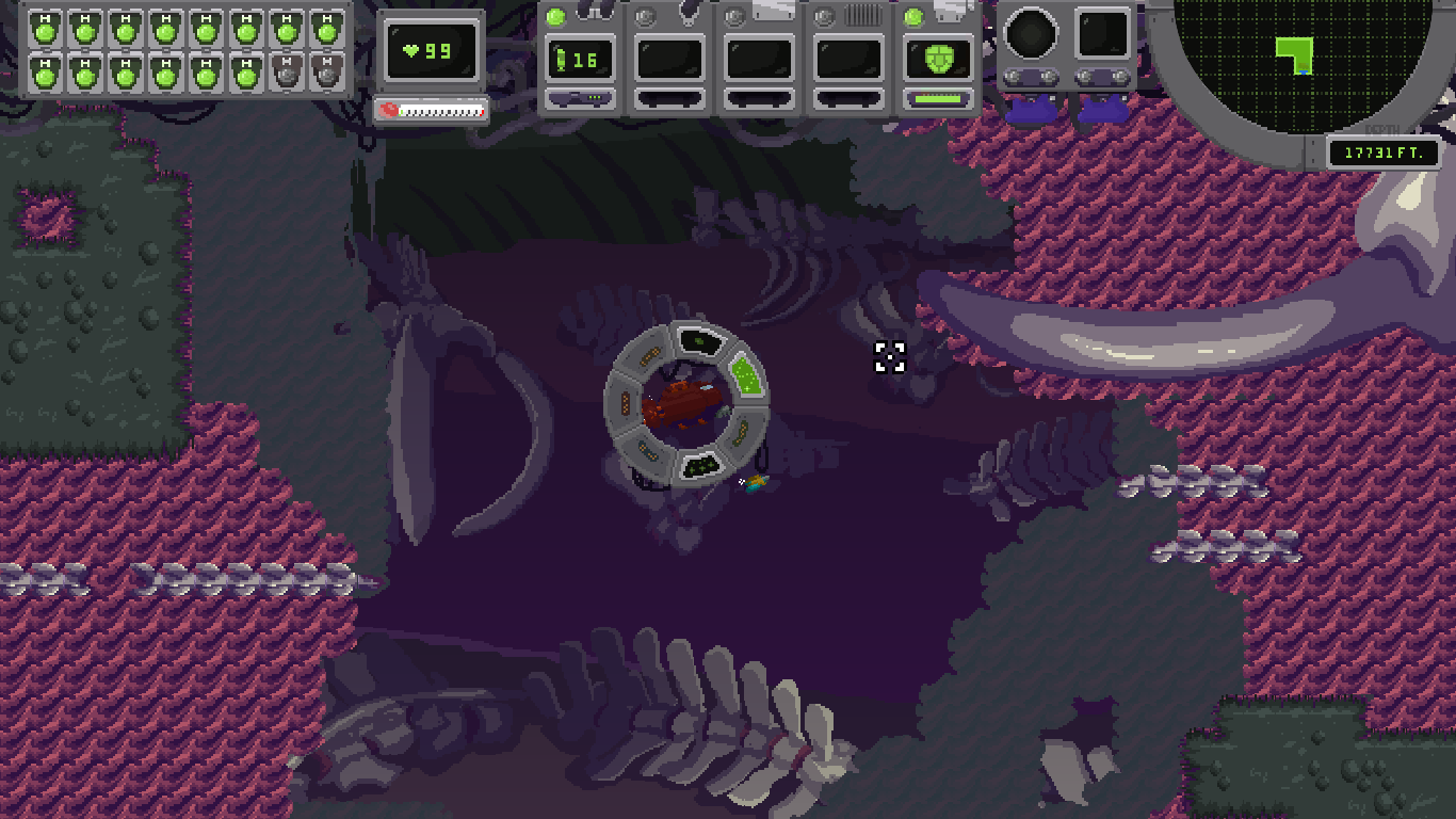
I’m definitely pretty happy with this final compromise. This current HUD gives the game it’s own unique feel - keeping the idea of having a “cockpit” view of your vitals - while being much more useful and visually interesting.
Early Access
Now we’re in Early Access, and while the team is happy with the design, we’re still adding tweaks as people play through the game and give us feedback. It’s been a pretty enlightening experience to have players finally being able to sink into the game for hours and help us tailor it for the eventual full release.
If you’d like to help us, you can get your Early Access copy here. Right now it contains the first 3 chapters of the game (out of 6), with Chapter 4 dropping in a few months.
Thanks for helping us, and we hope this gave you a bit of insight on how to arrive at a HUD that works for your indie game.
