This post is reprinted from here.
Feel free to follow us on Twitter and like us on Facebook
Hey gang! How’s your week been?
Ours has been really busy! We’ve been concentrating hard on how best to display information to the player within the game.
As you might or might not have noticed, we don’t really like to pat ourselves on the back here at Coffee Powered Machine, or give ourselves too many compliments. We really try to avoid it.
…But having said that, at the risk of sounding a bit pretentious, we have to admit something: we are trying to make something pretty new and unique here. Nobody has made a game quite like Okhlos before. Even though you may gather up a lot of people like in Katamari Damacy, or you may control a lot of units like in Pikmin, the similarities end there. Our game is fundamentally different.
As such, we don’t have a lot of examples to follow or existing parameters to use as guides. This has made Okhlos hard to develop. Very hard, actually.
Every new step we take is a step we have to test, gather feedback on, and see how well people understand it.
It’s very much the same process when it comes to displaying info in the game. It’s easy enough to show a ‘nerf’ status ailment on a character or even a few characters – but it’s very hard to display it over 50+ units without it looking horrible. Sometimes we try to display information as a Real Time Strategy (RTS) game would and that’s hardly ideal. Okhlos isn’t an RTS game, it’s pacing is fast and dynamic where an RTS’ is methodic and plodding. It’s almost the complete opposite. So we’ve learned to handle each piece of info on a case by case basis, always looking out and checking for a few things.
For example:
- It has to be a visible effect – you gotta be able to see it. Can you see it?
- You need to know when the info or the effect is still relevant and active and when it’s not.
- It can’t block or cover too much of the screen – you need to see where you’re going.
- It can’t be a dominant color, that’s too strong.
- Etc., etc., etc.
- And so on and so forth…
There are a lot of “rules” that have started to emerge from the systems we’ve created and the ways in which they interact. They’ve become our own little mythological monsters and we’ve got to wrestle and defeat them just as the mob would. (Mob pride!)
Take the following for example:
Aegis Shield
The Aegis Shield is an item that gives your mob invulnerability for a certain period of time. (Don’t ask me how long. I honestly don’t know. I’m the artist, the creative visionary over here. Ask Sebastian. He’s the numbers guy.) While the item’s taking effect we somehow have to display invincibility and let the player know intuitively that the item is working. We have to use a color, a graphic effect, or something of the sort, and we also have to show when the item is beginning to wear off.
When we first created the time, Sebastian quickly did some placeholder art and that tided us over for a while, but when I later had to take on the task myself, the first design turned out something like this:
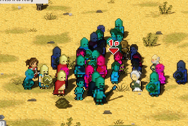
And here is what it looked like when the effect was wearing off:
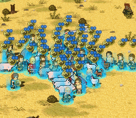
As you can see, the effect is very obnoxious and covers up most of your mob, making the units hard to see. It’s definitely less than ideal. The symbols we used weren’t great either. They’re a shield and two plus signs, which aren’t very legible or easy to interpret. They got in the way and just bog things down.
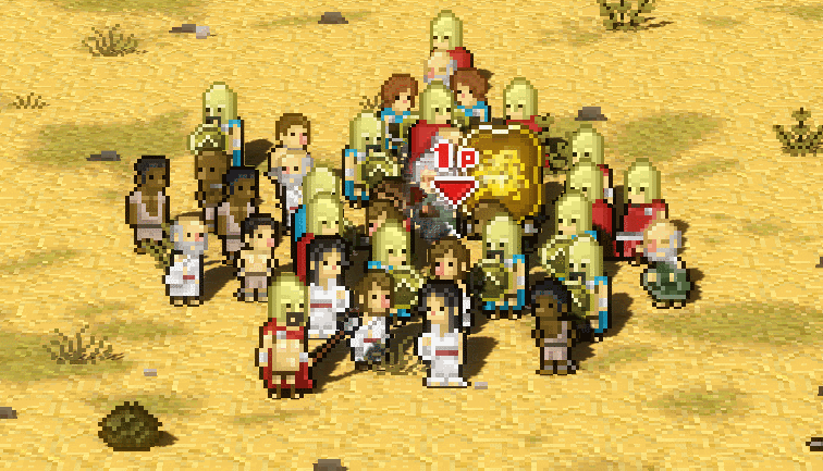
So, in the end, we decided to take look at the classics and actually ended up using the effect Sebastian had originally come up with as a place holder. It just goes to show. You never know just what ideas will stick in development.
This is what it looks like:
This is how it looks when it wears off:
The effect I designed was a little clearer about when it was wearing off, but for the most part, Sebastian’s design simply feels better. The one big drawback is… well, that we’re half-tempted to add a ~certain~ little tune to complete the retro vibe and just make it stellar! (Wink wink, nudge nudge, know what I mean? Say no more.)
(Yes, I’m afraid we might just have a very juvenile sense of humor here at Coffee Powered Machine!)
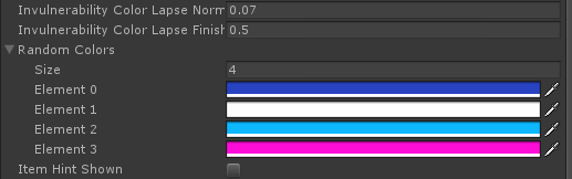
Sebastian was kind enough to make a color editor for me, so I could change around the colors of the invincibility effect without having to venture into the dark depths of hexcode:
What do you guys think of the effect? Too retro? We’re still pondering it over and are very open to suggestions. Let us know what you think!
And as a last note before we go, a little word of caution – NEVER dismiss a programmer’s placeholder art until you’re ABSOLUTELY POSITIVE you’ve made something better. They might know something you don’t. (As much as one might hate to admit it.)
Catch you guys around next time! Like us on Twitter! Follow us on Facebook! We might not know how to use all this new-fangled social media, but we need your good old-fashioned love!
This post was written, poorly and misshapen, by @roketronz, and soundly beaten into shape by @pfque_ .


Cool approach and improvement. Nice update! That was a cool read.
good update and a positive direction for the invincibility animation i think. :)
Thanks for all the comments! Very cool feedback! I think we might have to work a little more on this effect.