This post originally appeared on the Voltic Blog
So far, we haven't actually talked about the menu systems of Proof. They're actually very important to the game, but we're trying to minimise spoilers as much as possible. However, we've decided that given the recent work we've done it's probably worthwhile sharing some of the details with everyone.
Old Menu
We've had an "item" menu in Proof for some time now, but we didn't _actually_ show it to anyone. So, here you go:
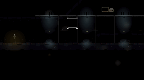
So, you might be able to work this out, but I'll explain it anyway. Basically, in Proof we have an item building mechanic. Nothing quite like the Minecraft style system, and (in my opinion) somewhat more intuitive. Basically, the player has one "item" equipped which is visible in the top row. This can be the combination of 1-3 parts which are visible in the second row. Each of these parts can be one of 8 different parts the player finds in game. These parts sometimes work individually, but can also be combined with one another. I'm not going to explain any combinations, since a large amount of the "puzzle" side of the game comes from these.
Issues
So, there are a few issues we identified with this old menu system (I'm sure you can think of more):
- The old system had an implied ordering to the three part-slots
- This is misleading as the parts can be combined in any order
- The selection grid for the 8 different parts is fairly confusing when the player has not discovered all the parts
- The blank center spot in the selection grid is how the player removes a part from a slot, which is pretty unintuitive
But, overall, the biggest issue for me was that the code was horrendous. The original menu was one of the first things I wrote in the game, and I was still fairly new to Flashpunk and AS3. At this stage, we've written a lot more library code that simplifies menu design massively. Overall, the original item menu clocked in at 720 lines of code. Now, I am a big believer that linecount doesn't _really_ mean much but that is quite a lot for a single screen. On the same note this wasn't great code, I've learned a huge amount over the course of this game about structuring applications that I had no idea about at the time.
If you'd like to see the original file, I've uploaded it in a gist here.
New Menu
So, in what some may consider a bold move, I decided to rewrite it. This was a big decision, as the original menu took me a couple of days to rewrite. Additionally, as we all know, rewriting code is a slippery slope. You can easily rewrite your entire application. Spoilers: it only took me a few hours.
Planning
Sadly, I don't have my original sketches for the redesign. Our first thoughts were that we would keep a similar layout but replace the grid-selector with a circular one, as you can see below:
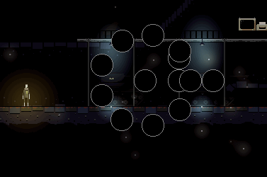
This was mainly to allow us to have a variable number of parts available to the user, and to remove the confusing "centre-of-grid-empties-a-slot-for-some-reason" interaction.
Implementation
Throughout the course of the game's development, we've built up a pretty solid framework on top of Flashpunk. This is tentatively called Volticpunk.
Volticpunk provides a lot of functionality, so I'm only going to highlight the features that were most useful for this menu system.
One of the most beneficial utilities I've created is the concept of Groups and FixedGroups. By default, Flashpunk doesn't provide a way to group Entity together. This allows simple games to be developed quickly, but when creating a menu system life is much simpler when you can group things together to move them and operate on them. Our Group implementation allows one Entity to contain other Entity's or Group's. The lifecycle of these parent-child combos are tied together. So when one is removed or added to the world, all the children are added or removed. These make use of the same interface as World's typically do.
An extension to Group's is the FixedGroup, any entities added to one of these will have its position treated as relative rather than absolute to the world. When this parent group is moved, the children also move correspondingly while maintaining their offset. This is amazingly useful in menu systems and almost everything in the new menu inherits from FixedGroup.
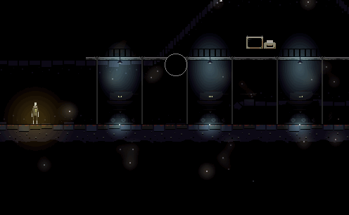
The parts menu moves with the part slot here using FixedGroup.
All positioning is also accomplished dynamically, this allows very clean layout code which relies on math rather than manual offset specification. This is done using pretty basic trigonometry, but I'll include some sample code for completeness:
for (var i:int = 0; i < ITEM_LIST.length; i++)
{
    item = items[i];
    item.isSelected = false;
    var angleIncrement: Number = 2*Math.PI / ITEM_LIST.length;

    calc = this.angle + angleIncrement * i - Math.PI / 2;
    item.groupX = Math.cos(calc) * radius;
    item.groupY = Math.sin(calc) * radius;
}
This simply displays however many items the player has in a circle surrounding the origin of it's FixedGroup.
Major Lessons Learned
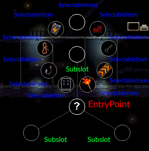
The main difference, aside from grouping and other utility methods from volticpunk, is just better design. The new menu system is built in layers:
ItemMenu
    -> EntryPoint
        -> Subslot
            -> SelectableItem
            -> SelectableItem
            -> SelectableItem
            -> SelectableItem
            -> SelectableItem
            -> SelectableItem
            -> SelectableItem
            -> SelectableItem
            -> SelectableItem
        -> Subslot
            -> SelectableItem
            -> SelectableItem
            -> SelectableItem
            -> SelectableItem
            -> SelectableItem
            -> SelectableItem
            -> SelectableItem
            -> SelectableItem
            -> SelectableItem
        -> Subslot
            -> SelectableItem
            -> SelectableItem
            -> SelectableItem
            -> SelectableItem
            -> SelectableItem
            -> SelectableItem
            -> SelectableItem
            -> SelectableItem
            -> SelectableItem
Each of these layers is only aware of the layer immediately below it. This allows very clean code design, which is not tightly coupled to any specific menu implementation. Basically, each of these layers has `open` and `close` methods, which the layer above calls as appropriate. Here's a how that maps to the actual in-game appearance:
Tweaks and Design Takeaways
So, here's a final Gyfcat overview of the system: Final Menu
After solving some of the original design issues we had with the menu we took some time to think about how to make the menu easy to use. One of the first measures we looked at for this was animation. The old design was also animated, but with a circular design the animations and timings do a lot to give the user context. If the animations are too slow, the UI will feel unresponsive and frustrating but making them too fast will lead to the user failing to understand exactly what happened. It's basically a balancing act, and we think we've arrived at something reasonable.
In the same line of thought, we added the "spokes" that join the EntryPoint to each Subslot to help visualise the rotations and linking. Originally we also used these to join each SelectableItem to each Subslot but decided it was too busy for the user to digest.
Summary
So there we have it, we identified the issues we had with the old menu, planned a design that would overcome them, iterated on the design and came up with something that I'm pretty happy with. This is a classic example of our skills outgrowing our work though, which has been a common theme throughout Proof's development. It's satisfying taking something to that next level, but a little depressing when two years later you think it's rubbish. Hopefully we won't have another two years on Proof for me to redo this again!
I think this has been an asset throughout Proof, and has helped us hold on to the mindset of constantly reevaluating our work. This doesn't mean we're always redoing everything, but it's very important to be sure you're happy with the game you're putting together. I'm still exploring ways to improve this menu even though it's "done" at the moment..!
Remember to follow us at @vivavolt and @iammonshushu for smaller updates on the game's progress!

Wow, that a nice idea for the menu!
But what will you do if you need more items in a selectableItem circle?
It's dynamic at the moment in terms of spacing etc, so the only real issue is that if there are too many options they would start to overlap. Which would probably lead to smaller icons or a larger radius on the menu..!