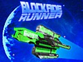
We've made a snazzy new logo that you may have seen in the latest video! Below are two renditions close up, one with a hot pink reflection, and the other with our traditional blue/pink coloration.


"Back to the Future" (one of my most favorite movies) was an obvious inspiration for the swept angles, perspective glance and overall font, and the logo for "Blade Runner" for the strike-through running through the "Runner" portion of the logo. The goal was to get a bit of 80's cheese and color while still maintaining a modernistic look, and so a blend between the goofiness of the Back to the Future logo with the seriousness of Blade Runner's we thought was a very fitting mix. I especially love the metallic reflections, very fun!
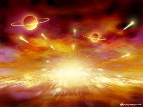
Also, the awesome explosion reflection in the logo is actually a lovely Photoshop digital painting by Ajda Gregorčič! We thought it looked plenty exciting!
Which logo coloration looks the best? Chime in here in the comments or on the forums!
- Aaron

They're all so awesome! I think I might like the first one the most though...
I'm digging the second one! They are all cool though.
Agreed. The second one has that kind of cool shiny factor while retaining the goofy colours.
Looking real good!
The Blue is great because it represents the openness of space.
Maybe a yellowish glow from behind to help it pop-out from the background starts....
Maybe that painting by Adja
last one is kool
I am a big fan of the first one. The last one is harder to read.