Hello everyone!
This time we would like to present you something a bit different comparing the previous blog posts, where we mostly talked about things you will experience in the game. For those of you who are following MOTHERGUNSHIP on our social media, you've probably seen the new artwork that we shared a couple of weeks ago. This new version was mainly designed to be used on the front cover of the physical retail packaging, and also for marketing materials such as store banners, posters, covers and advertisements. Creating the key art for a video game might not be one of the things that most of the devs will consider as their priority, but it can definitely be a key to the success of the game.

The illustration was created by our lead artist, Mergen Erdenebayar, and Tomas Duchek, a freelance concept artist and illustrator who has worked on various similar projects in the past.
When we sat down with the team to brainstorm ideas about the design, the first thing that we all agreed was that there should be four main elements that will describe what MOTHERGUNSHIP is: big guns, the player character, a giant boss, and a lot of bullets.

In the above image, you can see the first concept drafts that Mergen created. All of them demonstrate the key elements in a different way - some focus more on the player, others on the bullets and the guns, and a few on the monstrous face of the MOTHERGUNSHIP.
Since the skull was already used in our first artwork and the feedback we received was positive, we decided to continue with the same design but combine it with the elements that we liked the most on each draft. The result was the drafts that you can see below.

As you can see, the main focus of the design is on the skull, showcasing the MOTHERGUNSHIP in all her vicious glory, while the player is struggling to fight back. Then we added the colours and tried to capture the bullet-hell feel of the game - a hell with a sci-fi look into it. Later we made fast colour overpaints and choose which direction we want to go. The best option was the combination of the orange tone mixed with some colder tones as blue and purple.
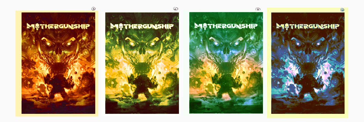


The next step was to add some extra elements such as the second player that hints to the co-op features of the game, more enemies, and some more bullets. The final step was to render the painting up to a final quality and add a few extra visual effects, leading to the final draft that you can see below.

The glowing red eyes, the ferocious face of the MOTHERGUNSHIP, the burning bullets and the smoking barrels..all of these elements illustrate the intense action that this game will offer to its players!
We hope that you will find this artwork as badass as we do, and that it will decorate the desktop of your PC, or even the wall in your room! You can find the wallpaper images in FullHD here and in 4k here.
Thank you for reading!
Personally i think that the first concept art Mergen created does show the
whole concept of what Mothergunship is all about best. But ofcourse was that a first concept and from there things grow. I like what you guys have come up with and it is great to see things grow like this,
thanks,
Leon
Hey Leon! Glad you like it :)