What is Runewatch?
Runewatch is a Single-Player Roguelite First-Person Shooter with Role-Playing Game elements for PC. The player controls an elementalist who makes use of their magic abilities while exploring randomly generated dungeons, defeating enemies, and progressively becoming a master elementalist through exploration, killing, death and repetition.
Since the basis of the game is already implemented, these dev logs will focus on polishing, as well as how we introduce and update mechanics to further improve on the challenging and rewarding player experience.
Dev log #2
In this Dev log we will be showing some UI Iterations of color and general layouts.
UI Color Study
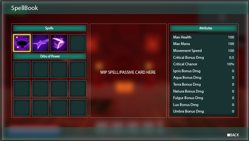
This was a very early stage of our UI, where we were trying to use colors that were related to magic or the mystical but moved away from that, into a more neutral and cleaner approach.
Started messing around with some decorations for the frames and bars, using some corners and borders with a gothic look to relate with the fantasy and medieval theme of the game, but moved away from this as it made the UI much more intense and heavier than we wanted. The center part is still just a wireframe for the finished piece, that we might cover in a future article.
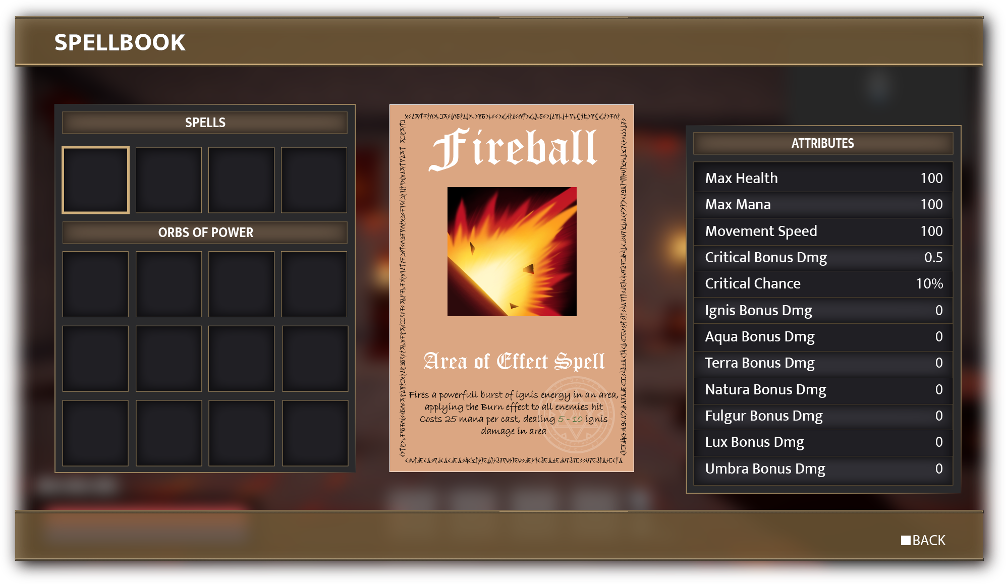
We agreed the clean modern look was the way to go, so the ornamental decorations were removed, but the colors still seemed a bit off, so we kept working on that.
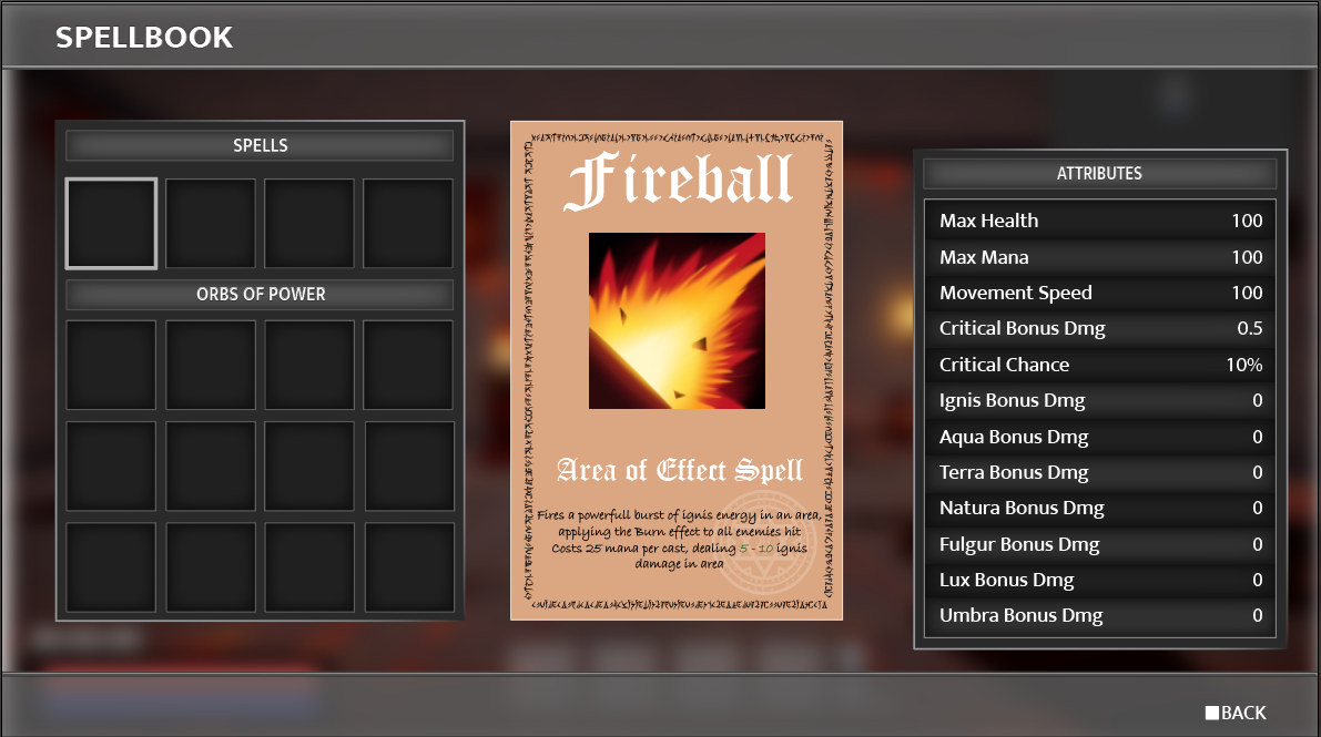
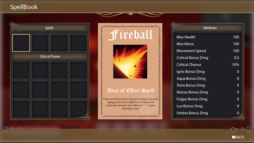
We tried to move away from warm colors to create contrast with the game environment, and started messing around with cold and neutral colors. Our latest iteration was focused on using only grayscale, so we can get a better feel of the contrast and hierarchy between elements, before exploring more color options. In addition to that, we introduced alternating row colors on the right side tab, to facilitate the reading.
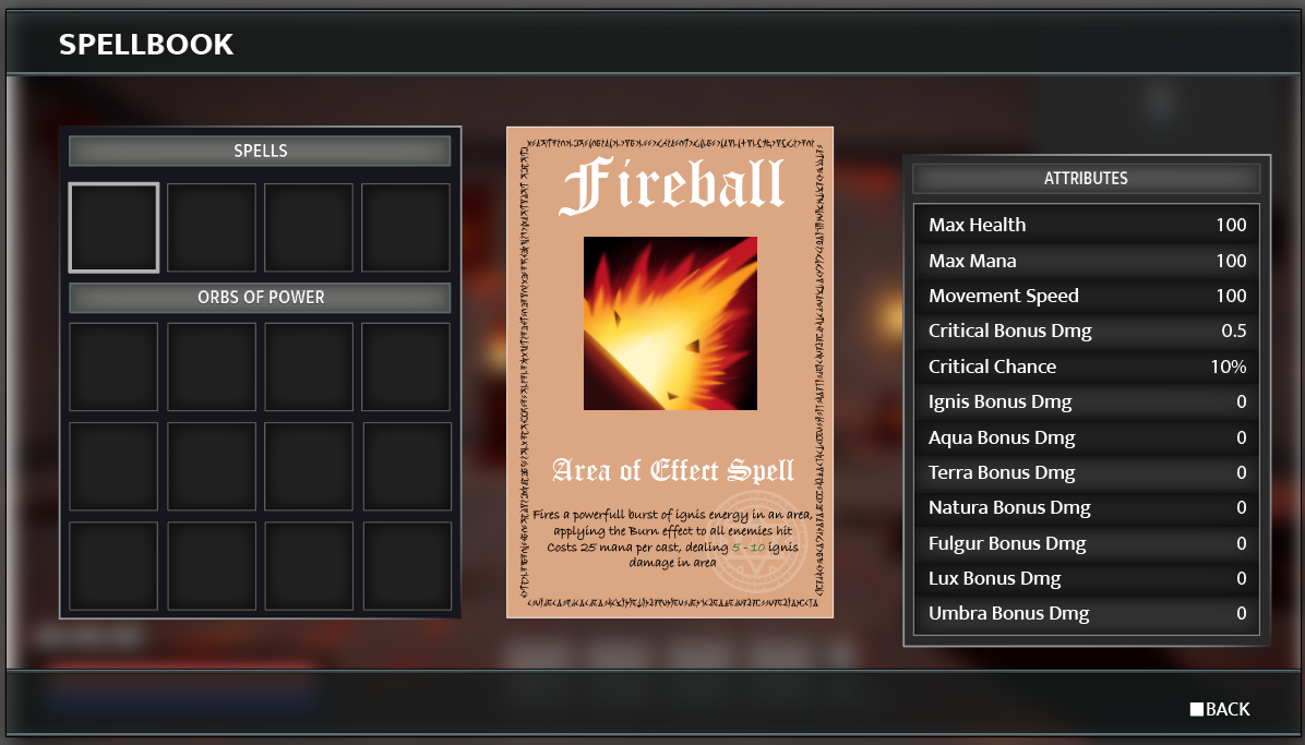
Decided to change a few tones of grey, adding darker tones, and adding some dark to light gradients in order lighten up the overall look.
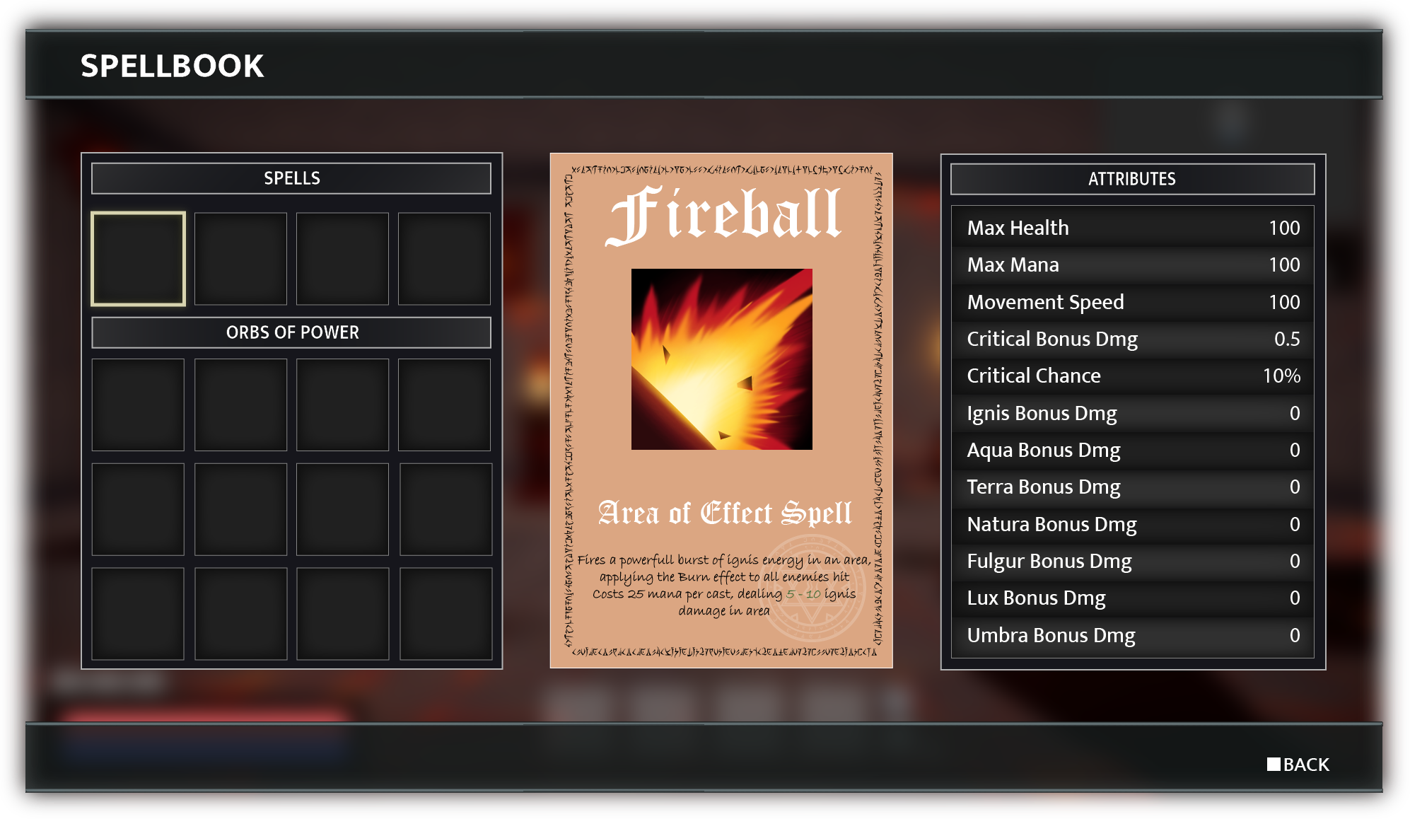
These process involve a lot of trial and error, changing just a couple colors can have a drastic effect on the overall interface, and sometimes we need to go back to previous iterations.
In Game UI
A small sneak peak from our UI in game with our spell bar.
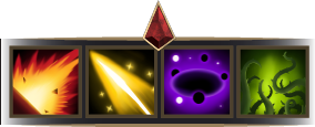
The gem at the center will match its color to the currently selected spell's element, so the player is aware of the element it is using.
Conclusion
Overall still needs a couple more tweaking and work, but its starting to come very close to what we think is a good mix between aesthetically pleasing and functional. Thanks for reading.