Ploxmons DevLog #2
- A new ingame UI & more
Hello guys, another week has passed and I want to share the progress that has been made in the game.
New UI
Most of the week has been spent with updating more of the menus. Currently I am working on upgrading the ingame scene to the new design. This does always take a lot of time since many UI elements have to be placed, correctly positioned (that's basically the most annoying job) and connected with the code. The optimisation of the UI takes a lot of time too since in Unity you can very easily build ineffecient UI that will just perform very badly especially on slower computers. Since I am partly an optimisation guy performance is a very important aspect for me and I spend a lot of time tuning them as far as I can.
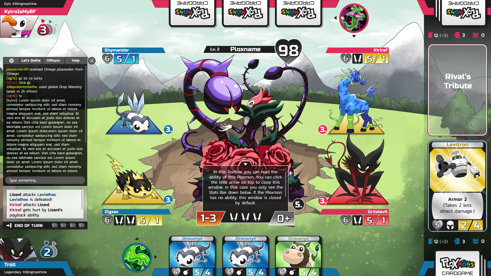
The new ingame UI. This is the battlefield of our cardgame.
Resolution Tuning
Unfortunately you can't just load images/sprites into the game engine and expect everything to work smooth and clean. That's on hard lesson I had to learn over the weekend. For a lot of time the UI always looked a bit blurry especially the text elements. I always scheduled this problem to a later point since there were more important things to do. However over the weekend the time has come where I had to fix this issues since the game looked just very badly despite of the clean UI and design.
Somehow Unity is very bad at displaying text that is scaled down a lot. This is basically everywhere the case in our game since text is always kind of small. I was able to fix this issue by replacing the Unity text elements with a better system that immediately improved the visual look a lot. However this was a very tough change since I had to replace every text element in the game (and we have ALOT of text elements).
More over that not only the text elements looked blurry in the beginning also the images where either blurry or pixelated - just not smooth as they should. After some researches I found the root of the problem: Resolution. Naturally you create game images and sprites in a really high resolution so they look good on big displays as well. However since Unity isn't able to scale down big images smoothely they appeared either blurry or pixelated despite and especially because of their orginal big resolution.
The solution I came up with was just pre-scaling the images to a resolution that fits the target resolution. With this fix Unity doesn't need to scale down the images at runtime that much.
The pros: Smooth looking images/sprites.
The cons: More effort since for each target resolution (FULL HD 1920x1080, HD 1280x720, ...) pre-scaled images must be created. Also the client has to choose the correct images based on the selected resolution which will be some effort the implement. However since this change improves the visual look a lot it is definitely worth it.
Game Queue
After all the annoying UI stuff I was finally able to spend some time on game related stuff.
Since you will be able to battle against other players there should be some kind of queue system to match one player to another. This has been implemented many months ago. However this system was not 100% done and needed some tweaks to support more than one game mode.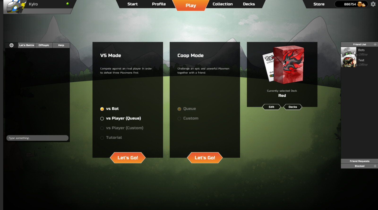
The play UI so far in which you queue up.
Also it was a very important feature for me to allow the players to browser through the menus, edit their deck, switch their avatars, ... WHILE they are in the queue waiting for a match. Some similar games (like Hearthstone) doesn't allow such freedom for a good reason: it's more complicated. The solution for this problem is an game-invite-system. After you queued up you are basically waiting for an entry to the game. If another player has been found (based on some match making algorithms) you will receive an invitation to join the game. You can now either accept or decline the invitation (and for example save your just edited deck before joining).
Pro: Much more freedom, no locking the player to one menu screen while waiting
Cons: More effort serverside, more effort clientside
Over all I am now very happy with this feature since it feels alot more clean now for the player.
Outlook
This week I will finish upgrading the ingame scene to the new UI design. While doing this some small new features will be implemented like a nice transition from menu to ingame. After the ingame scene has been polished I will probably start working on some of the monster/boss abilities again. There are still some abilities left to implement. Also more bug testing should be done.
Overall the list of Todos before we are able to release an early access version of the game is getting smaller. There are still many things to do however most of the annoying and complex tasks are almost about to be completed.
Personally my goal is to release an early access version this month and I am very confident that this will be possible.
More Insights and Dev Updates?
Join us on our Discord where we are very active!
We also have fun mini games there with our very own "PloxBot"!
Or follow us on Instagram, Twitter and Facebook!
We'd love to hear your feedback as well! Thanks so much! Smiley
Website: Ploxmons.com