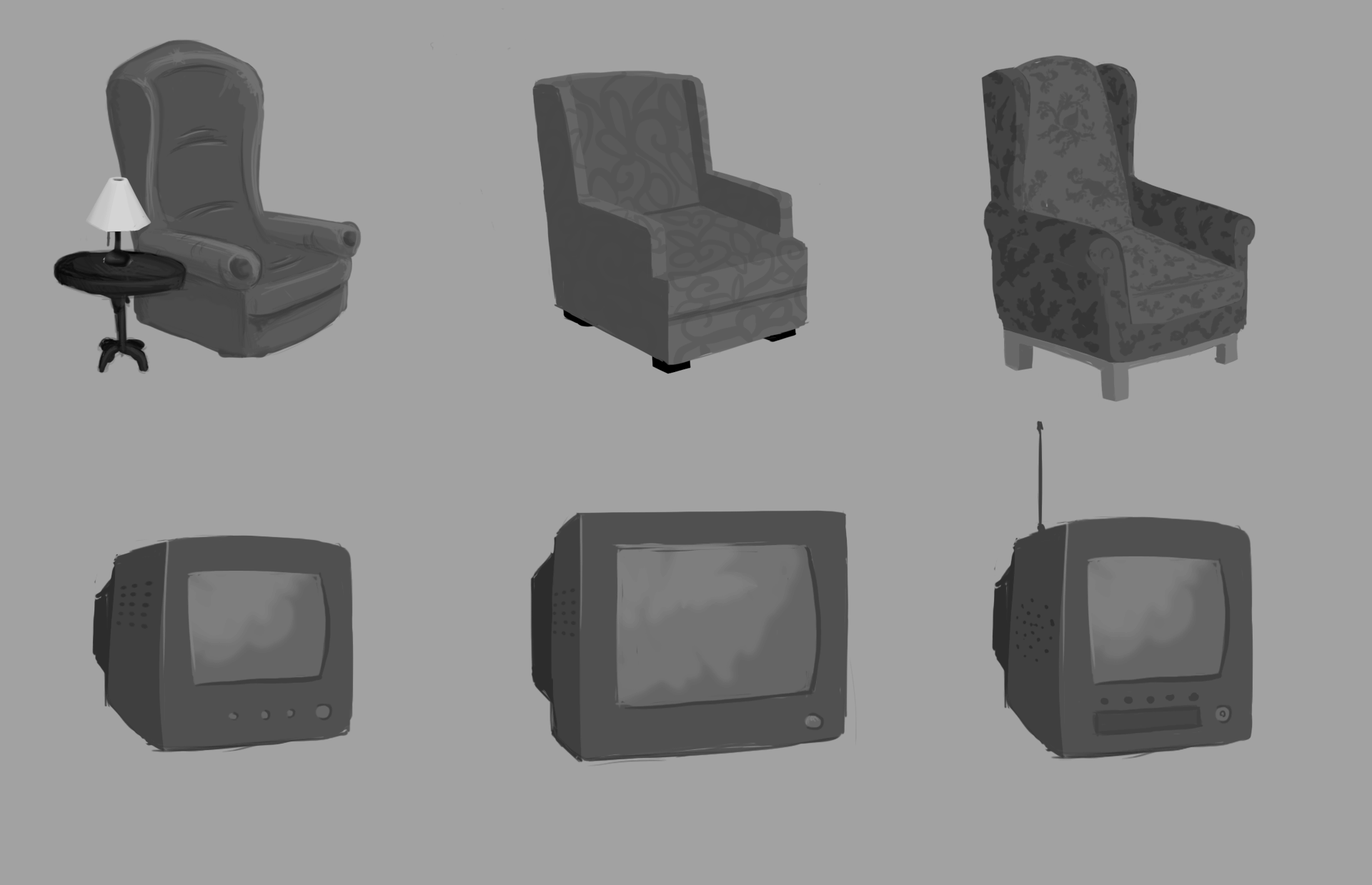
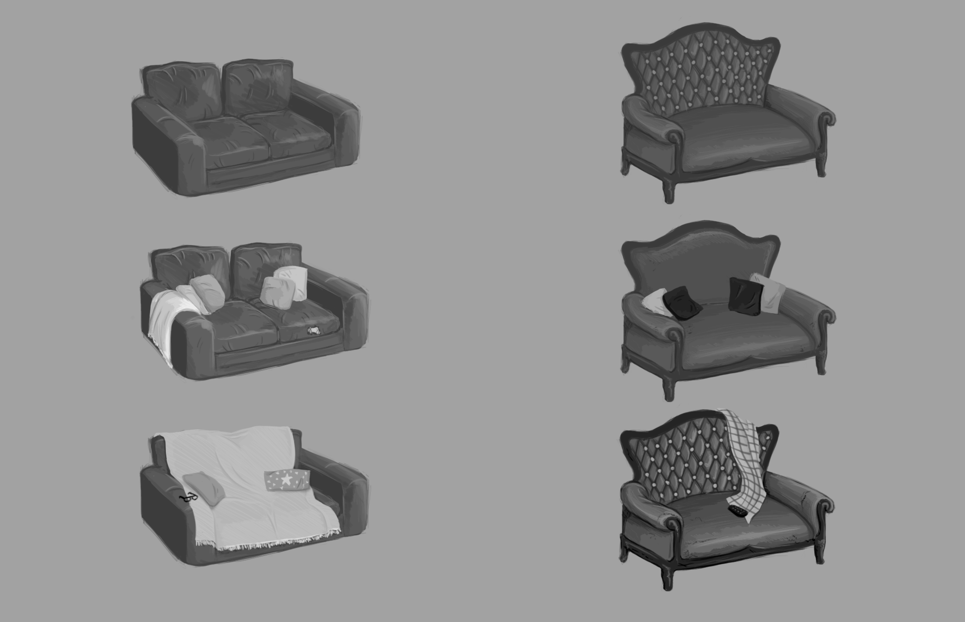
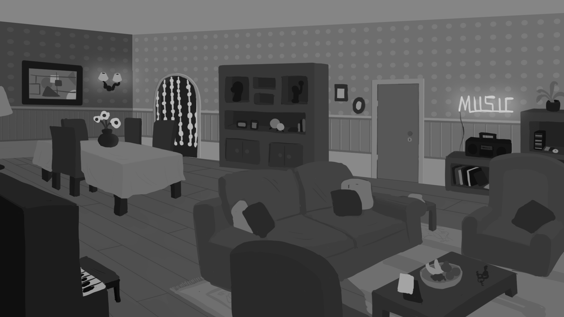
Our artist has started making some concepts for different objects on the living room as you can see below.
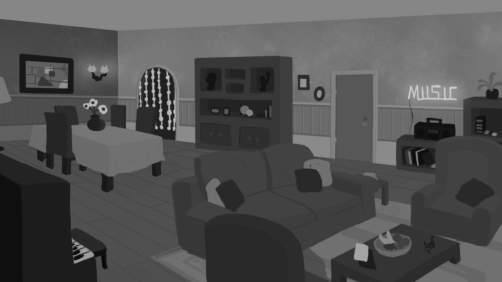
Also,we have some concepts for the furniture position on the living room of the past version of the house.
On the other hand, our developer has been making some studies for the game mechanics. This time she implemented in Unreal a system that makes an interactable object show itself when the player is close to it and is facing it. Making it easier to select which object to interact with when in a place where several interactable objects are present.
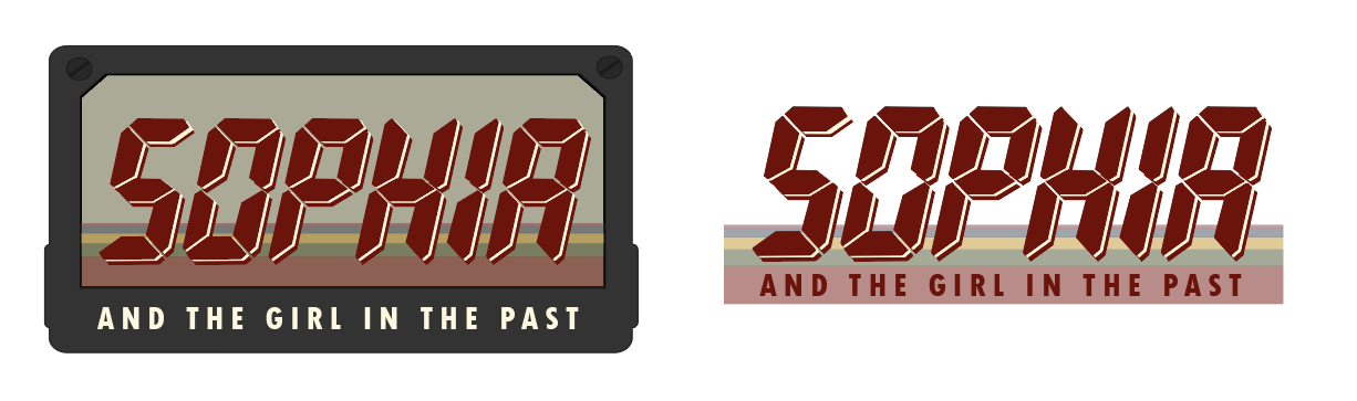
Now, our logo took longer than we imagined finishing, but it’s done now. We started with the idea of using a font that resembles the writing on old devices, such as the walkie talkie that allows our characters to communicate through time.
We really liked the idea of this font, so we tried it with different colors and different ways to fit in the subtitle. For the colors we tried to always have them remind of the 90s, be it neon, patterns, primary colors or give it more of a worn-out look. Here you can see some of the many options we tried.
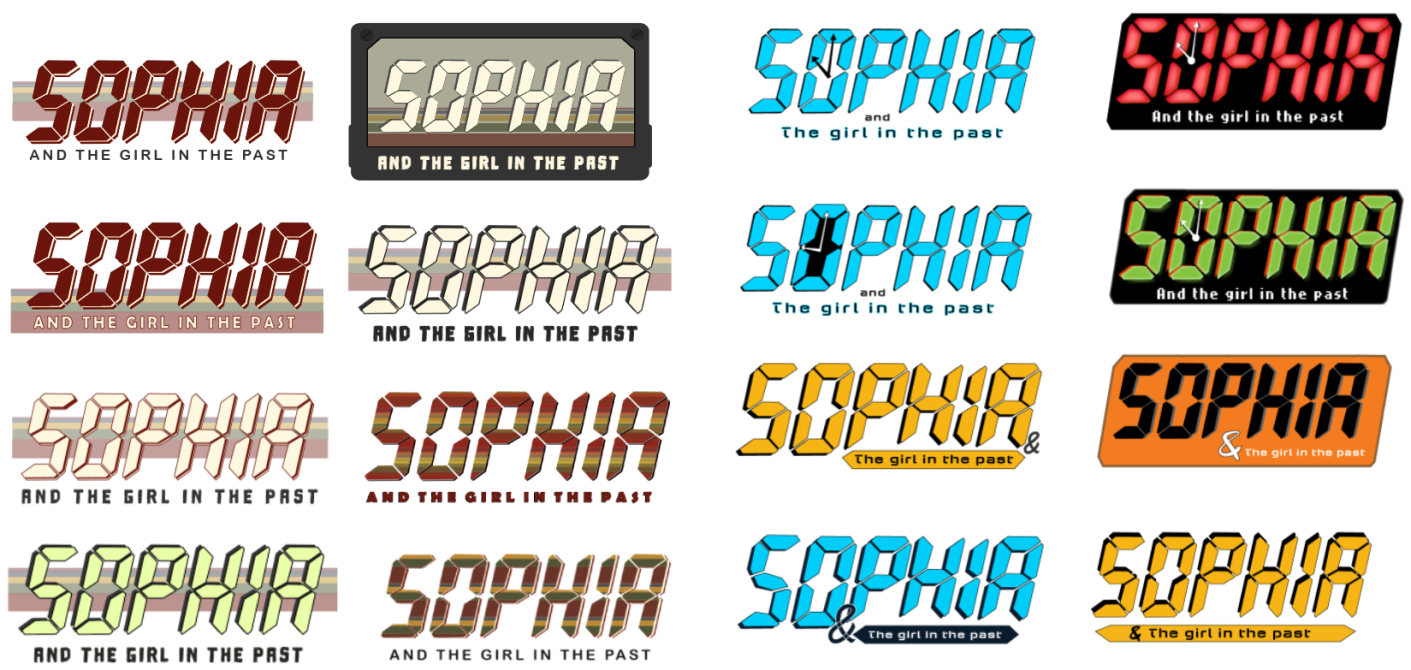
Then we picked a few of the more readable ones and tried getting lots of opinions on these.
![]()
Ultimately, we got to the conclusion that most peoples favorite was the cassette tape. This one was personally one of our favorites, but we were reluctant to choose it since its for a logo and having it always closed in a box not only makes it look more like an icon as it restricts its versatility.
After some discussing we decided that we would have two versions of the logo one with cassette tape and one without it.
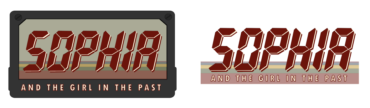
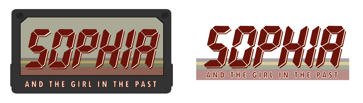
We tried a few different colors and fonts and decided on the red for the title, and a subtitle without outlines making it more readable.
Let us know what you think of these new developments.
And if you’re interested in the development of Sophia and the Girl in the Past follow us on our socials:
Instagram: Instagram.com
Twitter: Twitter.com