Hey, everyone,
After weeks of concept development and polishing, we are finally revealing Loowa's logo and app icon. It has been a long road filled with ups and downs. Sometimes it seemed like we took one step forward only to take two backwards. Nothing we tried seemed to fit the game's concept, aesthetics or mechanics. We were trying too hard to fit the mould, which never really works for us.
Since a game’s logo is one of the first thing players see, it’s paramount that it reflects the game’s identity and core, that is, the soul of the game. After sketching random ideas and recreating them in Photoshop, we searched for fonts which suited them and tried them out.
![]()
But, since none of these ideas were working, we went back to the basics and started thinking about the message we wanted our logo to convey, making a list of the keywords we believe define our game:
- Lines > continuity > pieces > missing > puzzles > path
- Trees > plants > flora
- Fluid + round
- Comic book
- Unfinished
With this list in mind, we knew what we needed to focus on: lines with gaps or missing pieces, plants and a comic book style font. At first glance, these seemed like completely different paths that may or may not lead to a final coherent and aesthetically pleasing result, so juggling all of these concepts was quite tricky.
After selecting a good range of references, we started our journey to find the perfect font. It was hard, but after a lot of trial and error (oh, how we hate this expression and what it means in the development process!) we found the font! It is a perfect match with what we wanted: there are gaps in the lines that make up the letters, representing our game mechanics: completing paths to be able to move forward. Furthermore, the double lines that compose each letter make it fuller and rounder, so it wouldn't feel at odds in a comic book title.
Now that we had the perfect font, it was time for colour tests. As you know by now, when it comes to colour tests, we usually go overboard. We tested every colour combination under the sun, but nothing seemed to fit our game's style. Until we tried Loowa's environment colour palette on the letters. And, just like that, things started shaping up. We filled the gaps with vine-like plants, and more colour tests ensued, but we ended up choosing a colour palette that is dear to our hearts: the one from the game's app icon — Loowa's eye.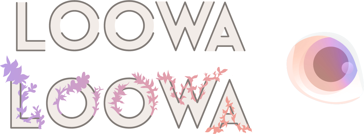
We now had a logo we quite liked, but the plants filled in the gaps so perfectly that nobody could see they were even there anymore. So this kind of defeated the whole purpose of choosing this font. But then we had an idea that changed everything.
As we mentioned before, Loowa is a comic book character and the game is meant to represent the comic book's narrative. So, what if the logo without plants represented the logo of "Loowa" the comic book, and the plant-filled one stood in for the logo of Loowa the game? And what if we created an animation where the gaps were gradually filled in with the plants?
It seemed like a great idea, so, you know it, of course, we tried it! So, without further ado, we present Loowa's logo, set on the game's main screen background:
![]()
In our opinion, having an animated logo is really the best of both worlds, giving us both logos in one fluid package. With this part out of the way, we set to polishing up our main screen, implementing the logo, icons, and artwork. It's now very close to the final look, and things are looking good, if we might say so ourselves!
What do you think of Loowa's logo? Do you believe it fits the game?
More news to come. Stay tuned!
#gamedevelopment #indiedevelopment #indiegame #indie #gameart #unityengine
