Introduction
Hello everyone!
We're back again with some new goodies for you lovelies.
We hope you enjoyed the music that's been produced for Helena.Unfortunatly that was all we have for now in the sound department.
Today we'll be showcasing our studies of what the game's logo and icon will look like.
"Let's get this show on the road!"
Studies - Logo
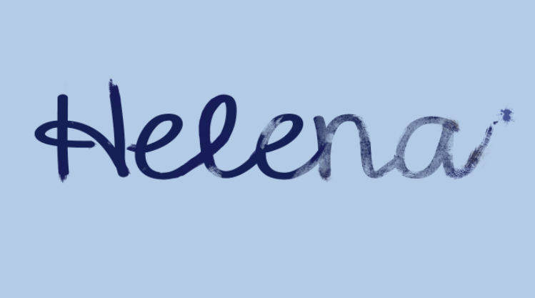
The logo for Helena is the name itself handwritten on a blue background. The fact that it is handwritten is a nod to the story and the blue background representing the Douro river and youth.
In terms of color for the letters we started off with yellow due to the contrast between the letter and background, and it remained yellow for a while, we didn't like it because yellow ink back then was absolutely ludicrous for writting letters but we thought this contrast was necessary. We ended up changing it in the end to a very dark blue that worked well with the background and haven't looked back.
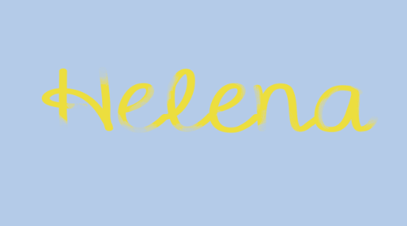
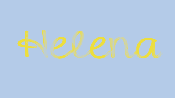
From the beginning we wanted the letters to have some sort of fade to them to simulate how you'd run out of ink on inkwell pens and would have to dip them in an ink bottle every so often. We chose to leave the fade at the end of the name as it made more sense with the "running out of ink bit".
Studies - UI Icons
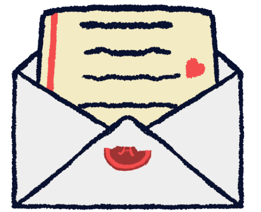
One of the icons in our UI is this envolope right here

But it didn't always look like this. Like anything else this icon went through iterations till it reached the final product above.
The letter has to have 4 things: the vertical red line, the horizontal black text, the white envelope and yellowish paper. Whatever we add to this is not mandatory but might elevate it's quality.
As you can see in our previous tests, the letter was supposed to have a red heart somewhere drawn in the letter. We later removed it because this sort of thing was not part of the culture of hand written letters in 1950's Portugal.
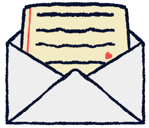
We also added a wax seal to one of the studies and it gave the envolope something to look at so we decided to keep it, only changing the amount of the seal that gets broken.
Conclusion
This week we delved in the dark arts of UI design. (Spooky...)
We marched in here and put all we did for the logo and icons on display. And we hope you enjoyed the process as much as we did.
Stay safe out there lovelies!


Awesome!good article!
Thanks! We post weekly devlogs here and on Twitter as well, if you want to know more about the game and its development, follow us :) @rio_studios_